Download
1 / 16
170 likes | 342 Vues
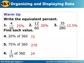
Warm Up Write the equivalent percent. 1. 2. 3. Find each value. 4. 20% of 360 5. 75% of 360 6. 20% . 12.5%. 25%. 72. 270 . 24. Bar graphs, line graphs, and circle graphs can be used to present data in a visual way.

E N D
Warm Up Write the equivalent percent. 1.2. 3. Find each value. 4. 20% of 360 5. 75% of 360 6. 20% 12.5% 25% 72 270 24
Bar graphs, line graphs, and circle graphs can be used to present data in a visual way. A bar graphdisplays data with vertical or horizontal bars. Bar graphs are a good way to display data that can be organized into categories. Using a bar graph, you can quickly compare the categories.
Example 1: Reading and Interpreting Bar Graphs Use the graph to answer each question. A. Which casserole was ordered the most? B. About how many total orders were placed? C. About how many more tuna noodle casseroles were ordered than king ranch casseroles? D. About what percent of the total orders were for baked ziti?
Check It Out! Example 1 Use the graph to answer each question. a. Which ingredient contains the least amount of fat? b. Which ingredients contain at least 8 grams of fat?
A double-bar graph can be used to compare two data sets. A double-bar graph has a key to distinguish between the two sets of data.
Example 2: Reading and Interpreting Double Bar Graphs Use the graph to answer each question. A. Which feature received the same satisfaction rating for each SUV? B. Which SUV received a better rating for mileage?
Check It Out! Example 2 Use the graph to determine which years had the same average basketball attendance. What was the average attendance for those years?
A line graphdisplays data using line segments. Line graphs are a good way to display data that changes over a period of time.
Example 3: Reading and Interpreting Line Graphs Use the graph to answer each question. A. At what time was the humidity the lowest? B. During which 4-hour time period did the humidity increase the most?
Check It Out! Example 3 Use the graph to estimate the difference in temperature between 4:00 A.M. and noon.
A double-line graph can be used to compare how two related data sets change over time. A double-line graph has a key to distinguish between the two sets of data.
Example 4: Reading and Interpreting Double-Line Graphs Use the graph to answer each question. A. In which month did station A charge more than station B? B. During which month(s) did the stations charge the same for gasoline?
Check It Out! Example 4 Use the graph to describe the general trend of the data.
In a circle graph, the entire circle represents 100% of the data. Each sector represents a percent of the total. Circle graphs are good for comparing each category of data to the whole set.
Example 5: Reading and Interpreting Circle Graphs Use the graph to answer the question. 12.5% 12.5% 50% 25% Which ingredients are present in equal amounts?
Check It Out! Example 5 Use the graph to determine what percent of the fruit salad is cantaloupe.