Using PowerPoint Concept Maps to Create Structured Online Notes
This brief introduction explores the application of Rodney Carr’s "Roadmap Tools" in creating structured online notes using PowerPoint concept maps. Drawing on Larry Weldon's SFU STAT 100 course, the article discusses how theoretical concepts can be absorbed while examining case studies, particularly in the context of sports leagues. It highlights simulations of the English Premier League’s 2004-5 season, prompting discussions on team rankings, point distributions, and the implications of data analysis. Key insights reveal the challenges of distinguishing between transient and persistent patterns in datasets.


Using PowerPoint Concept Maps to Create Structured Online Notes
E N D
Presentation Transcript
Using PowerPoint Concept Maps to Create Structured Online Notes A very brief intro to Rodney Carr’s “Roadmap Tools”, with examples from Larry Weldon’s SFU STAT 100 course. Larry Weldon SFU Rodney Carr Deakin U
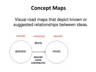
Case Study Approach How to ensure Theory is absorbed, as the Case Studies are explored? Theory = generally applicable tools and concepts
Sports League The case study Concepts and Techniques
The case study The English Premier League Soccer is one of the most watched sports leagues. The table shown here shows the team ladder for the 2004-5 season. Teams receive 0,1, or 3 points for each game lost, tied, or won, respectively. The Issue: does ranking of a team in a sports league reflect the quality of the team? What range of points would occur if every game (of the 190 games in the season) was a 50-50 game? Keep in mind that most teams have between 32 and 61 points – the top three looking exceptional with 77, 83, and 95
Analysis + Discussion In the analysis which follows, we study the range of points earned by the English Premier League teams. We use a technique called “Simulation” to do this. While the preparation of a program to do this requires knowledge of programming, this principle is simple an can be explained without jargon.
Analysis + Discussion(1) Typical league points for the 20 Teams would look like this: How can we explore what would happen if the 190 games were all “50-50”. The data from the season shows that about 30% of the games ended in a tie. So perhaps 50-50 means Lose 35% of the time, and win 35% of the time. We could simulate this by putting 20 tickets in a hat, 7 of them with “L”, 6 with “T” and 7 with “W” – then we draw tickets with replacement 190 times and record the result. Or, easier, let the computer do this! In fact, let’s have the computer do the whole 190 games 100 times….
Analysis + Discussion(2) The “typical” outcome of this simulation is only typical in the sense that half of the outcomes would have a greater spread of points and half smaller. The result of simulating 100 seasons (each with 190 games) produces the dotplot shown here. It shows that a range of 40 or more points would be pretty unusual without there being a real quality differential among the teams. But recall that the quality differential was only of this order when you compared the top three teams with the bottom ones. A reasonable conclusion would be that, in the 2004-5 season, only Chelsea, Arsenal and Manchester United demonstrated superiority over the lowest teams. There is really not much evidence for a quality difference between rank 4 and rank 20.
Analysis + Discussion(3) Here is another look at the implications of a no-difference assumption. We can plot the distribution of the top team’s points at the end of the 38 game season (red) and the bottom teams as well. Recall that the top three teams had 95, 83 and 77 points and the bottom teams had 32 and 33. This plot may cast a bit of doubt on the superiority of the team with 77 points. Remember – the graph is simulated assuming no-difference.
Analysis + Discussion(4) Our conclusion from this data alone does gain some support from results of earlier years. The three teams mentioned are the only ones to win the premiership over the last ten years! Review Note the logic of this analysis: We postulated a hypothesis (that all teams were equal), explored the implications of this hypothesis (that the range of points would usually be 40 or less) , compared those with the data (range of 63), and concluded that the equal-team hypothesis was not tenable. However, a secondary finding was that the difference in points had to be almost as large as observed to reveal team quality, a surprising result.
Review 1. Influence of Unexplained Variation (UV) on Interpretation of Data 2. UV can make temporary effects seem like permanent ones (illusions) 3. Graphing of Data is an essential first step in data analysis 4. Need for summary measures when UV present MCQ What is first thing you do with data? a. Collect it b. Graph it c. Decide what type of data it is
Not the best answer This is not the best answer….
Good answer You got the answer…. Have you thought about…
Illusions Some patterns in data are transient, and some are persistent. The transient ones can create illusions. The cause of these illusions is unexplained variation, and it can lead to misinterpretation of data by the statistically naïve. Patterns in data can appear that seem too regular to be transient, but this can be an illusion. By learning what can happen when we create a model that has no useful pattern, we can guard against being fooled by an apparent pattern. Of course, we do want to find those patterns that last, are not transient, if they exist. But it can be very difficult to distinguish between transient and persistent patterns. This dilemma motivates many of the techniques of statistics. Up concept tree
Simulation The idea that the effects of unexplained or uncontrolled variation can be determined by simulation is very powerful. Many of the examples in this course use simulation to study some complex situations – but note that the simulation method itself is not so complex. If you understand the sense in which tossing a coin can reproduce the outcome of a fair game, you will have the beginnings of the idea. (For example, can you use this technique to say how likely it is to get 5 “heads” in a row?). Back to Case Study
Using the Mean and SD The “mean” is just a synonym for “arithmetic average” – the usual one found by adding up a batch of numbers and dividing the total by the number of numbers in the batch. It gives a reasonable one-number summary of the batch. Of course, it is not a great summary of the batch! We need at least to describe the spread of the batch of numbers. The usual measure of spread is the “standard deviation” or SD. Think of it as a typical deviation of the numbers from their mean. Before we give the formula, here an example: your male classmates probably average about 178cm in height and the SD is about 6 cm. Although the two numbers 178 and 6 do not say exactly what the collection of heights is, it does give a rough idea. Using mean & standard deviation (SD) So the numbers mean and SD do give a convenient numerical description of a batch of numbers. Back to Case Study
Calculation of the SD Standard Deviation (SD) – how to compute it. Suppose you want the SD of n numbers: The SD is based on deviations of the n numbers from the mean. What you do is take these n deviations, square them, sum them up, divide the sum by n, and finally take the square root. Example: 1,2,3,5,9 is our batch. Mean is 20/5=4. SD is Back to Case Study
Simulation Simulation in general language means “generation of a likeness”. But in statistical jargon it is short for Monte Carlo simulation which is a particular strategy used to explore the implications of probability models. This simulation can be physical (making use of coins or dice or cards to produce “random” events) or electronic (making use of a computer algorithm to produce “random” numbers.) An example of a physical model would be the tossing of a coin 10 times, many groups of 10 tosses, to find out how variable the number of heads in 10 tosses is. The result of 100 such physical experiments would be a distribution of the number of heads: So many with 0 heads, so many with 1 head ….so many with 10 heads. Without knowing any theory of probability, you could actually get the result. This is why simulation is useful. However, the tossing of coins is laborious. So electronic simulation is a very welcome alternative. The computer can produce outcomes with the same properties as the physical experiment. To see a demonstration of this, click on coin.xls. Back to Case Study
Gasoline consumption 020904 The case study Concepts and Techniques
Context What is it about… This data shows the five year experience of gasoline consumption for my car. I commute 100 km each work day and do the same trip all year round. The consumption is measured by noting the kilometers travelled each time I fill up with gas, and the amount of gas that was necessary to refill the tank at that fill-up. But note the great variability from one fill to the next. The question here is, Is there anything of interest to learn about this car’s gas consumption from this data?
Analysis and Discussion The analysis will attempt to extract some useful or interesting information from this data.
Analysis and Discussion (1) The apparent chaos of this data disappears when a smoothing operation is applied to the data. This smoother happens to be one called “lowess” but the details need not be covered here. This or most other smoothers would extract the seasonal trend. The point is that it is automatic.
Analysis and Discussion (2) All you need to choose to make this smoother work is the amount of smoothing you want. This is a number between 0 and 1. the one used here is 0.15. It chooses the proportion of data used for each smooth point. This northern hemisphere data shows the highest rate of consumption in the winter and lowest in the summer. In the next slide we discuss possible explanations.
Analysis + Discussion(3) Possible causes This data was collected in Vancouver, Canada. In addition to the temperature changes during the year, there are changes in rain (much more in the winter) and traffic density (much more in the winter), and not much snow or ice at any time. Tire pressures might also be involved (higher consumption with lower pressure). What is your explanation of the smooth seasonal trend?
Analysis + Discussion(4) Is there any more information in the data? One way to check is with a residual plot. It looks at the difference between the data and the smooth fit. If the smooth is not the whole story, the residual plot should show it. After analysis of these residuals, you might conclude that there is not much of interest here – this is good.
Smoothing Plotting time series Smoothing and Residual Plots Seasonality vs trends … Recall Gas consumption data. The graph suggested the seasonality, and this led to interesting questions about the cause of the seasonality. Note: this is an example of a scatter plot. Two “variables” are plotted for a data set in which the rows of the data are linked: Var 1(Date) Var 2(Litres per 100 km) May 5 10.86 May 12 9.24 May 15 11.47 Because one of the variables is “Time”, this kind of data is called a time series. Why is a time series different from other kinds of data? See the Residual plot in Analysis(4) of this case study Back to Case Study
Residual Plots You plot (Y-fit of Y) against a predictor variable, or sometimes against Y-fit itself. If Y-fit is a good description of the “signal” then the residual plot should show no interesting trends. Interesting trends suggest that the model of the fit could be improved. Back to Case Study
Population change The case study Concepts and Techniques
Context The Issue: What do a country’s birth and death rates say about the trend of the changes in its population size, and what variability is there around the world in these trends? We need to ignore immigration and emigration for this simple analysis. We have data for 69 countries – while this is not all countries, it does include countries from the major continents.
Analysis and Discussion (1) First let’s look at the data one variable at a time – see the dotplots below. Death Rates Birth Rates
Analysis + Discussion (2) But the dotplots do not show the relationship between the birth and death rates for each country. For this we need a scatter plot. It would be nice to see the country names – can do, but a bit messy. Scatter Plot Labeled Scatter Plot
Analysis + Discussion (3) A more useful labeled scatter plot uses only the Continent Labels. Note that the birth and death rates do tend to cluster into separate regions of the graph. Can you explain why this is so? (Requires “context” knowledge of course).
Analysis + Discussion (4) We can alternatively look at the data in a table: But is this a good way to arrange the table? Note that sorting the rows often helps. Sort by birth rate, or by death rate, or by ratio birth/death rate, for example. The partial table at left is not the best arrangement – try some others. Homework: (not to hand in, yet) Propose a method for numerical summary of this data. By eye-balling the table, anticipate what your summary would show, and express this in words.
Context of the Data To design an informative table or graph, one needs to make careful use of the context of the data. (labelling plotted points by country, ordering table rows usefully). The method of analysis you choose will often depend on the context. The relative importance of various questions about the data must be taken into account. Back to Case Study
Dot Plot (2) Dot-plot The dotplots below show that for portraying the distribution of a single variable, dotplots work well. One can infer for example that death rates usually range between 5 and 15 per 1000 population while birth rates vary over a larger range, 15 to 50. However, note that any relationship between birthrates and deathrates is not observable from these plots. We need scatter plots for this. Back to Case Study
Scatterplot The scatter plot shows the simultaneous values of two variables. Back to Case Study
Ordering Rows or Columns in a Table Table The general idea is that if a feature of a display is arbitrary, it may sometimes be re-organized to advantage. Back to Case Study
Labelled Scatterplot Labelled scatterplot Back to Case Study
Stock Market Index The case study Concepts and Techniques
Context Here is some recent year’s stock index levels for the Toronto Stock Market. How can this series be described?
Analysis and Discussion Note: An introduction to this topic is provided in the article “Randomness in The Stock Market” by Cleary and Sharpe, in “SAGTU”, pp 359-372.
Analysis + Discussion(1) Coin Flipping reproduces a trend a little like the market. H= +1, T= -1 A slight modification to allow steps of varying size, but still equally likely up or down.
Analysis + Discussion (2) Compare the simulated time series with the stock index series. The fact that the trend is the same is accidental. But the variability does seem similar. What does this tell us? That the TSE trend could have occurred when the series had no predictable trend at all - because the simulated series was designed to have no predictable trend.
Pattern Illusions in Time Series Apparent trends can be useless for prediction, as is the case in the symmetric random walk – the level may be useful to guide your actions, but the trend up or down may not persist. It takes a long time series to determine whether trends are real or illusions, and even in a long time series you need some stability in the mechanism to infer anything. An example of this is in RandWalk.xls Back to Case Study
Random Walk The simplest random walk is one in which a “person” takes a series of steps of one meter forward or backward. One represents the net movement as a function of the number of steps taken – call it f(t), with t the step number. The graph of f(t) against t is a time series, and it is very useful for understanding some time series phenomena. The random part might be produced by tossing a fair coin, so that one side (e.g. head) would represent a step forward, and the other side (e.g. tail) would represent a step backward, and both kinds of steps would have the same chance at each step. Of course, the step sizes need not be equal to one metre – they could be random too. Moreover, the chance of a forward step need not be equal to the chance of a backward step. More general random walks are possible. The surprising thing about random walks is that what happens on average almost never happens! To explore what actually does happen, explore random walks with the Excel link below - RandWalk.xls Back to Case Study
Auto Insurance The case study Concepts and Techniques
Context Annual Suppose we pay $5 every day for auto insurance. The company receives 5x365 = $1825 in one year. If I have no accident the company keeps the $1825. If I have an accident, suppose the average cost is $6,000. Also, suppose the company has determined that my probability of having an accident this year is 1/5=0.2. will the company make money? With one customer, the company could not be sure. But with 100 customers, here is what would happen according to several simulations of a years experience with 100 customers: