Graphs
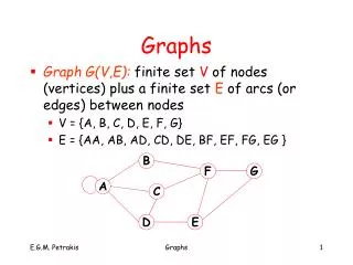
Graphs. Class A. Class B. Earth and Space Science. Box - and - Whisker Plot. Circle Graph. Pictograph. Types of Graphs. Bar Graphs. Plots. Line Graphs. Histogram. Single. Stem & Leaf. Single. Line. Double. Double. Scatter.

Graphs
E N D
Presentation Transcript
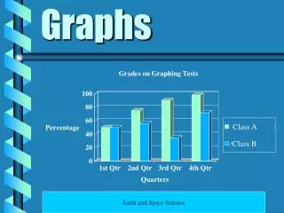
Graphs Class A Class B Earth and Space Science
Box - and - Whisker Plot Circle Graph Pictograph Types of Graphs Bar Graphs Plots Line Graphs Histogram Single Stem & Leaf Single Line Double Double Scatter
Circle graphs are used to display parts of the data in relation to the entire amount of data. All circle graphs need a title. Each part is called a sector and is labeled. Circle Graph
Circle Graph More Info
Histograms are used to show the frequency of data. Very similar to bar graphs, but use intervals on the X axis. Bars do touch. Histograms have a title. Histograms have two axes (X and Y), which are labeled. Histogram
Histogram Class Test Scores Frequency Test Scores
The purpose of a bar graph is to display and compare data. Bar graphs use bars to show the data. A bar graph must include: - a title - labeled X and Y axes - equal intervals are used on the Y axis. - the bars are evenlyspaced apart from each other. Bar Graph
Bar Graph More Info
A line graph is used to illustrate change over time. Line graphs need: - Title - Labeled X and Y axes - Equal Intervals - Data displayed by points connected into lines. Line Graph
Shows how closely two sets of data are related. The closer the sets are related, the closer the points come to forming a straight line. Scatter Plots include: - title - labeled axes - equal intervals - corresponding numbers plotted as ordered pairs. Scatter Plot
Scatter Plot Study Time Versus Grades 100 * * * * * 80 * * 60 Grade 40 20 0 0 1 2 3 4 5 Study Time in Hours