Download
1 / 11
110 likes | 125 Vues
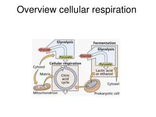
Cellular Overview and Omics Viewer. The Cellular Overview Diagram. A way to quickly visualize an organism’s metabolism Generated automatically by Pathway Tools Can be a static display or a dataset viewing tool. Organization of the Overview.

E N D
The Cellular Overview Diagram • A way to quickly visualize an organism’s metabolism • Generated automatically by Pathway Tools • Can be a static display or a dataset viewing tool
Organization of the Overview • Lines are reactions, nodes are biochemical species (compounds, proteins) • There’s a legend explaining symbols used • Includes metabolic and transport reactions • Pathways grouped functionally • Anabolism on the left, catabolism on the right, energy in the middle • Gray backgrounds indicate more specific functional groups • Non-pathway reactions on far right • Generally, pathways flow downward
Physical Location in the Overview • Non-cytoplasmic proteins with known locations shown • In E. coli, that means periplasmic, cell and outer membrane • This includes proteins with no associated reaction • Cytoplasmic proteins with enzymatic activities shown • Non-enzymatic cytoplasmic proteins left off to avoid clutter • Compare the gram-positive B. anthracis • Note pathway holes visualized as gray lines • Overview>Show/Hide Transport Links
Mousing Over in the Overview • Mousing over a gray backing tells you the pathway class • Mousing over a node gives compound name and pathway • Mousing over a line gives similar information • Can click through from anything to the PGDB • Can right-click to: • Zoom • Pop up pathways • Indicate pathway connections (clear in overview menu) • More
Highlighting in the Overview • Overview>Highlight>many options • Pathway by class (biosynthesis > all > select all) • Reactions > All without EC numbers (note second color) • Note all reaction options (many!) • Reactions > By modulation • Can clear highlighting at any time • Can save highlighting to file for later use • Can do Genes and Compounds as well • Can pull information from a file, or from answer list
Highlighting to Compare Organisms • Look at shared or nonshared reactions • Example – E. coli reactions shared with humans • Example – switch to B. anthracis • Reactions not shared with (human and coli) • Set from Any to All • One way to think about drug targeting, e.g. • Quick note – cross-species comparison from pathways • Go to this from individual pathway pages • Compares presence of pathway in question, and reactions of that pathway
The Omics Viewer • An intuitive, visual display of large data sets • Visualize any data that attaches numbers to genes, proteins or compounds • Proteomics, metabolomics, genomics • Accepts tab-delimited and SAM datasets
Using the Omics Viewer • Overview>Omics Viewer>Text File / SAM Output • Single-time-point experiment • Choose display • Relative/absolute data • What kind of data? • Which column is the data in? (Object IDs must be in zero) • Color schemes • Default (not standard between different datasets) • Others (see next slide)
Omics Viewer Output • Data report • Total data rows • Data rows not shown • Data rows with invalid data • Color key • Display options • Set maximum cutoff for default color scheme (e.g. 0.3) • Set manual color cutoffs (e.g. 0.3, 0.6, 0.9) • Both options let you compare different experiments
Viewing Multiple Data Sets • View as an Animation • Typically a time course, but does not have to be • Need to tell Pathway Tools which columns to use • Same output color / cutoff selections as single experiment • If you use automatic color scale, it’s set to the maximum shift in the experiment • Thus, all time points / data sets comparable • A good way to standardize across experiments • Can move between experiments/time points manually • Can save as HTML