Essential Design Principles for Effective Poster Presentations
This guide provides fundamental strategies for creating impactful poster presentations. Understanding your audience and purpose is crucial—aim to engage viewers without overwhelming them with information. Use clear headers and a visually appealing layout with ample white space for better readability. Choose appropriate typefaces, sizes, and colors to ensure that key points are conveyed effectively. Remember, you have only 30 seconds to capture attention. Explore additional resources for poster design, from templates to expert tips, to enhance your presentation skills.

Essential Design Principles for Effective Poster Presentations
E N D
Presentation Transcript
Poster Basics Sherry Wynn Perdue Oakland University Writing Center 212 Kresge Library (248) 370-3120 www.oakland.edu/ouwc
Rhetorical Purpose • Who is my audience? • Mixed-discipline • What is my purpose? • To get my audience to read my paper and/or ask for more information • For what situation/context do I compose? • A setting ripe for information overload. Don’t give viewers additional distractions. • What are the conventions of the genre? • Visual short-hand. Less is more.
Pivotal Design Question Acknowledge the limits of your influence: You have 30 seconds at a distance to convey your message. Ask: If the viewer remembers only one thing about my work, what will it be?
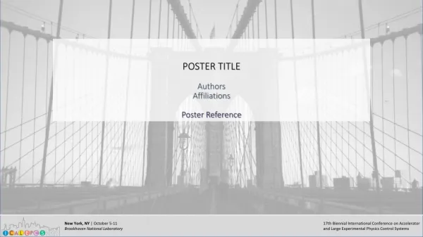
Entitlement • Convey a tangible, purpose-oriented message with as few words as possible. • Consider adding a sub-title if presenting a complex message • Consider forming a provocative question in lieu of statement title
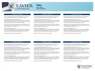
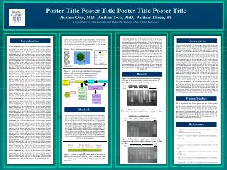
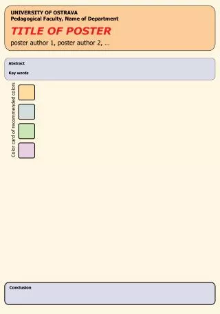
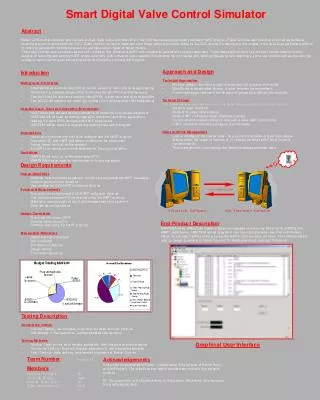
Headers Headings serve two purposes: • Provide order to the message • Convey key points or sections, such as Research Design/Methods, Findings, etc. To be effective, consider: • Typeface: Sans Serif • Helvetica, AvantGarde, Franklin Gothic • Size: Readable from a distance (4 feet away) • Color: Contrast but clear and readable
Layout Concerns • Clear progression, usually by columns from left to right • Sectioned: Avoid one long stream of text • Ample white space between items • Cropped with straight edges (don’t “eyeball alignment)
Resources The Dos and Don’t s of Power Presentation by Steven M. Block Poster Presentations by The University for Wisconsin-Madison Creating Effective Poster Presentations::Create Your Poster:: Headings by Hess, Tosney, and Liegel Designing Conference Posters by Colin Purrington
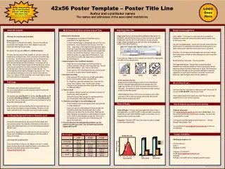
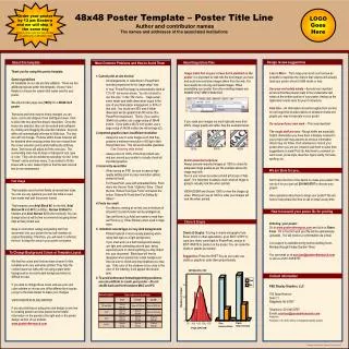
PPT Poster Presentation Templates • http://www.posterpresentations.com/html/free_poster_templates.html?gclid=CKnG8NKNwrICFeUWMgodgwgATw • http://colinpurrington.com/wp-content/uploads/2011/09/postertemplateppt.zip • http://www.posterpresentations.com/html/free_poster_templates.html • http://www.genigraphics.com/other/poster_templates.asp • http://colinpurrington.com/tips/academic/posterdesign • Instead of hand-constructing your poster, you can use PowerPoint to create one that you then have printed by a professional company. • In the alternative, you can use PPT to print sections of the poster, which you hand position on poster-board.