Chapter 3- Presenting GIS Data
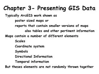
Chapter 3- Presenting GIS Data. Typically ArcGIS work shown as poster sized maps or reports that contain smaller versions of maps also tables and other pertinent information Maps contain a number of different elements Scales Coordinate system Symbols Directional Information

Chapter 3- Presenting GIS Data
E N D
Presentation Transcript
Chapter 3- Presenting GIS Data Typically ArcGIS work shown as poster sized maps or reports that contain smaller versions of maps also tables and other pertinent information Maps contain a number of different elements Scales Coordinate system Symbols Directional Information Temporal information But theses elements are not randomly thrown together
Basic map design • Objectives of the map • What is being communicated? • Who will be using it? • Where will they be using it? • For example, try navigating cross country using 7.5 minute topographic maps! Its impossible! • Then think about what most road atlases look like
Bad Good
Basic map design • Data layers to be included on the map • Some data are appropriate • Some data are not • Often trial and error to see what it will look like • For example, try all street names cannot be placed on a small scale map! • It would make the map too busy. • The same can be said for topographic maps and the contour interval for the topo lines
Basic map design • Planning the layout of the map • Place data frames at appropriate locations • Include where the legend will go • Determine how big the map will be when finished • The end result will be efficient and elegant maps as opposed to busy, impossible to read maps
Basic map design • Colors of the map • Use colors that indicate levels of importance • E.g., major roads are red, lesser roads are black • Same can be said fort he symbols choice • Use colors that suggest what the item is • e.g., water is blue • Avoid using colors that don’t allow the user to read things easily • Green text on blue backgrounds • Red text against green backgrounds or vice versa • Use an overall palette that indicates the nature of the data • Bold colors to indicate importance or severity • Pastels to indicate leisurely activities • Avoid color combinations that make the user feel like killing someone because of the weird contrasts that don’t work well together
Basic map design • Create the map • Try to think about all of the factors while actually creating the map • Realize there is a big advantage to using a computer • If it doesn’t work the way you thought, you can tweak it to make it better.
Choosing Symbols • Earth tones are more pleasing to look at • Greens, Browns, Cream, Blue • Strident tones should be used sparingly • Reds, “pepto bismal” pinks, fluorescent greens should be used to emphasize certain elements • Blues are cool and calming • Water, both liquid and frozen • Browns are steady and solid • Land, with little vegetation • Greens denote growth • Plant density can be shown using greens and brown
Patterns on maps • Avoid busy patterns • When necessary, make them less apparent and they swill be more effective without being distracting
Coordinate systems • We have identified a few different coordinate systems • UTM • Lat / Long • State Plane • We have identified that the coordinate system of the data frame determines how all other data sets are displayed in the data frame • ArcGIS changes them on the fly and makes sure that the data being viewed is aligned with each other correctly
Coordinate systems • How do we choose what system to use? • GIS will choose the original coordinates system based on which data set is imported first OR… • You can choose your own data set before importing the data • The choice of the coordinate system affects how the map will look.
Coordinate systems • All coordinate systems have a reference datum • Ensures a good fit of a spherical system to a distorted spherical object • NAD1983 means a reference datum for North America set in 1983 • WGC1984 means a reference datum for the world set in 1984 (World Geodetic System) • Lat Long are angular measurements meant for spherical shapes • They are difficult to display as planar maps
Lat / Long and projections • When Lat long is imported into a map that is planar • Distortion occurs in the east/west direction due to the planar coordinate system on the map • The closer to the poles, the greater the distortion • There are ways to minimize certain types of distortions with various types of projections
Unprojected Projected
Cylindrical Preserves distance and shape Conical Preserves distance and area Planar or Azimuthal Preserves distance and area
Coordinate systems • The type of map and the info you want to portray determines the coordinate system you will use and how its projected • Very important for small scale maps that show nations or the world • Regardless of what systems or projections you use, there will be distortion on these maps • Example 1- maps that will be used for distance or area measurements • Use a conic or a planar (azimuthal) projection • Which preserve distance and area, but distort direction and shape • Example 2- maps that will be used for navigation using a compass • Use a cylindrical projection which preserves those traits on the map
Mercator Equal-Area cylindrical
Projection and data frame layouts • Map projection influences some elements commonly placed in a data frame • Small scale conic projections cannot show north using a North arrow Why? • Small scale Mercator (cylindrical) maps cannot measure distance using a bar scale Why? These are usually given what is known as a graticule grid for determining location
Reference Grid Graticule Grid (Lat/Long) UTM Grid

