
Picking your visuals
E N D
Presentation Transcript
Picking your visuals Some tips on which visuals to use (and which not to use) and when
Consider These Before Beginning Content Content
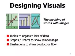
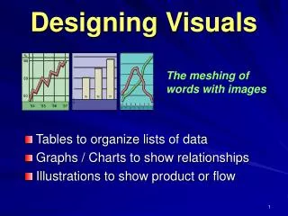
Relationships Between Numbers • There are several types of visuals for number comparisons • Bar charts, line charts, histograms, box plots, pie charts and scatter plots are just a handful • Nature of the values, situation and audience are important things to keep in mind
Relationships Between Numbers Chart title Data label Y-axis label Axes labels
Relationships Between Numbers Legend Axes labels Data label
Horizontal vs Vertical charts • While horizontal and vertical bar graphs are often interchangeable, there are some defining differences that make one type more suitable in certain situations. • Use a vertical bar graph if: • You want to display time series data • Your axes labels are short • You want to emphasize a magnitude of change/disparity • Use a horizontal bar graph if: • Your axes labels are long (i.e. countries) • There are few (or no) time periods
Don’t use 3-D charts When considering a 3-d chart, ask yourself what the extra dimension adds to your presentation. Probably nothing. More than likely, the 3-d aspect is unnecessary and distracting, taking away from the impact of your visual.
Caution With Pie While pie charts are popular in the business world, it’s generally a good idea to stay away from using them, unless your chart will include only two values. This is because it’s difficult for the human eye to easily detect the discrepancy in values when there are several sections and a pie chart labeled with numbers is messy and difficult to read. A bar graph or other type of graph is generally much more effective at conveying the difference.
How to Create These Visuals? These visuals can be created in Excel or PowerPoint. While both are effective, PowerPoint offers more control. Why? While Excel is intuitive and interacts directly with your data source, once the visual is exported, there is little you can do to manipulate your visual.
Components of a total/whole A stacked bar chart is usually your best bet when you want to convey parts of a whole or a segment’s relationship to the overall population. The example to the right depicts a company’s sales in the electronics department compared to all other departments. Notice how the figures are in percentages and there are four quarters. One thing to keep in mind when building stacked bar charts is the number of comparisons you want to make. Things can get messy if you try to compare three or more segments in a single column.
Depicting Trends As with visuals that compare values, there are several ways to display trends. The line graph and area chart are the two go-to options, but there are other visuals to choose from as well.
Area charts: How and When Area charts represent change over time. Unlike line charts, area charts are great at visually representing volume. Area charts are great for communicating overall trends as opposed to individual values. The example to the right depicts the number of new contacts a company makes per month. It is comparing two contact types: organic search and social media. Notice how the overall area is a combination of the two categories. As you can see, organic search represents a higher volume of contacts and is a larger proportion of the total contacts.
Depicting Trends This line graph, copied from an online source, is effective at conveying the change of prices over a long period of time. Line graphs are a great way to depict fluctuations over long periods of time. Source: http://www.cleanri.com/post_line-chart_102/
Communicating Entities Through Sequences Need to depict a relationship amongst entities? Smart Art is a good place to look. There is a wide variety of Smart Art available which allows you to depict a variety of relationships in a way that is simple and easy to understand, yet elegant and aesthetically pleasing.
Depicting Objects, Places, or Things Title of Picture You’ve probably heard the old cliché a picture is worth 1,000 words. While the expression may be overused, it’s true. Often times the best way to communicate something is by simply showing it to your audience. Cliffs of Moher This photo, copied and pasted from Google Images, depicts the Cliffs of Moher, a famous tourist destination in Western Ireland Caption for Picture
Write a headline • Before selecting the visual, come up with a headline • Put yourself in the shoes of a newspaper editor and pretend you have only a few words to catch your audience’s attention • The headline should convey one clear message
In Closing While there are other visuals available, this presentation provides you a list of some of the most commonly used visuals and when they are most appropriate. Other things to keep in mind: • Be sure to properly label your visuals • Always think before you build • You are a storyteller—your visuals are one way you tell the story