Enhance Your Website: Key Strategies for Better User Experience
In just five seconds, web visitors decide if they'll stay on your site. To captivate users, create an intuitive and clutter-free layout that employs "chunking" and adheres to core UX principles. Ensure clarity with your site ID, page names, and easy navigation options, including browsing and search functionalities. Communicate effectively with a strong tagline and maintain a clear visual hierarchy. Explore expert insights from UXbooth.com and utilize tools like the Five Second Test to optimize your site and encourage customer loyalty.


Enhance Your Website: Key Strategies for Better User Experience
E N D
Presentation Transcript
Making a Better User Experience Giving Your Web Customers a Reason to Stay
UX Community Expert Input • Web visitors only take 5 SECONDS to decide whether they want to stay on your site • “Users don’t read, they scan” • Avoid “Visual Clutter” • Apply the “Chunking” principle when creating a layout for your pages • “Don’t Make Me Think!” (Steve Krug)
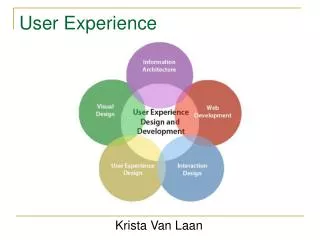
5 Key User Experience Concepts This is what you want to say: • 1. This is who we are • 2. This is where you are • 3. This is what you can find here • 4. This is how you can find it • 5. This is what makes us awesome
How can I make a better web experience for my customers? David Leggett, who writes for a popular user-experience blog, "UXbooth.com", states these things for starters: • SITE ID (make it clear to the visitor what your site will give them) • Page Name(never leave a user wondering where they are) • Navigation by Browsing(clear navigation menus, top, bottom, or side) • Navigation by Search(for those visitors who are looking for something specific) • Current Location(akin to what you see in many shopping carts, like "payment", "update address", etc) • Tagline / Site Description(almost like a motto or slogan, but more of a short description of what your site does) • Clear Visual Page Hierarchy(this is most effectively done with headers) • (http://www.uxbooth.com/blog/quick-usability-checklist/ )
How does yourcompare? • “Five Second Test” http://fivesecondtest.com • “Usability Checklist” http://www.uxbooth.com/blog/quick-usability-checklist • “E Commerce Gallery” http://ecommercegallery.com
Excellent eCommerce Sites • http://www.famouscookies.com/ • http://www.stickermule.com/ • http://www.pastebot.com/