Download
1 / 18
190 likes | 319 Vues
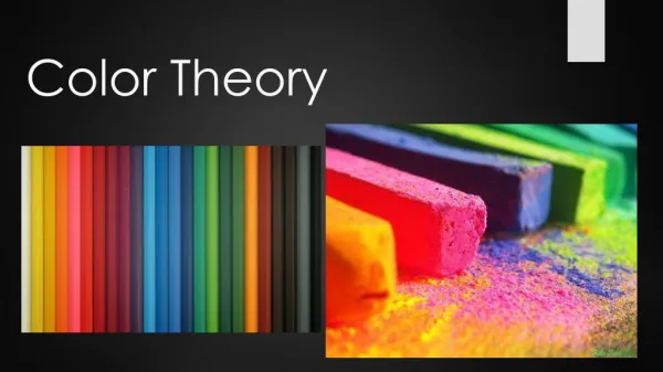
Intro to Color Theory. Color is possible because of the energy of the sun filters through the earth’s atmosphere. Light shining through a prism bends at different angles according to the wavelength. Different wavelengths produce the various colors of the visible spectrum.

E N D
Color is possible because of the energy of the sun filters through the earth’s atmosphere
Light shining through a prism bends at different angles according to the wavelength.
Different wavelengths produce the various colors of the visible spectrum.
“Additive color mixing” with light, uses the primaries of red, blue and green. The result of mixing all the additive primaries is white light.
In “subtractive color mixing”, with light absorbing materials such as paint, ink, dyes, pastels and colored pencil, the color that is seen is what bounces back to the eye. The result of combining 3 primaries (red, yellow and blue) in subtractive color mixing is dark gray or black.
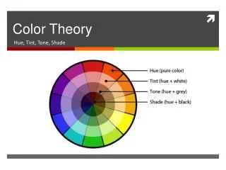
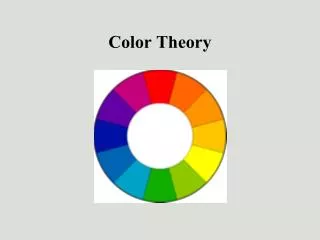
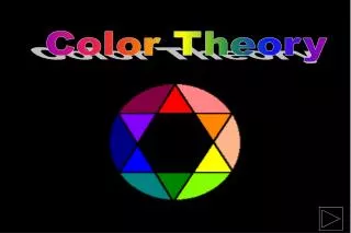
For hundreds of years, artists and scientists have been developing color theories to help explain the phenomena of how we see and arrive at given colors. From the largest ring, the inside hues plus white are “tints”. The outside hues on the points of the star have black added and are called “shades”.
The 12-step color wheel is generally accepted by artists as the model for understanding hue relationships. Fully saturated colors are on the outside ring of this diagram. The smaller rings show the hues mixed with neutral gray. The inner ring is the least saturated, or the dullest.
Primary colors are hues that cannot be mixed from other hues.
Secondary colors are made from mixing 2 of the primaries together.
Colors made by adding a primary to a secondary are called “tertiary”, meaning made up of three hues. Between yellow and green, there is yellow-green. Note the primary hue is listed first.
“Complementary colors” are located directly opposite each other on the color wheel. Any two colors opposite each other are referred to as complements.
Frantisek Kupka, Study in Yellow following the Theories of Chevreul, a French colorist and dye master who oversaw the dyeing of wool for tapestries and fabrics for royalty. • The yellow, orange and yellow-orange hues of the background are “analogous” – closely related because they are adjacent on the color wheel. • Notice how Kupka has used small amounts of light greens and red-purple tints to contrast and anchor the center of the composition. The blue-gray shadows draw attention to the face. Value contrast in addition to temperature shift.
Another analogous palette, with a cooler emphasis. This was one of my first textile design assignments, painted in ink on waxed rice paper.
Paul Klee, Fire at Evening, uses an isolated saturated warm red in a field of cool blues and greens, with just a few low saturation (Low key) reddish violets and red browns to unify the composition. • What feeling or mood do you get from this painting?
Helen Frankenthaler used pairs of near complements in Small’s Paradise. Blue/ tint of red-orange & red-orange/yellow green. • Organic, almost spontaneous, gestural shapes, in a very active, dynamic color scheme.
Jacob Lawrence uses similar hues, but less intense (saturated)- in “Going Home”. • Notice how the lightest tints and the blacks move the eye in diagonals, while the repeated green seats set up a horizontal rhythm. • What is the overall effect of this painting?