Download
1 / 12
120 likes | 267 Vues
In this evaluation, Lauren Toal shares her creative process in developing a school magazine tailored for the sixth form at St. Catherine’s College. Highlighting the importance of adhering to conventional layout styles, she emphasizes a professional aesthetic while infusing playful elements. The magazine features prominent sixth form students on the cover and incorporates engaging topics that resonate with its audience. Through the use of new technologies like Wordpress and Adobe Photoshop, Lauren learned to navigate the intricacies of digital publishing, aiming to attract and inform students, parents, and even teachers.

E N D
School Magazine Evaluation Lauren Toal
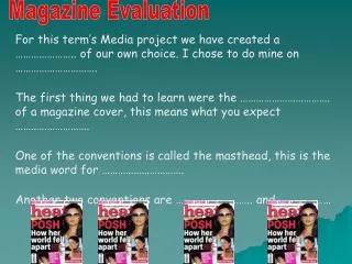
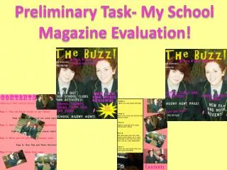
Cover Page Logo Masthead Puff Issue number and date Main Image Coverlines and blurb Image and subtitle
Contents Page Title Images relating to stories with number references Topics, blurb for each one and page numbers Reference box for images Enticement to read further
In what ways does your media product use, develop or challenge forms and conventions of real media products? • In order to keep my magazine looking somewhat professional, I tried sticking to the ‘conventional’ layout of my front cover, with the masthead in the top left and my issue number below. • I kept it neat and organised, with a box containing my contents on the left hand side, and the writing all of the same font and similar size. • I kept to the colour scheme of the school colours and didn’t go outside them, sticking to my house style of yellow, red and green with some white writing to make it stand out on the cover. • Within my Contents page I carried through the house style, but I overlapped my images on the contents page, giving an almost scrapbook and alternative fun feel, so that it made the magazine not look so rigid and neat, it had a playful side too.
How does your media product represent certain social groups? • Due to my media product being a school magazine for 6th forms, I wanted to represent that group. So, featured on my front cover are the two head girls of the school, who are from the sixth form. They are chosen to represent the school as a whole as well as sixth form, so seen them as the appropriate choice! The girls are wearing the sixth form shirt which is different from the rest of the school, so it shows along with the masthead that the magazine is tailored for 6th form reading mainly. • On my front cover, all the cover lines are 6th form related, with features about university choices and the upcoming 6th form formal. These are hot topics within 6th form so would encourage readers to pick up the magazine! • Even though it is mainly aimed at 6th forms, the bright and busy cover is interesting enough to attract teachers and parents alike!
What type of media institution might distribute your product? • As my magazine in a media product aimed at students of sixth form in St Catherine’s College, it would be the most ideal and practical distributor for the magazine. • However, a local news agent “Macaris” which is only a 5 minute walk from the school could also distribute the magazine as they receive a lot of student’s custom before and after the school day. • Another source may be the local paper “Armagh Gazette” which could sell the magazine once a month with their paper, delivering the magazine to news agents close to the students home.
Who would the audience be for your media product? • With it being a school magazine, it would be aimed at a school (St Catherine’s College) and with it being tailored for 6th form, it would be most suitable for that year group. • However, if a 5th year wished to read it to try and see what the 6th form experience would be like the following year for them, it would also be a suitable read for that year group. • Parents would also be able to read the magazine to get an insight into what school life is like for their children, and would be especially helpful in understanding school related subjects; in particular the UCAS and University form system.
How did you attract and address your audience? • I decided to keep my magazine a mixture of formal and informal addressing, with the majority being informal. Such things as “HUG- what could YOU bring to the project?” engages and reaches out to my audience as I am speaking to them, but then the likes of “New Head Girls, we speak to them exclusively inside!” is more of a formal addressing. • From my own experience of being in 6th form, the exclusivity and recognition of being the older part of the school is something enjoyable to experience, so by making a magazine tailored just to 6th form events and goings on and speaking directly to them, this adds to the exclusivity and experience.
What have you learned about technologies from the process of constructing this project? • In order to construct and complete my own school magazine, I had to incorporate new computer technologies that I had not used before. • The first one was the blog website “Wordpress” where I had to learn how to make my own page, and navigate around it. • Next was the online mind-map website “PREZI” where I learned how to use the new and modern form of an interactive spider diagram/mindmap. • After that was the use of “Adobe Photoshop” which I used to edit my pictures and create my magazine covers on. Personally, I found this programme the most complicated of them all to get used too.
Mastheads both at top left, in green writing Cover Page Comparison My cover contains a puff where as the other doesn’t School crest is featured on both Both contain coverlines along the left hand side Both contain smiling females in uniform, although mine has two *Mode of address is similar, both talking directly to their audience Strap line telling what else is inside, on this magazine and not mine A second image is featured on my cover, but not the other
Contents Page Comparison Titles both laid out on top Images both displayed on the right hand side Contents laid out along the left hand side * The colour schemes and house style of the two are contrasting, with my cover being bright and vibrant, and the other darker and slicker On my page however there is a reference box , this is not shared by the other Competition enticements written on the bottom of the page, positioned slightly different
The End