Download
1 / 47
470 likes | 487 Vues
This course provides an introduction to elementary methods for presenting biomedical and socio-demographic data, analyzing data, statistical inference, and data collection techniques. It emphasizes the application of statistical ideas and methods to biomedical data interpretation.

E N D
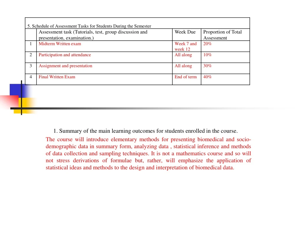
1. Summary of the main learning outcomes for students enrolled in the course. The course will introduce elementary methods for presenting biomedical and socio- demographic data in summary form, analyzing data , statistical inference and methods of data collection and sampling techniques. It is not a mathematics course and so will not stress derivations of formulae but, rather, will emphasize the application of statistical ideas and methods to the design and interpretation of biomedical data.
Numerical & graphical summarization of data • Dr. Omer Alhaj
Contents of the presentation: • Definition of Data • Types of Data • Graphical presentation of Data • Numerical presentation of Data • Measures of central tendency • Normal distribution curve
Data • Def.: it is the basic building blocks of statistics and refer to the individual values (Presented, Measured, Observed). • Types of data • Grouped versus ungrouped • Primary versus secondary (data sources) • Quantitative versus qualitative • Tools of data collection 1. Observation 2. Questionnaire 3. Interviews 4. Record analysis
Ungrouped versus grouped data Ungrouped data: • Presented or observed individually • ex.: List of weight for sex men: • 80, 70, 70, 70, 95, 95 kg Grouped data • Presented in groups consisting of identical data by frequency • See the table:
Sources of data • Census • Vital statistics report • International publication (WHO) data • Scientific journals data • Hospital and outpatient clinics data • Recorded data • Survey • Studies
Data presentation • Usefulness of data presentation: To organize and summarize raw data in easily comprehensible forms • Methods of data presentation: • Tabular • Diagrammatic • Numerical
I-Tabular presentation of data • It is a basic method in data presentation • Characteristics of good table 1. Simple 2. Self explanatory - Explaining abbreviation - Columns and rows labeled clearly - Unites of measures should be written - Title: should be clear and concise and separated from the head of the table. 3. Source of data should be written (data not original)
Types of table • Univariate table (simple frequency distribution table) • Bivariate table • Multivariate table Age distribution of the studied cases Age distribution of the studied cases by sex
II-Diagrammatic presentation of Data It includes presentation of data in the forms of: • Graphs. • Charts - A graph or chart is used to present facts in visual form. - Graphical representation of data is far more effective in conveying information than are tables of data.
Histogram (2) • Histogram composed of columns with no spaces between them, and it is suitable for presenting data that are continuous, measured in interval or ratio scales. • 2 axis (x axis “abscissa”, and y axis “ordinate”). The continuous data are presented on X and their frequency on Y. • Histogram is similar to bar chart; however the only difference is the presentation being that the bars of histogram are joined together. • The histogram evolved to meet the need for evaluating data that occurs at a certain frequency.
Frequency Polygon (1) • If we connect the midpoints of each class interval with straight lines, a frequency polygon is formed. • The frequency polygon describes the distribution of the data.
Scatter Diagram • Scatter graphs are widely used in science to present measurements of two (or more) variables (i.e., continuous) that are expected to be related; one variable is plotted on theY axis (dependent variable e.g. (Weight) & the other variable is plotted on theX axis (Height). The latter is said to be the independent variable. Results:If the pattern of plot: 1- tend to form a straight line THERE IS A RELATION (+ ve or – ve). 2- tend to form just a scatter point THERE IS NO A RELATION(as the figure below demonstrate). Scatter plots are useful for illustrating the relationship between continuous variables
Bar chart (1) • Bar chart is composed of columns, all of the same width and there are spaces between columns and this type is ideally suited for comparing categories of mutually exclusive discrete data. • A bar chart is similar to a histogram except that the bar chart has spaces between the bars whereas the bars in a histogram are contiguous. A bar chart should not be called a histogram because the bar chart illustrates categorical data and the histogram shows the distribution of continuous data
Bar chart (2) Types of Bar chart • Simple bar chart • Component or segmented bar chart it is a bar chart in which the bars are divided into portions which are either colored or shaded to denote their classifications 3. Grouped bar chart
Freq. dist. Of Ch. Dis. In 3 governorates (Component bar Chart)
Freq. dist. Of Ch. Dis. In 3 governorates (grouped bar Chart)
Pie Chart (1) • It should be used only where the values have a constant sum(usually 100%). • It should be used where the individual values show significant variations; a pie chart of equal values is of no use. • It should be used when the number of categories (`slices') is reasonably small; as a rule of thumb the number of categories should be normally between 3 and 10. • It can be used to display quantitative (discrete data) & qualitative ( categorical) data.
III. Numerical presentation of data A- MEASURE OF CENTRAL TENDENCY MEAN MEDIAN AND MODE B- Measure Of Dispersion (= Variability) Range Variance And SD Mean Deviation Co-efficient of variation
MEASURE OF CENTRAL TENDENCY MODE (1) - Mode is defined as the most frequently occurring number in a distribution. - The advantage of the mode as a measure of central tendency is that its meaning is obvious. - Further, it is the only measure of central tendency that can be used with nominal data.
MEASURE OF CENTRAL TENDENCY MODE (2) *Example: ex.1(23, 34, 35, 36, 36, 37, 40, 45, 50) Mode = 36 ex.2(4, 10, 10, 15, 18, 20, 20, 24, 26) Modes = 10 and 20 (bimodal) ex.3(44, 47, 50, 56, 58, 60, 65, 75) Mode = 0
Mode (4) Advantages • Quick and easy to calculate • Unaffected by extreme values Disadvantages • May not be representative of the whole sample as they do not use all values • Seldom gives statistical significance
MEASURE OF CENTRAL TENDENCY Median (1) Median: it is the central value which divide the data into 2 equal parts after data arrangement in descending or ascending manner). i.e., it is the value that divides a series of observations into 2 equal halves when all observations are listed from lowest to highest or from highest to lowest. • In odd numbered series, Median = (n+1)/2 . • In even numbered series, Median = n/2, n/2 +1
MEASURE OF CENTRAL TENDENCY Median (2) Characteristics of Median: • The median is less sensitive to extreme scores than the mean and this makes it a better measure than the mean for highly skewed distributions. • Used mainly in survival analysis
MEASURE OF CENTRAL TENDENCY Median (3) Examples: “ Do not forget to rearrange the data, if any” ex.1 (odd series)(2,4, 5, 7, 8, 10, 11) Median = 7+1÷2 = 4 (i.e. observation No. 4) 7 ex.2 (even series)(2,4, 5, 7, 8, 10, 11,12) Median = 8+1÷2 = 4.5 (i.e. observation No. 4&5) 7+8 ÷2 = 7.5 ex.3 (7,11, 5, 2, 8, 10, 4) Re-arrangement (2,4, 5, 7, 8, 10, 11) Median = 7
Median: Advantages • Fairly easy to calculate and always exist • Relatively easy to interpret - half of the sample (normally) lies above/below the median • Is not affected by extreme data values • Used when distribution of data is skewed • Does not include values of observations, only their ranks • Can be used with ordinal observations because calculation does not use actual vales of the observations • Do not need a complete data set to calculate the rank
Median: Disadvantages • Manually tedious to find for a large sample which is not in order (Requires ordering) • Does not utilize all data values
MEASURE OF CENTRAL TENDENCY Mean (1) Mean is: the most common and a useful measure to describe the central tendency or arithmetic average of a distribution of values for any group of individuals, objects or events. Def.: It can be defined as the sum of values of a series of observations divided by the number of observations.
MEASURE OF CENTRAL TENDENCY Mean (2) • Calculation and examples - Ungrouped data: 5, 8, 12, 15, 40 Mean = 80 ÷5 = 16 2, 4, 6, 8, 10 Mean = 30 ÷5 = 6 - Grouped data: Mean X = ∑ xi / n Mean X = ∑ Fj xj / n
Mean (grouped data) (3) X = ∑ Fj xj / n = 1850 /30 = 61.67
Mean: Advantages • It is familiar to most people • It reflects the inclusion of every item in the data set • Utilize all values • It always exists • It is unique • It is easily used with other statistical measurements • The mean is the center of gravity of the data and, easy to understand and to calculate • Distribution is determine symmetrical • Important for statistical analyses and its applications
Mean: Disadvantages • It can be affected by extreme values in the data set, called outliers, and therefore be biased • Loss of accuracy when the distribution is skewed • Including or excluding a data (number) will change the mean • Manually, more tedious to calculate
The Normal Distribution Curve (Gaussian curve) (1) Definition: It is a mathematical model which describes adequately many types of measurement in medicine.
The Normal Distribution Curve (Gaussian curve) Idea: • When scientists first began constructing histograms, a particular shape occurred so often that people began to expect it. Hence, it was given the name normal distribution. • The normal distribution is symmetric (you can fold it in half and the two halves will match) and unimodal (single peaked). • It is what psychologists call the bell- shaped curve.