Color
Color. Color. More & more internet surfers use high quality monitors As a result, color & graphics are becoming increasingly important to Web page design Color use can be a highly subjective. What is Color?. Hue (color) – spectral wavelength composition of a color

Color
E N D
Presentation Transcript
Color • More & more internet surfers use high quality monitors • As a result, color & graphics are becoming increasingly important to Web page design • Color use can be a highly subjective
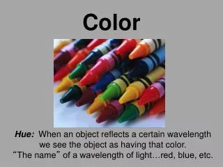
What is Color? • Hue (color) – spectral wavelength composition of a color • Value (intensity) – relative lightness or darkness • Chroma (Saturation) – purity of a color from gray to the most vivid color
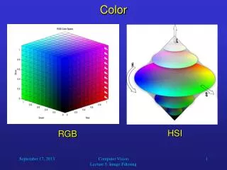
Monitors • A pixel color is a combination of red, blue, and green • RGB values typically 0 – 255, which means 2553 possible colors • 16,777,216
Color Harmony • Implies a color scene is neither boring nor chaotic • people respond well to the harmonious use of color • creates an inner sense of order & visual balance • Techniques for color harmony: • don’t use too many colors (overwhelming) • Use no more than 4 or 5 colors • don’t use too few (boring) • use proper color contrast • Be conservative in your use of color • Design for monochrome first
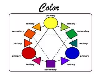
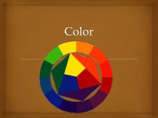
Contrast & the Color Wheel • For good contrast: • select colors on opposite sides of the color wheel • color complement • Other contrasts: • by saturation • cool-warm contrast
Color Selection • Use bright colors to emphasize or draw attention • Use contrasting colors to emphasize separation • opposite on color wheel • different saturation • Use similar colors to convey similarity • themes for a site • near each other on color wheel • Warm colors indicate that action is necessary and force attention • Red, orange, yellow • Cool colors to provide status and sometimes background • Green, blue, violet, purple • Pastels for background colors • Be consistent with other color meanings • Yellow – caution • Red – stop • Green - OK
Refocus Issues • Too many colors in a page require refocusing of the eye, resulting in fatigue • Proper choice of colors enhance readability, poor choices result in fatigue • Pure or saturated colors require more refocusing than unsaturated colors • Older surfers have decreased sensitivity to blue • A clear image requires differences in brightness between adjacent objects
Web Page Color Implications • If different parts of the screen are attended to separately, color the parts differently • If screen searching is performed to locate information, color code these items for contrast • If a sequence of information is ordered, color code the sequence • ROYGBIV • If information on a screen is crowded, use color to provide visual groupings
Text • Text in color is not as visible as in B/W • Text in color is not as visible as in B/W • Maintain legibility of color text by increasing the font size or make bold Note this font is not bold Note this font is bold