Brief 3 Website analysis
Brief 3 Website analysis. Brief 3. Brief 3. Essay 2. Website create on: www.weebly.com weebly tutorial: http://help.weebly.com/beginners-guide.html. Examples of students’ websites 2012. http://laurasiwrite.weebly.com/ www.stianiwrite.weebly.com www.severedthumbs.weebly.com

Brief 3 Website analysis
E N D
Presentation Transcript
Brief 3 Website analysis
Brief 3 Brief 3 • Essay 2. Website create on: www.weebly.com weebly tutorial: http://help.weebly.com/beginners-guide.html
Examples of students’ websites 2012 http://laurasiwrite.weebly.com/ www.stianiwrite.weebly.com www.severedthumbs.weebly.com http://captainheeneyssplendtacularwebsi.weebly.com/
THE ESSAY Analysis of a website: an image-text essay Example essays http://iwrite2011.weebly.com/uploads/4/6/3/2/4632467/imagetextexample.pdf www.stianiwrite.weebly.com http://abouttogoham.weebly.com/
The academic essay • Organisation of information • Vocabulary • Sentence structure ( passive, nominalisation etc) • Tentative language • Substantiation of claims (in-text referencing) • Reference list (APA)
Analysis vs description • “Your essay contains a high proportion of description as opposed to analysis.” • “Your essay is not an analysis as such. It is a description of various parts of the site.”
References AUT Online: https://autonline.aut.ac.nz/webapps/portal/frameset.jsp?tab_tab_group_id=_2_1&url=%2Fwebapps%2Fblackboard%2Fexecute%2Flauncher%3Ftype%3DCourse%26id%3D69811%26url%3D Nielson, J. (2007), Writing for the web: Research on how users read on the web and how authors should write their web pages. Retrieved26 June, 2007 from: http://www.useit.com/papers/webwriting/ Warnick, B. (2006). Rhetoric on the web. InP. Messaris and L. Humphreys (Eds.), Digital media; Transformations in human communication, (pp. 139 -146) New York, NY: Lang. Wysocki, A. F.(2004). The multiple media of texts: How onscreen and paper texts incorporate words, images and other media. In C. Bazerman and P. Prior,(Eds.) What writing does and how it does it: An introduction to analyzingtexts and textual practices, pp. 123 -163, Mahwah, NJ: Lawrence Erlbaum. Also : Common Visual Design Elements of Weblogs by Scheidt and Wright http://blog.lib.umn.edu/blogosphere/common_visual.html
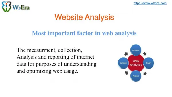
Multi-modal texts • In the twenty-first century, multimodal texts are in the ascendancy and visual communication has become a core component of the world of work and of our lives in general. • Newspapers contain photographs, diagrams and changes of typeface. Company letterheads are carefully designed, including the choice of graphics and colour of the paper to craft the company’s image. We now take it for granted that an electronic text, such as a page on the web, will use more than one of the language modes. • Therefore the literate citizen must develop a knowledge of visual codes, … in order to interpret written information. EDUC6751 Knowledge and Communication Technologies
Categories for analysis • Genre • Typeface • Textual structure • Sound • Visuals
Genre The visual presentation of a page or screen gives you an immediate sense of its genre.
Genre: 2 The genre of the big sports websites IAAF FIFA NFL NBA IRB IFNA ITF
Typeface style / size / font etc
Textual structure: 2 • Web authors are ‘advised to write for easy scanning, because web readers do not read word for word’. • Conciseness - content is expressed in ‘chunks’ or independent nodules • Discouraged from inserting outlinks - the goal of commercial web design is to create ‘stickiness’ • Liberal use of white space. Warnick, B. (2006). Rhetoric on the web.(pp. 141-142).
Textual structure: 3 • Users won’t read your text thoroughly • The first two paragraphs must state the most important information • Start subheadings, paragraphs, and bullet points with information carrying words http://www.useit.com/papers/webwriting/
Visuals Visuals • Shapes • Colour • Photos / drawing / paintings • Charts & graphs • Videos / animations
Visual literacy • Visual literacy is the ability to interpret, negotiate, and make meaning from information presented in the form of an image. • Visual literacy is based on the idea that images can be “read” and that meaning can be communicated through such reading. EDUC6751 Knowledge and Communication Technologies
Visuals : shapes buttons, highlights,outlines, borders, etc
Visuals: video / animation http://www.unicef.org/ http://news.armani.com/en/giorgioarmani/framesoflife/#presenting/nina
Essay: Analysis of typeface : example www.aut.ac.nz
The use of typeface For most of the informational text the AUT homepage uses a sans serif font, either Ariel or Verdana. According to Wysocki (2004), the use of typeface is “a major visual strategy for a text’s composers” (p.127), and can provide insights into the way a writer wants to relate to a reader. The predominant use of sans serif font suggests the desire for a contemporary, technological image, such fonts having been developed to represent the modern rational industrial world (Wysocki 2004). A desire to be seen as innovative and contemporary is reflected by AUT’s recent adoption of a U.S. college font for its logo, rather than the traditional crest of a
European university. However, the colours used and the overall regularity oftypeface suggest a conservative dimension to the webpage. Wysocki (2004) observes thatblack on a white page is traditionally associated with academic or more formal writing, as is the overall use of only one or two typefaces in a text. Therefore, while the AUT website visually conveys a modern sensibility, supported by the words contemporary, unique, and innovative in its introductory statement, the largely white background and regularity of typeface in black, white or grey, Wysocki (2004) would assert, also conveys the underlying conservatism of the institution.
Week 9 • Set up your website • Email url to studio lecturer • Choose a site to analyse: pick a genre you are familiar with pick a website that offers plenty of scope for analysis