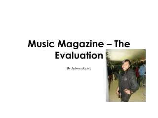
Music Magazine M edia Evaluation
180 likes | 301 Vues
This magazine evaluation explores the evolution of a music product, highlighting its creative use of traditional conventions and modern design elements. The cover embraces strong visual impact through eye contact, strategic font choices, and a bold color scheme, effectively capturing the target audience aged 17-24. The content pages juxtapose simplicity with vibrant colors, while the double-page spread employs varied imagery and engaging layouts. By integrating elements of established rock magazines like NME and IPC Media's distribution strategies, this product seeks to challenge conventions while appealing to a diverse readership.

Music Magazine M edia Evaluation
E N D
Presentation Transcript
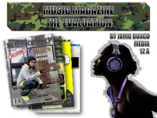
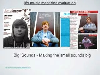
In what way does your media product use, develop or challenge forms and conventions of real media products? The eyebrow The image has eye contact. Mast head Prizes given Cover lines It is a medium shot Main image Barcode includes the date and prize. Main cover line.
Review title Titles contents News title Images making the page more interesting and also giving you sneak peaks of what is going to be in the magazine. Features title Text giving you clues what will be in the magazine Page number in the corner of the page
Used a similar tone of colour. Making this DPS not too colourful to look at Title includes different colour and different font making it interesting for the reader. Two columns which makes it neat and not busy to look at Text on the second page Main image. Large and attractive. Page number pull out quote stands out from the rest of the text attracting readers attention. Header/footer. Giving you details if you need more information Smaller image giving more of a variety to look at
To develop my products. I had to think about what kind of font, colour and how everything would be displayed. Since my magazine was of a rock genre I had to research rock magazines and what kind of codes and conventions they used. This helped and influenced me to create my music magazine, by using similar codes and conventions of a rock magazine. I also analyzed magazines and how they displayed and arranged everything. This all lead to me creating my own magazine • my magazine was mainly influenced by NME magazines. I liked how they used red as there title. They also use black and white and a colour scheme. NME’s main cover line are mostly large and bold in the centre.
Challenge • On my cover page I have used mostly all the conventions of a magazine. The conventions I have challenged is my masthead. Most mastheads are bold and big. Mine is not bold, but it is big enough that it stands out. Also the colour red has a great contrast from the background making it stand out more. So even though its not bold I still think my masthead is effective and would attract lots of readers. • In my contents page I have made it simple and clear but I have made my colour scheme too colourful and bold. you would normally not see this in a contents page. A contents page is normally very simple with light colours. Even though mine is not like that. I think the contrast between the colours is more exciting . The arrangement of the page is fun and interesting with a few image to look at. I have not used any quotes, even though it’s a conventions I didn’t think it was necessary, since I had more then enough information on this page. • In my DPS I have used all the main conventions such as using a main image but also adding smaller images giving more of a variety for the readers to look at, I also used header and footer. Overall I don’t think I have challenged any conventions on this page.
How does your media product represent particular social group? My magazine’s audience is from the age 17-24. this is showed throughout my cover, contents page and double page spread. In my cover page I have used simple fonts making it seem more formal and readable for my older readers. The red colour I have used gives it a hint its more informal and will catch the attentions of my younger readers. My model is in the centre of the page. The has her hands on her hip and eye contacts, with a faint smile on her face. She is dressed in black and has a serene look to her face. The model is also pretty which will attract my male readers, maybe even my female who would want to look like her. This image is simple but effective and would attract all my readers.
On my contents page its more fun and lively for my younger readers. The colours and fonts are more bold and bright. My stories and featured would attract my older readers to read on the images in my contents page would appeal to all my readers for the fashion and how they are presented.
In my double page spread I have used a brown tone. On my title I have used 4 different colours and 3 different fonts, this Makes it more interesting to look at. My double page spread would appeal to all my readers both male and female. It is not girly and not manly either which is perfect for the two genders
What kind of media institution might distribute your media product and why? IPC Media produces over 60 iconic media brands, with print alone reaching almost two thirds of UK women and 42% of UK men – almost 26 million UK adults – while our websites collectively reach over 20 million users every month. IPC's diverse print and digital portfolio offers something for everyone, with a focus on three core audiences: men, mass market women and upmarket women. Bauer Media reaches over nineteen million UK adults across multiple media channels. We have more than eighty influential media brands spanning a wide range of interests, including heat, GRAZIA, Closer, MCN, FHM, Parkers, MATCH, Magic 105.4, Kiss 100,Kerrang and 4Music. Our business is built on millions of personal relationships with engaged readers and listeners. We connect audiences with compelling content, whenever, wherever, and however they want.
I think Bauer would be the most suitable media institute to distribute my rock magazine. I picked Bauer because it is one of the largest distributional institutes and also Bauer seems to produce more rock magazines then other institutions. This means they have had more experiences with the rock genre and will have more of a success distributing my rock magazine.
Who would be the audience for your media product? • My audience for my magazine is aged from 17-24. They are passionate about rock music and loves to catch up with the latest updates and news. My magazine will influence my readers on how they look and what kind of music they will listen to. RokkMusika also features all music artists. • My magazine in not formal but it is still in good English which is easy to understand, but is also intelligent vocabulary for my older readers. • The price of my magazine is £2.80. This is a very reasonable price to pay. Its not too cheap so you wouldn't think the magazine is of a bad quality and it also not too expensive so my readers of a lower class so they can afford it.
How did you attract/address your audience My magazine is new and exciting. I features all rock music artists and including new fresh ones people have not heard before. The rocky feel of the magazine will attracted readers. The layout of the front cover is exciting and the masthead RokkMusika says it all. I use colours suitable for a rock lovers such has reds, blacks and mainly dark colours with is still attractive. Bold colours Eye contact Mid shot of the model Interesting storylines Attractive model Big masthead
The articles and stories included are easy to understand and straight to the point. Rokkmusika has biographies, features, DPS’s, and other things which would attract a rock music fan. The images I have used are strong and eye catching, this entices readers to want to know more about them and read on. Also one of my models look like evanescence a very popular rock band, which attract readers since she is attractive. This magazine also looks of a good quality. I have used lots of different colours and font texts.
What have you learnt about technologies from the process of constructing Creating my product, I used many software's to complete it and make it look good. Slide share is a website where you can upload your work from the programme PowerPoint. After doing this you can then share you work on to any other website/blog. I found this really easy to do and useful for next time. On Photoshop, this is where I did all my image editing. Photoshop was confusing but as you got use to it, it was easier to understand. I learnt a lot from Photoshop such has how to add special effects and using the tool bar all to make the image more appealing. Word press is a blog where we uploaded all our work we did for this project. I found this website quite easy to understand. I learnt what a blog is and how you upload things on to your blog. Word press was the second most thing I used in this project
In design was the main programme I used most out of this whole project. I didn’t know anything about this programme, so to begin with I found it really complicated to use, but as I got use to it I learnt tricks and started to enjoy making my product. On In Design I created my cover page, contents and double page spread. Using this, I learnt how to position things to make it look good. I have also learnt the meaning of layers and how you can add effects on it. Overall I found in design fun and I feel now I understand it. I used power point when I did my research. Using power point was very easy since I had used it before. PowerPoint made my work look better and was presented better.
Looking back at your preliminary task, what do you feel you have learnt in the progression from it to the full product
As you can see there is a big difference from my preliminary exercise to my real one. During the process of creating my design I have learnt about all the conventions of a magazine which I did not know in the beginning. I now know how to layout a cover page, contents and a PDS also what need to be on those pages. • In my preliminary exercises I did not know how to use all the software's properly. This exercise was for us to get use to the software. Now I feel I know around all the programmes and software's we have used. • The images I used I had to think about how they were going to be interpreted into my magazine. I had to slot a time to take pictures. • Overall I think my magazine has turned out really well. I have learnt a lot from doing all of this and hope it will help me for future reference.