Graphs
Learn about the three essential types of graphs: bar, line, and circle graphs. Bar graphs use vertical or horizontal bars to compare amounts of numerical data, ensuring consistent bar width and appropriate scales. Line graphs showcase changes over time with connected points representing data items. Circle graphs illustrate percentages of a whole, with each wedge representing a portion of the 100%. Master these graph types to effectively present and analyze data in various contexts.

Graphs
E N D
Presentation Transcript
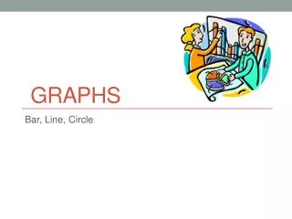
Graphs Bar, Line, Circle
Bar Graph • A bar graph uses vertical or horizontal bars to display numerical information. • Bar graphs can be used to compare amounts. • Choose an appropriate scale (with regular intervals). • The bars should have the same width.
Line Graph • A line graph uses a series of line segments to show changes in data over time. • Plot a point for each data item, and then connect the dots with straight line segments.
A circle graph is a graph of percentages where the entire circle represents the whole (100%). Each wedge represents a percentage of the whole. Circle Graph
Example: 10%, 40%, 50% Start with 50%. 50% = ½ Now look at 40%. 40% will be almost all of the top half. 40% 10% The remainder is labeled with 10%. 50%