Big Data & Visualization
Big Data & Visualization. What is Big Data?. Massive amounts of data too big to read through and sometimes to store Exabytes of data – 1 Billion Gigabytes Usually can’t use traditional software tools (databases) to organize and process it

Big Data & Visualization
E N D
Presentation Transcript
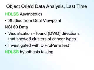
What is Big Data? • Massive amounts of data too big to read through and sometimes to store • Exabytes of data – 1 Billion Gigabytes • Usually can’t use traditional software tools (databases) to organize and process it • Programs are written to look for patterns, trends, statistics • Must be able to capture, store, search, analyze, share, and visualize it
How to Visualize it • Make simple charts of the statistics about the data • Frequency, sums, affinity, etc. • Create cool ways to present that add value and beauty • Size, color, relationships • The visualization should allow people to draw inferences and ask questions
Examples • http://www.theregister.co.uk/2012/04/26/data_visualization/ • http://mashable.com/2012/12/11/data-visualization-jer-thorp/ • http://www.chronozoomproject.org/#/t55 • http://scaleofuniverse.com/ • http://tweetping.net • http://www.guardian.co.uk/news/datablog/interactive/2013/jan/21/presidential-inauguration-speeches-obama-compared • http://visual.ly/our-future-demands-stem • Wordle • Tableau • Google+ ripples • Visual.ly • “Data Visualization” in google images
Assignment • Come up with a cool way to represent one of these subjects in groups of 2-3: • Student texting use • SnapChat use • Tweets about a subject/event • Statistics about crime, poverty, etc. • Tie it into another class you’re taking/subject you’re investigating/book • Think about 2-3 measures • Number of items/things • Content – words/subjects • Time of day, or year, or minutes (i.e., in classrooms) • Info about users (sex, age, • Doesn’t matter what the specific numbers are, so make them up if you need to, but make them realistic • Look online for examples of visualizations • The graph may show two measures, then think of a cool way to add the 3rd one


