Download
1 / 9
130 likes | 316 Vues
A BRIEF HISTORY OF SYMBOLS, MARKS, LOGOS, TRADEMARKS AND CORPORATE IDENTITY. TIMELINE. 35,000 -15,000 BC First use of symbols Pictographs on walls and caves in France and Spain. 4500 -3500 BC First exact reproduction of images

E N D
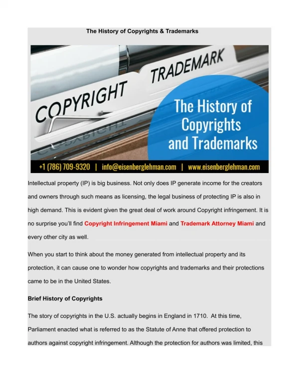
A BRIEF HISTORY OF SYMBOLS, MARKS, LOGOS, TRADEMARKS AND CORPORATE IDENTITY
TIMELINE 35,000 -15,000 BC • First use of symbols • Pictographs on walls and caves in France and Spain. 4500 -3500 BC • First exact reproduction of images • Stamp seals, carved from metal or stones, and were used to impress ownership on clay. • Cylinder sear -when rolled across clay created a repetitive pattern Trademarks and Symbols • Trademarks and symbols used in commerce before the time of Christ to serve two reasons: 1. For recognition and to single out their products from the competition. 2. For identification, so medieval authorities could trace the product to its maker for recognition or punishment.
Present Day Trademarks • The industrial revolution • The introduction of packaging • The brand-name advertising: A mark was needed to assist customers in picking out a widely advertised product from a shelf crowded with competitors' products. Corporate Identity • The concept of visual coherence dates back to early guilds (weavers, metal smiths, etc.) • Professional designers have worked with identity in this country since 1920's • But with distinction only since the end of WW2.
Mark. • Graphic designers have a professional responsibility to be well versed in the spectrum of marks available for solving visual problems. Many classifications systems exist, developed by graphic designers, anthropologists, and psychologists. Most have positive attributes, but taken together they can lead to confusion and redundancy. A few basic terms can effectively classify marks and form a logical working language for designer, client, and printer.
Mark. 1. Symbols– marks without type used to identify a corporation, agency or institution. Can be legally protected. • Advantages: Unique, simple gestalt. Quick impact • Disadvantages: Costly to promote, explain. Confusion with other symbols. 2. Pictographs Public symbols. Used to cross language barriers for direction, safety, transportation. Use encouraged by all. • Advantages: Substitute for words. International • Disadvantages: Confusion with corporate marks. Cultural confusion. 3. Lettermarks– Letters from name in type used to identify company, often to shorten long name, not pronounceable. • Advantages: Letterforms readable. Abbreviated name. • Disadvantages: Costly to promote. 4. Logos– Words or words in type that identify company, brand, project, group. Pronounceable. Can be legally protected. • Advantages: Phonic, unique, easier to promote • Disadvantages: Complex gestalt
Symbols CBS by W. Golden, New York, N.Y. Abstract eye, promoted very heavily since about 1951. Extremely high recognition because of exposure frequency. One of the best known marks in U.S. Wool mark by Francesco Saroglia, Italy. Since 1964 has become one of the world’s most familiar symbols. Abstracted skein of yarn, space, flow, optical strength. Canadian Broadcast Corporation by Burton Kramer, Toronto – High degree of abstraction. Bold cap C fragments like a sound wave. Bold, dynamic, and promoted heavily. Positive direction.
Symbols Traits of “good symbols” useful for ideation, development, and analysis. 1. POSITIVE ASSOCIATON -Symbol should show the image of a company or product in -best-or favourable light. 2. EASY IDEntification-Symbol should quickly and readily be recognized, remembered, and recalled. 3. “Close GESTALT" -Think of your closed hand or fist as a closed Gestalt. When you open it up your fingers point outward and create an open shape. Flow should be internal rather than external. 4. The perfect circle has ideal gestalt. It serves as a magnet for the eye 4. ABSTRACTION LEVEL -Symbol must hit the appropriate understanding level of the intended audience. Very abstract marks are costly to promote and make understood. Beware! Photographic marks, illustration marks and logos generally function as the best communication elements. 5. REDUCTION -Symbols should be designed to reduce in size effectively to ½ “in diameter. Even smaller would be better. Be careful that the symbol.
LOGOS • Logos are marks which consist of pronounceable words. They are most often a single word such as “Ford”, “Coca Cola”, or “Exxon”. They make excellent identity devices because they are related to visual and phonic codes with which we are familiar, unlike abstract symbols. Logos must be carefully researched to insure that they are cross-culturally effective, understandable, and, most critically, inoffensive. Ideally they are one word, the shorter the better. • Traits of “good logos” are similar to those of “good symbols”. In addition, the designer must consider how the logo sounds and how letterforms relate to each other (since each letter is in itself a symbol). TRACINGS -Most successful logos are derived from the thousands of existing typefaces. On tissue or bond paper trace alternative logos from type specimen books. Outline with a 2H pencil, fill with a very soft black pencil to a total blackness. Always list type name and specimen page number for future reference. This allows you to see how your logo will look in many typestyles. Stay small and fast! REFINEMENTS -Overlay tracings first in soft pencil then in black marker. This allows you to explore the ligatures, distortions, case variations, and swashes that make the logo truly unique. PRESENTATION -Present as you would a symbol. Absolutely precise. Draw with drafting instruments.
Logos Case Implements by Lippincott & Margulies, Inc. N.Y. created for a producer of heavy equipment, tractors, loaders. Strong masculine, industrial shapes. Letters formed from negative shapes. Effective for stencil applications. Public Broadcasting Service by Ernie Smith, N.Y. – Technically a lettermark but has phonic quality. Hand drawn letters use same size circles as counter shapes. Human quality by the contour shape of the P. one of the best known marks in the country. Dansk by Alan Peckolick, N.Y. for Danish producer of quality house wares. Geometric letter. Forms reflect precision, attention to detail. Compact gestalt through tight fitting and overlapping.