1 / 39
430 likes | 716 Vues
A logo is often a company's first impression, one that can impact a customer's brand perception, purchase decisions and overall attitude towards a product.<br>Visit our website:-<br>https://www.admecindia.co.in/

E N D
A Workshop on Designing Logos and Corporate Stationery A Presentation by ADMEC Multimedia Institute
What is a Logo? A logo is often a company's first impression, one that can impact a customer's brand perception, purchase decisions and overall attitude towards a product. We live in a society painted with brand logos. Even toddlers who can't yet tie their own shoelaces recognize many logos or are able to deduce what a company sells just by looking at its brandmark.
Types of Logos We need different types of approaches to design a logo, especially for small to medium businesses. Types of Logos: 1. Abstract 4. Descriptive 7. Woodmark 2. Emblematic 5. Illustrative 3. Letterform 6. Typographic
1. The Abstract Logos This type of logo is like an abstract idea which does not contain any specific idea in your brain. contains a non-descriptive message with a particular graphic image. Usually it Usually, this kind of abstract logos are good to convey a generic idea uniquely. It is also good feelings in a deep way rather than the facts. to express
2. The Emblematic Logos This type of logos consist of an emblem symbol with the brand name and pictorial elements. Here, there will be no difference between the emblem and the words. The text and the icon become one. The peculiar difference comes when using this kind of logos especially in small sizes because the name and the detail may become invisible and very difficult to read. This kind of logos are especially good to convey the value of protection. Further, they are also recommended for package designs and entertainment teams.
3. The Letterform Logos This kind of logos are usually designed by using acronyms or one or more letters from the brand name, product name or business name. As a result, the combination of two or three letters become a symbol and gives peerless design which acts as a “focal point” for your product name. This Letterform logos are usually good for fortifying the acronym or initials of the product and brand.
4. The Descriptive Logos Descriptive logos mention the name, benefits or character of a brand indirectly with a clear image. It is usually good for brand recognition proceeding with a very specific message or feeling of trust when interacting with a brand or product.
5. The Illustrative Logos The illustrative logos are designed with special drawings and characters. They are very good to express a great deal about the brand/product or business. They are designed by taking into consideration the overall visual identity of the business or product.
6. The Typographic Logos This type of logo does not use any special characters or symbols. It needs only letters or words to design an image. It is very simple yet very effective. Typographic logos are good to start up a business and labels.
7. The Wordmark Logos It uses the brand, business or product name as a root for logo design.The typography logo can be designed first either from the “scratch” or from the commercial font. After that, images can be added into the typography logo. It will definitely give a great look and feel. The Wordmark logos are good to create a “mental picture” of a business.
Establish Your Own Design Process 1. Brief 2. Research 3. Reference 4. Sketching & Conceptualization 5. Reflection 6. Revisions 7. Presentation 8. Delivery 9. Support
Establish Your Own Design Process Every designer has his or her own process, and it is rarely linear, but in general this is how the branding process is completed, which can be used as a guide to establish your own. Design brief: Conduct a questionnaire or interview with the client to get the design brief. Research: Conduct research focused on the industry itself, its history, and its competitors. Reference: Conduct research into logo designs that have been successful and current styles and trends that are related to the design brief.
Establish Your Own Design Process Sketching and conceptualizing: Develop the logo concepts around the brief and research. Reflection: Take breaks throughout the design process. This allows your ideas to mature and lets you get renewed enthusiasm. Receive feedback. Presentation: Choose to present only few selected logos to the client or a whole collection. Get feedback and repeat until completed.
5 Principles of Logo Design What makes a good logo? A good logo is distinctive, appropriate, practical, graphic, simple in form and conveys an intended message. There are five principles that you should follow to ensure that this is so… An effective logo is: ●Simple ●Memorable ●Timeless ●Versatile ●Appropriate
1. Simple A simple logo design allows for easy recognition and allows the logo to be memorable. Good logos feature something unique without being overdrawn.
2. Memorable Following closely behind the principle of simplicity, is that of memorability. An effective logo design should be memorable and this is achieved by having a simple, yet, appropriate logo.
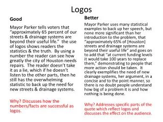
3. Timeless An effective logo should be timeless – that is, it will endure the ages. Will the logo still be effective in 10, 20, 50 years? Probably the best example of a timeless logo is the Coca- Cola logo… if you compare it to the Pepsi logo below, you can see just how effective creating a timeless logo can be. Notice how the Coca Cola logo has barely changed since 1885? That is timeless design.
4. Versatile An effective logo should be able to work across a variety of mediums and applications. The logo should be functional. For this reason a logo should be designed in vector format, to ensure that it can be scaled to any size. The logo should be able to work both in horizontal and vertical formats. Ask yourself; is a logo still effective if: ● Printed in one color? ● Printed on the something the size of a postage stamp? ● Printed on something as large as a billboard? ● Printed in reverse (i.e. light logo on dark background)
5. Appropriate How you position the logo should be appropriate for its intended purpose. For example, if you are designing a logo for children toys store, it would be appropriate to use a childish font & color scheme. This would not be so appropriate for a law firm. It is also important to state that a logo doesn’t need to show what a business sells or offers as a service i.e. car logos don’t need to show cars, computer logos don’t need to show computers. The Harley Davidson logo isn’t a motorcycle, nor is the Nokia logo a mobile phone. A logo is purely for identification.
Branding, Identity & Logo Design Explained
A logo is not your brand, nor is it your identity. Logo design, identity design and branding all have different roles, that together, form a perceived image for a business or product. What is brand? – The perceived emotional corporate image as a whole. What is identity? – The visual aspects that form part of the overall brand. What is a logo? – A logo identifies a business in its simplest form via the use of a mark or icon.
Logo Design Mistakes to Avoid 1. Typography Typography in logo design can make or break a design, so it’s vital you know your typographic ABC‘s. A logo should be kept as simple as possible while still portraying the intended message, and for this to happen, one must consider all typographic aspects of the design. Don’t use too many fonts or weights (two maximum). Don’t use predictable, crazy, or ultra thin fonts. Pay close attention to kerning, spacing, and sizing and most importantly, ensure you’ve chosen the right font(s) for the project.
2. Too complex, too abstract Simple logos are more memorable as they allow for easier recognition; however, for a logo to be memorable and stand apart from the crowd, it must have something unique about it, without being too overdrawn. Not only does simplicity make a logo more memorable, but it also makes the logo more versatile, meaning it can work over more mediums. For example, a logo should work on something the size of a postage stamp and on something as large as a billboard.
3. Relying on special effects or color If a logo requires color or special effects to make it a strong logo, it’s not a strong logo. To get around this, work in black and white first and then add the special effects or color later. This allows you to focus on the shape and concept rather than the special effects. Don’t use drop shadows, embossing, or other layer styles to gloss up logos — a good logo will stand on its own. You can also make different variations of a logo to ensure it works in colour or grey scale.
4. Using raster images A logo should be designed in a vector graphics program such as Adobe Illustrator to ensure that the final logo can be scaled to any size, enabling the logo to be applied easily to other media. A vector graphic is made up of mathematically precise points, which ensures visual consistency across all mediums and sizes. A raster image (made out of pixels, such as what you would find in Photoshop) can’t be scaled to any size, which means at large sizes, the logo would be unusable
5. Settling for a monogram One of the more common mistakes of the amateur logo designer is trying to create a monogram out of the business’ initials (e.g. Bob’s Hardware would become a logo made out of B & H). Although this sounds like a smart solution at first, it’s rather difficult to build credibility or convey an intended message with just the initials of a company. You can certainly explore this route, but don’t settle on it unless you can create an original, creative, and memorable solution that reflects the business’ goals. HP, FedEx, IBM, and GM never started out as acronyms — they became acronyms after many years of high-profile exposure.
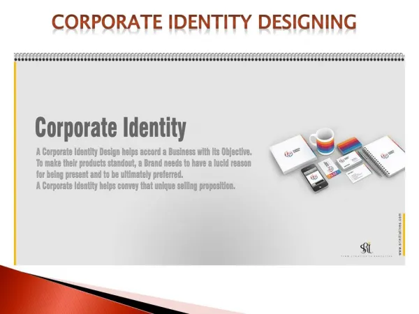
Guidelines for Corporate Stationery Designing Corporate stationery is a common item branded by companies. Branding includes placing your brand name, logo, tagline and other symbols on notepads, business cards, letterhead and envelopes. Although the process is a subtle way to promote your brand and establish a professional image, stick to some basic guidelines in branding stationery.
1. Stay Consistent “Consistency is key in building an effective brand.” This is true across all types of communication and within specific tools, such as stationery. To deliver a consistent image in stationery, maintain a similar color scheme, placement and implementation with your logo, tagline and whatever other symbols you use. You might place a logo, name and tagline with a constant color pattern in the upper left corner of a business card, letterhead and envelopes,
2. Don't Overdo It “Stationery provides functional purposes. “ A business card is a tool to share contact information with people you meet. Letterheads and envelopes are used to type memos or letters and send them to others. While you want to brand these items, keep the branding simple enough not to detract from the functional value. Additionally, you want the logo and branding to mirror what people see in other print ads, such as in newspapers and magazines.
3. Devise a Color Scheme Color schemes are an important design aspect in branded stationery. According to the International Paper Company, standard color design for stationery is simply black ink on white paper. If you want a highly professional image, this is likely the way to go. However, many companies want to present a different image with a color scheme. Bright colors, such as red and yellow, may align with a company's emphasis on intensity, action or energy. You may also want to use a color scheme that matches store colors or colors used in other ad branding.
4. Balance Design with Readability On your business cards and letterhead, balance design with readability. This is especially critical in selecting typefaces and font sizes. “A creative or clever-looking typeface that people can't read isn't effective.” Similarly, cramming a bunch of contact details and company information at the top of a letterhead won't work well if the font size is too small too read without a magnifying glass.