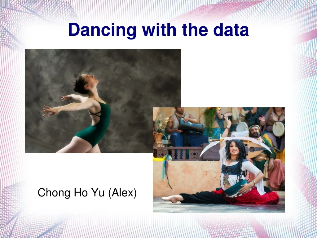

Dancing with the data
E N D
Presentation Transcript
Chong Ho Yu (Alex) Dancing with the data
Agenda • Difference between static and dynamic graphics • Visualization techniques from 1 to 5 dimensions • Future trend: multi-panel visualization to go beyond 5 dimensions • Hand-on exercises using JMP.
Opposition • Fisher (1932) said: • Diagrams prove nothing, but bring outstanding features readily to the eye; they are therefore no substitute for such critical tests as may be applied to the data. • Today many researchers insist that reporting the numbers is sufficient. • How can we spot outliers, check assumptions (e.g. linearity, normality), identify patterns (e.g. clusters), evaluate model adequacy (e.g. residuals) without looking at the data?
Opposition • “Many journal articles do not display graphics.” • Because it is expensive! It’ll cost you an arm and a leg!
See beyond the horizon! • Can you do this in a print journal? • Yu, C. H., & Stockford, S. (2003). Evaluating spatial- and temporal-oriented multi-dimensional visualization techniques for research and instruction. Practical Assessment, Research & Evaluation, 8(17). Retrieved fromhttp://pareonline.net/getvn.asp?v=8&n=17
See beyond the horizon! • Can you do this in a hard copy? • http://www.creative-wisdom.com/teaching/WBI/galton.htm
Numbers may fool you! • Anscombe's data is a classical example. • Another one: Kurtosis is the relative ratio of the mass of the distribution located in the center vs. in the tails. Kurtosis = 3 → Normal curve. • In this example, Kurtosis = 3.2, fairly normal, right? • No, there is a lot of central mass, but the histogram shows that the distribution is skewed and there are two outliers.
Static vs. dynamic • Static • What you see is what you get. • After the graph is made, you cannot manipulate the graph (changing the background color or the line width is not considered “data manipulation because it cannot give you any insight about the data) • Dynamic • The data table and different graphic panels are linked. Changing one would change all others. • You can manipulate the graph to explore the data through different perspectives.
Regression lines by gender • The two lines do not look the same, but there is an outlier.
Regression lines by gender • Put on a pair of sun glass (don't look at the outlier)
Example: Logistic regression • Aged between 45 and 50 → in group 1 and 5.
GIS Map • The Yankees (Northern states) are doing better. • But usually people perceive “red” as “risk”.
SPSS Post hoc multiple comparison • In SPSS you have 18 options. When I was a graduate student, I took a course on it.
Diamond plot • Grand sample mean: horizontal black line • Group means: horizontal line inside each diamond. • Confidence intervals: The top of the diamond is the upper bound while the bottom is the lower bound. • Quantile: boxplot
Ternary plot: Clustering and Profiling • In the era of globalization, how can we define what a USA company is? One argue that if you buy a Korean Kia, you may help reducingthe trade deficit.
Clustering pattern • There are three clusters, but one company does not belong to any.
Visualizing multiple dimensions by colors and markers • I want to know how academic rank and gender moderate the relationship between high school GPA and university test scores.
Right click on the scatterplot and choose row legend. • Keep the default color assignment of rank. • Now you are viewing three dimensions. • Everything is everywhere! Good! No systematic concentration.
Do not assign colors to gender. • Use sex symbols for gender marker. • A green O is a female sophomore; a red + is a male freshman. • Four dimensions • Everything is everywhere! Good!
Linking and brushing • What are the characteristics of top performers in college test scores? • They are from WA, UT, and CA. • Their high school GPA is good but their SAT is not necessarily good.
Prediction Profiler • What would the scores be if GPA is low, SAT is high, and household income is low? • What would it be if GPA is high, SAT is high, and household income is low? • What if….?
Two-way interaction is easy • You can do it in Excel. • We can extend the two-way plot to three-way in Mathematica or Maple. • How about putting 2 two-way plots together?
Dancing with three-way interaction • The objective of showing you these graphics is to let you be aware what options you have if you want to do multi-dimensional data visualization in the future. It is NOT required to learn how to create these graphics now. • A regression equation is a function. Y is a function of Xs. • http://www.creative-wisdom.com/multimedia/regression.html
Dancing with three-way interaction • Detecting and interpreting three-way interactions in regression may be very complicated. Using a mesh surface is much clearer. • Interaction: the effect of X on Y is not consistent across all levels of A and B → regression lines vary • If there is NO interaction, there should be no curving or dancing in the movie. Every frame should look the same.
WolframAlpha • If you do not have Mathematica or Maple, you can use WolframAlpha. It is free!
What the bubble dance tell you? • In 1973 a strong association was found between the two crime rates, but in 1993 their connection became weaker. • In both years big cities with a large population size tended to suffer from higher crime rates, with the Northeast region being the worst. • The US crime rate has been steadily declining since the 1990s. In 2010, the crime rates appear to be under control. The robbery rate and the rape rate seemed to be negatively correlated. • Big cities and Northeast are no longer the most dangerous places to live.
Observations • Mean years of adult schooling and R&D have a positive relationship. • This relationship has been stable for over a decade. • Countries that are doing well in both are high in Human Development Index. • Size doesn't matter. Some very populated countries are not doing well in both.
Observations • Japan has been ahead of the US in spending money for R&D (as a percentage of GDP) for over a decade. • On the average Japanese people spend fewer years in school than their American counterparts, but they still invest more in R&D. • Compare with other nations, US and Japan are among the top in terms of years of schooling and R&D. • US has been leading in years of schooling and Germany catches up in recent years.
Assignment 7.1 • Open the data set visualization_data.jmp • Use Graph builder to make a US map. Show the SAT scores on the map. Which states have best and worst average SAT scores? • Do the same as above for GPA. • Create boxplots of GPA by academic rank. What are the characteristic?
Assignment 7.2 • Create a scatterplot using (X: GPA, Y: scores) • Use Race and gender as the Row legends. • Is there a systematic pattern? Do race and gender moderate the relationship between high school GPA and college test scores? • Use “distributions” to show all variables. Click on Females. Who are they in terms of their attributes of other variables? • Do the same for students whose GPA is 3.0 or higher.