Using Charts in a Presentation
This lesson focuses on using charts effectively within your PowerPoint presentations. Charts help convey complex data relationships visually, aiding audience comprehension. Learn how to insert various types of charts directly from PowerPoint by utilizing Excel for data entry. This guide walks you through the steps to create, modify, and format charts, ensuring clear data representation. Explore features like legends, category axis labels, and customizable chart types to enhance your presentations.


Using Charts in a Presentation
E N D
Presentation Transcript
Using Charts in a Presentation Lesson 6
Software Orientation • Charts can help your audience understand relationships among numerical values. The figure below shows a sample PowerPoint chart with some standard chart features labeled. • A chart can compare multiple data series, as at right, with each series represented by a different color or pattern. A legendexplains what each color represents. Category axis labels explain what the groupings of bars represent (on the horizontal axis) and vertical axis labels explain the meaning of the numeric values (on the vertical axis). Optional elements such as gridlines behind the chart help make the chart more readable.
Building Charts • Chartsare visual representations of numerical data. • Chart features such as columns, bars, lines, or pie slices make it easy to understand trends or compare values. • Once you have created a chart in PowerPoint, you can easily modify the data on which the chart is based, choose a different type of chart to display the data, change the layout of the chart, and modify its formats.
Inserting a Chart from a Content Placeholder • Excel opens when you create a chart in PowerPoint, and you enter the data in Excel that you want to plot on the chart. • Then when you return to PowerPoint, the chart appears with the data presented. • As with tables and other objects such as diagrams and pictures, the easiest way to insert a chart is to click the Insert Chart icon in any content placeholder. • PowerPoint guides you the rest of the way to complete the chart. • In the following exercise, you place a chart on a slide using a content placeholder.
Step-by-Step: Insert a Chart • Before you begin these steps, make sure that your computer is on. Log on, if necessary. • STARTPowerPoint, if the program is not already running. • Locate and open the Revenuespresentation and save it as Revenues Final. • Go to slide 3. Click the Insert Chart icon in the center of the content placeholder. The Insert Chart dialog box opens, as shown above, showing chart types and subtypes.
Step-by-Step: Insert a Chart • Click the 3-D Clustered Column chart subtype (the fourth from the left in the top row of the dialog box). • Click OK. Microsoft Excel opens in a separate window on top of the PowerPoint window. See right. Notice the bright-blue border that surrounds the data range in Excel. This range border is used to indicate the data being charted.
Step-by-Step: Insert a Chart • Drag the marker in the bottom right corner of the range border so that the range includes only cells A1:C5. • Select column D, and then press Delete to clear the selected cells. • Click cell B1 and type 2010, replacing the current entry. Then press Tab to move to cell C1. Type 2011, and press Enter. • Beginning in cell A2, type the data below in Excel to complete the chart. Spring $89,000 $102,000 Summer $54,000 $62,000 Fall $102,000 $118,000 Winter $233,000 $267,000
Step-by-Step: Insert a Chart • Close Excel and return to PowerPoint. The chart appears with the data you entered, as shown below. • SAVE the presentation. • LEAVE the presentation open to use in the next exercise.
Step-by-Step: Insert a Chart • As you saw in the previous exercise, Excel opens to allow you to insert the data that creates the chart. • If you do not have Excel installed, PowerPoint instead resorts to Microsoft Graph, the charting application used in previous versions of PowerPoint. Microsoft Graph is not covered in this course. • After you type the chart data, you can close Excel. You do not have to save your work in Excel because it is saved within the PowerPoint file, as part of the chart. • You can edit the Excel data any time you want by clicking the Edit Data button on PowerPoint’s Chart Tools Design tab (which appears when a chart is selected).
Step-by-Step: Insert a Chart • If you want to use data from an existing workbook, open that workbook and Copy and Paste the data into the sheet created for the chart’s data. Adjust the range border as needed. • You can also create the chart in Excel, and then copy the completed chart to PowerPoint using the Clipboard.
Choosing a Different Chart Type • After creating a chart, you may choose to change its type and/or its layout. If you decide that the chart type you have chosen does not display the data the way you want, you can choose a different chart type or subtype. • Different chart types display the data series differently. • A data series consists of all the data points for a particular category, such as all the columns for Quarter 1 values. A data point, sometimes called a data marker, is one column or point in a series. The default chart type is a Column chart. • In this exercise, you change a chart’s type.
Step-by-Step: Choose a Different Chart Type • USEthe Revenues Final presentation that is still open from the previous exercise. • In PowerPoint, click the Change Chart Type button on the Chart Tools Design tab. The Change Chart Type dialog box opens, showing the same options that appeared when you first created the chart. • On the list of chart types at the left, click Bar.
Step-by-Step: Choose a Different Chart Type • Click the Clustered Horizontal Cylindersubtype, and then click OK. The rectangular columns change to 3-D cylinders, as shown at right. Don’t worry if the text is not readable; you will learn to fix that later in this lesson. • SAVEthe presentation. • LEAVE the presentation open to use in the next exercise.
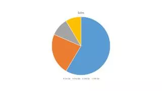
Step-by-Step: Choose a Different Chart Type • You can change any chart type to any other type, but the result may not always be what you expect, and you may lose some data. • For example, when you change from any multi-series chart (such as a clustered bar or line) to a pie chart, only the first data series appears on the chart. • In addition, when you change from a vertical to a horizontal chart, as in the preceding exercise, some of the axis labels may need adjustment. • If you apply a chart type that does not display your data as you want, use Undo to reverse the change and then try another type.
Applying a Different Chart Layout • PowerPoint supplies several preformatted chart layouts that you can apply quickly to modify the default layout. • These layouts may adjust the position of features, such as the legend, or add chart components such as titles and data labels. • In this exercise, you choose a different chart layout.
Step-by-Step: Apply a Different Chart Layout • USEthe Revenues Final presentation that is still open from the previous exercise. • With the chart on slide 3 selected, click the More button in the Chart Layouts group on the Chart Tools Design tab. The Chart Layout gallery displays, as shown at right. • Click Layout 2 in the gallery. The layout is modified to place the legend above the chart and add data labels to each of the bars. See the figure on the next slide.
Step-by-Step: Apply a Different Chart Layout • Switch to the Chart Tools Layout tab. • Click the Chart Titlebutton to open a menu, and click None. The chart title is removed. (It’s not necessary because the slide itself provides a title.) • SAVEthe presentation and then CLOSE the file. • LEAVE PowerPoint open to use in the next exercise.
Formatting Charts with Quick Styles • Chart Quick Styles provide instant formatting to change the look of a chart. A Quick Style can change colors and borders of data markers, apply effects to the data markers, and apply color to the chart or plot area. • You can use a Quick Style to format a chart if you do not have time to adjust formatting of chart elements such as data series or the individual data points in a series. • In this exercise, you apply a Quick Style to a chart.
Step-by-Step: Apply a Quick Style to a Chart • To apply a quick style to a chart, perform these steps: • OPENthe Conditions presentation and save it as Conditions Final. • Go to slide 2 and click the chart to select it. • On the Chart Tools Design tab, click the More button in the Chart Styles group. The Quick Styles gallery appears, as shown at right.
Step-by-Step: Apply a Quick Style to a Chart • Click Style 7. The data series’ colors change to variations of another theme color. This is not quite dramatic enough for your purpose. • Click the More button again, and then click Style 43. This style applies new theme color, bevel effects, and different chart background colors, as shown at right. • SAVEthe presentation and then CLOSE the file. • LEAVE PowerPoint open to use in the next exercise.
Modifying Chart Data and Elements • You can change the data on which the chart is based at any time or change the way in which the data is plotted. You can also add or remove chart elements as desired to customize your chart.
Editing a Chart’s Data • Chart data remains “live” as long as the chart remains on the slide. You can reopen the chart worksheet at any time to adjust the data. • Changes you make to the chart data worksheet are immediately reflected on the PowerPoint chart. Use the Edit Data button to reactivate the data worksheet in Excel, and make your changes there. • You can also use Switch Rows/Columns to plot the data on different axes. • Before you can edit chart data, you must select it. To select an individual cell in the data sheet, click that cell. To select ranges of cells, drag across them, or click a column or row header to select the entire row or column. • In the following exercise, you practice editing chart data, including selecting individual cells and entire columns.
Step-by-Step: Edit a Chart’s Data • To edit a chart’s data, do the following: • OPENthe Pricing presentation and save it as Pricing Final. Examine the information on the slides, and notice that the dates on the title slide do not agree with the dates on the chart. • Go to slide 2 and click the chart to select it. • On the Chart Tools Design tab, click the Edit Data button in the Data group. The data worksheet opens in Excel. • Click cell A3 and type Equipment, replacing the current entry there.
Step-by-Step: Edit a Chart’s Data • Click column B’s column header to select the entire column, and then on the Home tab, click Delete. The data in Excel should now resemble the figure at right. • Close Excel, and return to PowerPoint. Notice that the chart on slide 2 has been updated.
Step-by-Step: Edit a Chart’s Data • In PowerPoint, on the Chart Tools Design tab, click the Switch Row/Column button. The chart changes to plot the data with the years on the horizontal axis, rather than the categories. See above. • SAVEthe presentation. • LEAVE the presentation open to use in the next exercise.
Step-by-Step: Edit a Chart’s Data • The Switch Row/Column feature can be very helpful in adjusting the way data appears in a chart. In essence, the legend entries and the horizontal axis labels switch places. • If you find that your chart does not seem to show the data as you wish, try switching rows and columns for a different perspective on the data.
Adding and Deleting Chart Elements • Elements such as axis labels, a chart title, and data labels make your chart more informative. Use the tools on the Chart Tools Layout tab to turn chart elements on or off or adjust settings for a particular element. • The Chart Tools Layout tab has four groups of buttons that control chart elements. When clicked, most of these buttons display options you can apply by clicking. Some include submenus with additional options or a More Options command. • You can remove chart elements by turning them off—most of the layout element buttons include a None option—or by simply clicking the item to select it and then pressing Delete. • In this exercise, you will practice adding and deleting chart elements.
Step-by-Step: Add and Delete Chart Elements • USEthe Pricing Final presentation that is still open from the previous exercise. • Click the chart on slide 2 to select it, and click the Chart Tools Layouttab. • Click the Gridlinesbutton, point to Primary Vertical Gridlines, and click Major Gridlines (see right). Vertical gridlines are added to the chart. • Click one of the red bars within the chart to select the Equipment series. All the red bars should be selected.
Step-by-Step: Add and Delete Chart Elements • Click the Data Labelsbutton, and then click Outside End. The number for each data point in the selected series appears above the bar, as shown at right. • Modify the data labels you just inserted as follows: a. Click one of the data labels to select all data labels for the series.
Step-by-Step: Add and Delete Chart Elements b. Click the Data Labels button again, then click More Data Label Optionsat the bottom of the menu. The Format DataLabelsdialog box opens. c.In the Label Position area of the Label Options pane, click Centerto center each label within its bar. d. Click Number in the left pane, and then click the Currencycategory. e. Select the value in the Decimalplacesbox and type 0 to reduce decimal places to 0. See above. f. Click Close.
Step-by-Step: Add and Delete Chart Elements • Click one of the Lift Passes data bars, and repeat steps 4 and 5 to add and format currency data labels. • Click the Chart Title button, and click None. • Click the Axis Titles button, point to Primary Vertical Axis Title, and then click Rotated Title. An axis title placeholder appears to the left of the vertical axis. • Drag over the placeholder text and type U.S. Dollars. • Click outside the chart to deselect it. Your chart should look similar to the figure on the next slide. • SAVEthe presentation.
Step-by-Step: Add and Delete Chart Elements • LEAVE the presentation open to use in the next exercise. • Applying elements such as a chart title or axis titles generally reduces the size of the plot area and the data markers. You can offset this adjustment by resizing the chart or by reducing the font size of axis labels and titles, as you learn later in this lesson.
Adjusting and Formatting Chart Axes • PowerPoint automatically determines the numeric scale to be used for the chart’s axes, with the minimum value at zero (usually) and the maximum value slightly higher than the largest value to be plotted. • You can adjust the axis scale if you like, however, to create different effects. • You can also apply formatting to the axis labels, such as formatting the numbers as currency or changing their font, font size, and font color, or any of the other font-formatting actions you have learned in earlier lessons. • In this exercise, you will practice formatting chart axes.
Step-by-Step: Adjust a Chart Axis • USEthe Pricing Final presentation that is still open from the previous exercise. • Click the chart on slide 2to select it, if necessary. • Double-click one of the numbers on the vertical axis(for example, 200). The Format Axis dialog box opens. • On the Maximum line, click the Fixed button, and change the value to 500 to establish that as the maximum value for the chart’s vertical axis, see above.
Step-by-Step: Adjust a Chart Axis • Click Number in the left pane, and then click the Currency category. • Select the value in the Decimal places box and type 0 to reduce decimal places to 0. • Click Close to close the dialog box and apply your changes. • On the Home tab, open the Font Sizedrop-down list and click 14. • Click the Font Colorbutton’s arrowto open its palette, and click the dark blue squarein the Standard Colors section. The chart should resemble the one above. • SAVEthe presentation and close it. • LEAVE PowerPoint to use in the next exercise.
Step-by-Step: Adjust a Chart Axis • Adjusting an axis’s scale can be useful if you are trying to make the data convey a certain message. If you want to accentuate the differences between values, tighten up the axis scale. For example, if all the data points are between 110 and 120, you might make the minimum value 100 and the maximum value 120. • By default, a chart’s axis and formatting are automatically adjusted as needed when you make changes to the chart. Be aware, however, that if you specify exact values for settings, as you did in the preceding exercise, those settings will remain fixed even if you make changes to the chart.
Manually Formatting a Chart • Once you have final data and have added the elements you want to include in the chart, you can make final adjustments to the size and position of the chart and its elements, and apply final formatting. • Use the tools on the Chart Tools Format tab to apply formats to any part of a chart, including the entire chart area, the data series markers, the legend, and the chart’s labels and titles.
Positioning Chart Elements • Each chart element has a default position, and also several alternate positions you can select instead. • You can either use one of the button's menus on the Chart Tools Layout tab to select a precise position, or you can manually drag and drop a chart element into a new position. • In this exercise, you practice repositioning chart elements.
Step-by-Step: Reposition Chart Elements • To reposition chart elements, perform the following tasks: • OPENthe Admissions presentation and save it as Admissions Final. • Select the chart on slide 2. • On the Chart Tools Layout tab, click the Legend button, and then click Show Legend at Bottom. The legend moves to the bottom of the chart and changes its layout to a single row. • Click the legend to select it. • Point to the border of the legend’s frame, so that the mouse becomes a four-headed arrow, and click and drag the legend onto the chart itself, see right.
Step-by-Step: Reposition Chart Elements • Click the Legend button again and click More Legend Options. The Format Legend dialog box opens. • In the Legend Position list, click Top Right. • Clear the Show The Legend Without Overlapping The Chart check box. The legend moves to the upper-right corner of the chart, inside the chart frame (see above).
Step-by-Step: Reposition Chart Elements • Click Close to close the Format Legend dialog box. • SAVEthe presentation. • LEAVE the presentation open to use in the next exercise. • Nearly all of the chart elements can be positioned in the same way that you saw in the preceding exercise, but each has its own special options appropriate to it. For example, the chart title can either overlap the chart or not, and data labels can be placed inside or outside of the bars, columns, or pie slices they represent. In each case, the menu that opens when you click the button on the Chart Tools Layout tab contains some basic presets, and you can see more options by clicking the More command at the bottom of the menu.
Resizing and Moving a Chart • You can move and resize a chart. The dotted areas on the chart’s border are sizing handles. • You can resize any object by dragging a side or corner handle of its container. Note that if you drag a side handle, you may “stretch” the container, distorting its contents. • Hold down Shift to maintain the height-width ratio (the aspect ratio). • You can move any object, including a chart, by dragging it by its border. When you see the four-headed pointer, just click and drag. • In this exercise, you will resize and move a chart.
Step-by-Step: Resize and Move a Chart • USEthe Admissions Final presentation that is still open from the previous exercise. • Select the chart on slide 2 if it is not already selected. • Position the pointer on the lower right corner of the chart’s frame, so the mouse pointer becomes a double-headed arrow. • Drag inward to decrease the size of the chart by about 1” in both height and width. • Position the pointer anywhere on the chart’s frame except one of the sizing handles. The mouse pointer becomes a four-headed arrow.
Step-by-Step: Resize and Move a Chart • Drag to reposition the chart so that it is centered attractively on the slide, as below. • SAVEthe presentation. • LEAVE the presentation open to use in the next exercise.
Changing the Fill of the Chart Area • When you change the chart area fill, you format the entire area within the chart’s frame. When choosing a fill for the chart area, you have familiar choices: you can select a theme color, picture, gradient, or texture. • Do not confuse the chart area with the plot area. The chart area includes everything inside the chart’s frame; the plot area includes only the area within the chart’s frame where the data is plotted. It excludes the extra elements such as the legend, the chart title, and the data table. You can apply different formatting to the plot area than to the chart area. • You can select a chart element by clicking it, or you can select it from the Chart Elements box on the Chart Tools Layout tab. • In this exercise, you will select the chart area and change the chart area’s fill.
Step-by-Step: Change the Chart Area Fill • USEthe Admissions Final presentation that is still open from the previous exercise. • Select the chart on slide 2 if it is not already selected. • Click the Chart Tools Format tab. • If Chart Area does not already appear in the Chart Elements box, open the drop-down list in the Current Selection group and select it (see below).
Step-by-Step: Change the Chart Area Fill • Click the Format Selection button below the Chart Elements box. The Format Chart Area dialog box opens. • Click Picture or texture fill, and then click the Texture button. The texture gallery opens. • Click the Newsprint texture, and then drag the Transparency slider to 25%. The chart area has been formatted with a light texture background that makes it stand out from the slide, as shown on the next slide.
Step-by-Step: Change the Chart Area Fill • Click Close to close the Chart Area dialog box. • SAVEthe presentation. • LEAVE the presentation open to use in the next exercise.
Step-by-Step: Change the Chart Area Fill • When formatting parts of a chart, it is sometimes a challenge to select the element you want to change. Use the Chart Elements list in the Current Selection group on either the Chart Tools Layout or Chart Tools Format tab to help you select the element you want.. • You can also select any element on the chart by right-clicking it. The shortcut menu displays a Format command at the bottom that corresponds to the element you have clicked. • The dialog box that opens when you select a chart element to format provides options specifically for that element.