Download
1 / 46
460 likes | 769 Vues
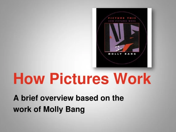
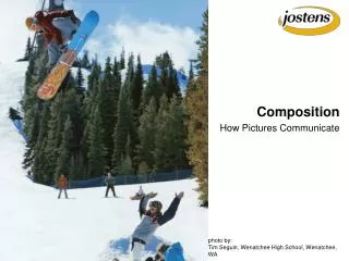
How Pictures Work. A brief how-to based on the work of Molly Bang. This lesson is about how visual images make meaning. Or, how we make meaning from visual images. However you want to put it.

E N D
How Pictures Work A brief how-to based on the work of Molly Bang
This lesson is about how visual images make meaning. Or, how we make meaning from visual images. However you want to put it. In it, you will go through a series of slides, some with pictures and some with explanations or instruction. Some will ask you to think about what you’re looking at. Please, seriously please, do so. It’s important that you think about how the images affect you. There isn’t a right or wrong, so go ahead and see what you think. Often many people agree about these things, and the ‘common view’ may be mentioned, so it’s important for you to get your own thoughts figured out first.
First, get out your notebook. Then, write down these three terms: Context Composition Compositional Elements Definitions are on the next slides.
Context • When we talk about context in relation to a text, we are talking about outside influences on the text, things that influence our thoughts or feelings about the text, and that maybe help us analyze it, too. • For instance, if we see Jim Carey in a movie, we bet its genre is comedy, even before he does something funny. This is because of an outside influence - we know that he has made other comedy movies, so we expect that. Other contexts that typically come up include • When a text was made, e.g. songs from the 60s / hippie music • When we encounter the text, e.g. on a date vs. with our parents • What is going on in the world at the time, for instance the Gulf War • Advertising for the text, or controversies about it, like protests of The Laramie Project
Composition Composition is kind of the opposite of context. Context looks exclusively outside the text. Composition looks exclusively at the text itself. What is the text like? What parts does it have? How are they put together? What media is the text in? How big is it? These are all composition questions. When we talk about the composition of a text, we aren’t talking about what it means. Sure, the compositional elements help determine the meaning, but when we talk composition, we are just talking about the text itself. Not our interpretations. Not our feelings. Not what we think it is. Nothing. This is very useful when we do analyze. What we really want to be able to do is describe the compositional elements and explain how they lead us to an interpretation of the text.
Compositional Elements. Here are some examples for visual texts: • Color • Contrast • Size • Shape • Spatial Arrangement • Symmetry • When we talk about the composition, we are talking about elements like this. • Now… let’s put this to work.
Take a couple minutes to write about this picture. First, say some things about the composition. Look back at the list of elements and see if you can use them. Next, try to tell what you think is going on in this picture. What’s the story?Go to the next slide when you’re done writing.
The story going on there is Little Red Ridinghood. Get it? When Molly Bang wrote this book, she worked hard to try to figure out what shapes and colors would tell the story best. We want you to think about this, too. Look at the next slide. What impressions does the shape give you? Think for a second…. Then compare it to the slide following it.
How do the two shapes compare? Which is cooler? Which one is more boring? Which is more dynamic or energetic? Which is more huggable? Why? Why do you suppose the triangle was chosen for Little Red Ridinghood? Now, let’s think about the mother. Consider the following several slides.
This could represent mother and daughter. But, how motherly does the big triangle seem?
How about now? The author thought the rounded corners made the figure more gentle and mom-like. But, think about the color.
The author thought red was too energetic for the mom. Plus, moms and daughters aren’t exactly the same. She chose Purple because it was related to red.
The author thought red was too energetic for the mom. Plus, moms and daughters aren’t exactly the same. She chose Purple because it was related to red, but not the same. • But why red in the first place. Well, 2 kinds of reasons: • Literal: it’s Little Red Ridinghood, after all. Just like the triangle kind of looks like a hood or a cape like she wears, red is red like she is. • Figurative: Red represents danger, and the girl is in danger. Also, it is an energetic color, the color of blood and life and fire. All of these meanings are kind of going on at the same time, and it’s up to us to sort out which ones to pay attention to. Context helps us do that.
So. We’ve seen that size means something - bigger for mom. And shape means something - less point for motherly. And color means some things. Now, let’s look at contrast and spatial arrangement. In the previous frame, Mom gives her the basket. The color is black to contrast with the other colors. It stands out. It’s clearly something different that the other two shapes. Note how the basket is tilted, also. This implies motion, that mom is handing it off. If it were level, it wouldn’t have that feeling.
There were 3 choices for trees. The first seemed too simple. Compositionally, it was triangles, too, which might have confused the issue with Little Red. The second was more obviously tree like, which was okay in its way. But, it also looked like an overhead view, and there wouldn’t be much room for our heroine in the picture. Now, look at the next 4 slides. See how changing the size and spatial arrangement of LRR affects your feelings about the picture. Which one is more scary? She’s supposed to be in danger, after all.
There is a sort of consistency or symmetry to the tree trunks. They all go straight up and down. Now, look at the next slide. Not too much has changed, but what difference does it make?
The author said these things: • When everything is straight up and down or sideways, things seem stable. • When things are at an angle, they seem in motion. This is important, and we saw the same idea with the basket earlier. • Note also that things seem scarier, too. This forest could fall on the girl. • Plus, looking at the picture, there is a lot of open white space for her to move into as she comes forward. She looks cut off from going backwards, though. • Now, look at the next 10 pictures. We meet the wolf. Which ones seem scarier? Why? Which not so scary? Why?
Just a few notes: • Smaller wolf might have been more creepy / sneaky, but probably not so dangerous. • Purple wolf… what a joke. Not scary at all. • Wolf with round corners? Looks like a sock puppet. • Did you think the purple eye was ridiculous? • What did you think about the triangle eye? Look at that one again and think about your reaction. • Next, we add some more to the wolf. See what you think.
The tongue makes it look less like a silhouette. This may be good or bad, but the author liked it. One thing it really does, though, is make the wolf stand out more from the background - you can’t se the tree trunk through his mouth any more. Note also the use of red. It seems associated with LRR by color, and the red is literal for the tongue. Also, though, it is demonic for the eye - that’s the color of eyes devils have, and teacher typing up PowerPoints late at night. Now, look at this change in background. Why? What’s up with that?
Finally, the author decided to sue some more contrast on the teeth. This is maybe kind of literal, but I bet real wolf teeth are more grungy yellow unless they get regular milkbones. White does make us think of teeth, though, and there is a lot of contrast. Do you like the change?
Okay. Now, you’ve had a chance to think about a lot of compositional elements and how they work to make meaning. We may still need the context to figure out the story completely, but the images get us close. Even without knowing what the story was, you could have guessed that a wolf was after something from the first picture you saw. YOUR ASSIGNMENT is to make ONE frame of a story most people will know. Use simple shapes like were used here. You can do this on a computer, with crayons, by cutting up construction paper… whatever. It should be in color, though. (You could print empty shapes in B+W and then color them if you wanted.) Then, write a 1-pager (300 words, claim and evidence) to explain WHY you made the choices you did. I.e., why did you chose the shapes, the colors, the contrast, the arrangements that you did? Your reasons shouldn’t be ALL figurative or ALL literal - go for a mix of both.