Excel Diving: Analyzing Data Trends, Projections & Graphs
Dive deep into data analysis with Excel! Learn to compare and track changes over time, identify strengths and weaknesses, and let data lead discussions. Explore MAP/PASS projections, triangulation sheets, and create colorful graphs. Discover tips on sorting, filtering, borders, highlighting, and conditional formatting. Master creating various chart types, customizing chart elements, and manipulating axis values for insightful data visualization.

Excel Diving: Analyzing Data Trends, Projections & Graphs
E N D
Presentation Transcript
Diving Into Data with EXCEL Emily K. Thomas, Instructional Coach Welcome Elementary School, GCS ekthomas@greenville.k12.sc.us
A Few More Examples • PASS 11 Spreadsheets – EXCEL • Color Coded PASS Scores • Intervention
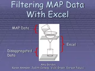
Time to Play with Excel! • MAP Data • typing in cells • making cells larger • tabs • Data Tab • Sort: 1 attribute and more (add level) • Filter • Home Tab • Borders • Highlighting • Conditional Formatting
Graphs in Excel • PASS Data • Insert Tab: Choosing your graph • Chart Tools • Design Tab • Change chart type • Switch Row/Column • Layout Tab • Chart Title • Axis Titles • Legend • Data Labels • Data Table • Gridlines • Change axis values