Download
1 / 35
350 likes | 495 Vues
Explore the principles of balance, movement, rhythm, contrast, emphasis, and pattern in art and design. Learn about symmetry, asymmetry, value balance, visual movement, color contrast, focal areas, and more. Enhance your understanding of creating harmonious compositions.

E N D
Balance • Balance: the distribution of visual weight in a work of art. • The visual equilibrium of the elements causes the total image to appear balanced.
Balance • Symmetrical balance: When elements on both sides of a central vertical line appear to be about equal in shape, weight, value, and color. Also called: formal or classical balance. • Asymmetrical balance: two sides that are different, but yet are in visual balance. Ex. A large 3-figure shape of people sitting quietly is balanced by smaller, but much more active birds. Also called informal balance.
Balance • Value balance: Ex. A small light value shape seems to balance a large middle value shape. • Radial balance: when all the elements radiate out from a central point. A grapefruit cut in half is a good example. • All over pattern is another form of balance, since the same visual weight, texture, and colors are evenly distributed. Ex. Fabric.
Movement • Visual movement is used to direct viewers through their work, often to focal areas • Can be directed along lines, edges, shapes, and colors within the works, but moves the eye most easily on paths of equal value
Movement • Visual passage or linkage: the artist moves our eyes through a painting using dark or light values • Our eyes move into a painting if the work contains 1-point perspective.
Movement • Elongated shapes cause our eyes to move along them • A strong center of interest will cause our eyes to follow it like a magnet. • Linear movement: can be direct (straight) or irregular (curvilinear).
Movement • Our eyes follow lines and edges in sculpture, architecture, and paintings, as well as in nature. • Closure: our eyes move across a surface and interruptions may occur. Our eye skips across the interruptions.
Movement Richard Earl Thompson Claire Ruby
Rhythm • Rhythm: the repetition of visual movement of the elements—colors, shapes, lines, values, forms, spaces, and textures. • Variety is essential to keep rhythm exciting and active, and to avoid monotony.
Rhythm • Movement and rhythm work together to create the visual equivalent of a musical beat. • Regular Rhythm: the repetition of elements that are the same or nearly the same in regular sequences.
Rhythm • Irregular Rhythms: might repeat throughout a painting without any exact duplication—unevenly spaced. • Staccato rhythms: repetitions that are abrupt and that change frequently. They often seem to be short bursts of energy in a painting.
Rhythm • Progressive rhythms: those in which the elements change sizes as they progress or move across space. • In architecture, rhythmic sequences of windows, columns and other architectural details are used to unify large surfaces.
Contrast • Contrast: differences in values, colors, textures, shapes, and other elements. • Creates visual excitement and adds interest to the work.
Contrast • Value contrast: when black is next to white, and when light values from one end of the gray scale are next to dark values from the other end. • Simultaneous contrast: occurs when 2 pure complementary colors are placed side by side. Each will appear brighter.
Contrast • Contrast in color intensity: occurs when a pure, fully intense color is next to a muted or grayed color mixture. The pure color’s strength and intensity seem to cause it to glow. • Shape contrast: occurs when organic shapes are placed in a geometric environment and vice versa.
Contrast • Temperature contrast: the contrast of warm and cool colors. • Textural contrast: when artists use heavy textures to contrast with smoother areas in painting, sculpture, photography, architecture, or any of the crafts. Textural contrasts are abundant in nature.
Emphasis • Emphasis: used by artists to create dominance and focus in their work. • They can emphasize color, value, shapes, or other art elements to achieve dominance.
Emphasis • Focal areas (centers of interest): used by artists to place emphasis on the most important aspect of a work. • Best location for focal areas is a location off center about 1/3 from either side of the piece of paper and 1/3 from top or bottom
Emphasis • Color dominance: a way of emphasizing a color or color family in a painting. • Visual emphasis: can be achieved by having the strongest light and dark value contrasts in a painting located in a desirable place.
Emphasis • Visual emphasis is enhanced when value passages (light or dark movements) lead to a focal area. • In nature, emphasis might be felt when elements are isolated—emphasis is usually on the element that is different • Using shape contrast can develop visual emphasis.
Emphasis 4 Hot Spots
Pattern • Pattern uses the art elements in planned or random repetitions to enhance surfaces of paintings or sculptures. • Often occur in nature, and artists use similar repeated motifs to create pattern in their work. • Increases visual excitement by enriching surface interest.
Pattern • Regular or planned patterns: repeated with accuracy (lines, shapes, swirls, or other design elements). Ex. Fabrics • Architects use planned patterns to create surface interest on buildings. • In nature: repeated leaves, flowers, grass, shells, and many others.
Pattern • Radial patterns: fruits and vegetables can be noticed when cut in half. • Used to organize surface elements. Ex. A regular pattern of squares is made more interesting with an irregular pattern of another shape within them.
Pattern • Patterns made of repeated lines, shapes, colors, or texture are used in: jewelry, ceramics, weavings, wall coverings, fabrics, carpets, and flooring.
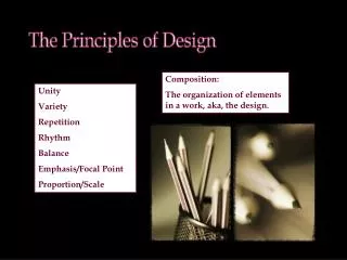
Unity • Visual unity: one of the most important aspects of well designed art and is planned by the artist. • Provides the cohesive quality that makes an artwork feel complete and finished. • When all the elements look as though they belong, the artist has achieved unity
Unity • Variety: essential to keep art from being monotonous (boring). Horizontal layers of paint or collage create unity, but a different element, color, shape, line, and could provide variety. • Visual unity can be developed by clustering elements or by placing them close together (proximity).
Unity • Graphic designers use vertical and horizontal contour continuation to organize complex materials. • When edges of visual elements are lined up, a sense of unity is felt. • Overall surface treatments create very strong sense of unity.
Unity • Overall intense colors, repeated shapes, consistently hard edges, and clustering create a strong sense of unity. • Dominant color will unify a painting. So will repeated textures, shapes, edges, and consistent painting techniques.
Unity • **All of the principles work together to create unity and a successful design.