Logo Design
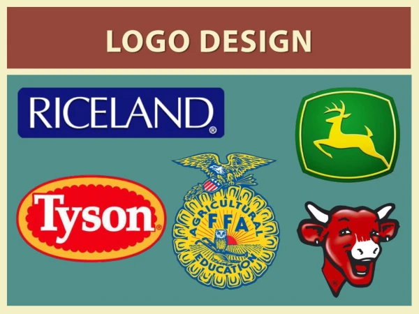
Logo Design. How to create an effective Logo. Key Points. It’s describable It’s memorable It’s effective without colour It’s scalable i.e. works when just an inch in size It’s appropriate. Its describable and memorable.

Logo Design
E N D
Presentation Transcript
Logo Design How to create an effective Logo
Key Points • It’s describable • It’s memorable • It’s effective without colour • It’s scalable i.e. works when just an inch in size • It’s appropriate
Its describable and memorable • Points one and two go hand-in-hand, because if you can’t describe what a logo looks like then how will you be able to remember it?
It’s effective without colour • Point number three is important because colour is secondary to the shape and form. I always leave colour to the end of the design process, because if the mark doesn’t work in black only, no amount of colour will rescue it.
It’s scalable i.e. works when just an inch in size • Point number four is vital for collateral, such as office stationery (pens, pin badges etc.) — all those little things that can easily be overlooked.
It’s appropriate • Lastly, the design must be appropriate for the business it identifies.
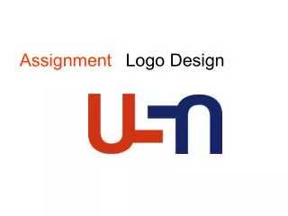
Logo example The Open University or OU The O The U An example of a simple design that meets the criteria
An example of a simple design sheet where the designer has explored some possibilities for an internet company. Where do you think the designer started? Which do you think is his final design? Does it meet the key criteria?
