
Menu Control
Menu Control. The Menu control enables you to create two types of menus. You can use the Menu control to create the left-column menu that appears in many websites. In other words, you can use the Menu control to display a vertical list of links.


Menu Control
E N D
Presentation Transcript
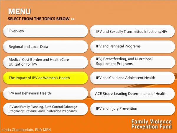
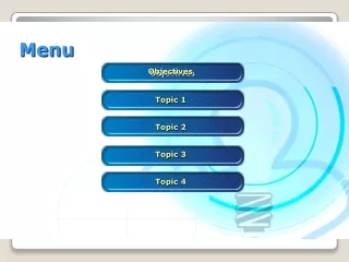
The Menu control enables you to create two types of menus. You can use the Menu control to create the left-column menu that appears in many websites. In other words, you can use the Menu control to display a vertical list of links.
You also can use the Menu control to create a menu that more closely resembles the drop-down menus that appear in traditional desktop applications. In this case, the Menu control renders a horizontal list of links.
You can display a menu with the Menu control by adding one or more MenuItem objects to its Items property. For example, the page in Listing 17.5 uses a Menu control to create a simple vertical menu
The Menu is created from MenuItem objects. Each menu item in contains a link to another page. • Notice that MenuItem objects can be nested. The second MenuItem objectServicesincludes two child MenuItem objects. When you hover your mouse over a parent menu item, the child menu items are displayed.
Each MenuItem includes a Text and NavigateUrl property. Rather than use a MenuItem to link to a new page, you also can use a MenuItem to link back to the same page. In other words, each MenuItem can act like a Linkbutton control instead of a HyperLink control.
For example, each MenuItem object includes a Text and Value property. When you click a menu item, the same page is reloaded and the value of the selected menu item is displayed.
Formatting the Menu Control • The Menu control supports an abundance of properties that can be used to format the appearance of the control. Many of these properties have an effect on static menu items, and many of these properties have an effect on dynamic menu items. Static menu items are menu items that always appear. Dynamic menu items are menu items that appear only when you hover your mouse over another menu item.
DisappearAfter: Enables you to specify the amount of time, in milliseconds, that a dynamic menu item is displayed after a user moves the mouse away from the menu item. • DynamicBottomSeparatorImageUrl :Enables you to specify the URL to an image that appears under each dynamic menu item.
DynamicEnableDefaultPopOutImage: Enables you to disable the image (triangle) that indicates that a dynamic menu item has child menu items. • DynamicHorizontalOffset : Enables you to specify the number of pixels that a dynamic menu item is shifted relative to its parent menu item.
DynamicItemFormatString: Enables you to format the text displayed in a dynamic menu item. • DynamicPopOutImageTextFormatString : Enables you to format the alt text displayed for the popout image.
DynamicPopOutImageUrl: Enables you to specify the URL for the dynamic popout image. (By default, a triangle is displayed.) • DynamicTopSeparatorImageUrl: Enables you to specify the URL to an image that appears above each dynamic menu item.
ItemWrap : Enables you to specify whether the text in menu items should wrap. • MaximumDynamicDisplayLevels: Enables you to specify the maximum number of levels of dynamic menu items to display. • Orientation :Enables you to display a menu horizontally or vertically (the default value is Vertical).
ScollDownImageUrl: Enables you to specify the URL to an image that is displayed and that enables you to scroll down through menu items. • ScrollDownText: Enables you to specify alt text for the ScrollDown image.
ScrollUpImageUrl : Enables you to specify the URL to an image that is displayed and that enables you to scroll up through menu items. • Target : Enables you to specify the window in which a new page opens when you click a menu item.
DynamicHoverStyle Style applied to a dynamic menu item when you hover your mouse over it. • DynamicMenuItemStyle Style applied to each dynamic menu item. • DynamicMenuStyle Style applied to the container tag for the dynamic menu. • DynamicSelectedStyle Style applied to the selected dynamic menu item.
StaticHoverStyle Style applied to a static menu item when you hover your mouse over it. • StaticMenuItemStyle Style applied to each static menu item. • StaticMenuStyle Style applied to the container tag for the static menu. • StaticSelectedStyle Style applied to the selected static menu item.
Finally, the MenuItem class itself includes several useful formatting properties: • ImageUrl Enables you to specify the URL for an image that is displayed next to a menu item. • PopOutImageUrl Enables you to specify the URL for an image that is displayed when a menu item contains child menu items. • SeparatorImageUrl Enables you to specify the URL for an image that appears below a menu item.
Selectable Enables you to prevent users from selecting (clicking) a menu item. • Selected Enables you to specify whether a menu item is selected. • Target Enables you to specify the name of the window that opens when you click a menu item.


