Download
1 / 47
490 likes | 731 Vues
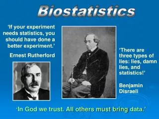
Lies, Damned Lies and Statistics. Introduction 8 Questions To Ask of Statistics 5 Statistical Concepts. Polls & Surveys. Polls and surveys are simply attempts to discover what people think about a given topic. These have limited value at the best of times.

E N D
Lies, Damned Lies and Statistics Introduction 8 Questions To Ask of Statistics 5 Statistical Concepts
Polls & Surveys • Polls and surveys are simply attempts to discover what people think about a given topic. • These have limited value at the best of times. • The most we can hope for is an accurate “snapshot” of how a particular population feels at a given moment. • They sometimes have predictive value for elections. • They are occasionally useful for determining civil, provincial and federal legislation. • While useful in a limited sense, in common use they are virtually useless
Surveys and their use • Surveys of the scientific community can tell us what the majority of scientists think about a subject. • Caveats: • This doesn’t mean that they’re right. Virtually every scientific theory has been accepted by a majority before it’s overturned. Bear in mind that one of the big arguments against Copernicus’ theory that the Earth revolved around the sun was the fact that virtually every scientist of the time believed otherwise. • To be truly representative, the survey should only involve experts in the field under discussion. You don’t ask physicists to give their opinion about the homeless issue or psychologists to discuss safe radiation levels. And as for what celebrities and sports figure think about anything – who cares? • Surveys can help politicians decide what the public considers the most important social issues and what they want done about it. • Caveats: • Just because a majority of the population believes something is important doesn’t necessarily mean it is. As a result, many millions of dollars can be spent “solving” issues that make little practical difference to the well-being of society. • Politicians are often in the position of making a particular social issue seem more relevant than it is by bringing it to the attention of the press. As a result, the general population can come to believe that a crisis exists when none does, an example of this being marijuana.
Anecdotal Evidence • Anecdotal evidence may indicate something that should be looked at further, but it is not, itself, evidence. • This comes up often when talking about gender differences. For instance, a survey may indicate that a vast majority of women enjoy shopping. Upon reading this, some woman is bound to exclaim, “That’s not true! I’m a woman and I hate shopping!” • This, however, does not disprove the survey any more than the fact that I hate sports somehow disproves the assertion that most men like sports. • Surveys and other statistics must be disproved from the same level that they have been created: • Showing that the study was flawed • Showing that the interpretation was flawed • Producing a similar study that contradicts the data
Statistics It is often said that “statistics can prove anything.” This is not true of good statistics, but most of what we see cannot be called “good.” And even good statistics can have their problems, especially in interpretation.
Statisticians on Statistics • Tom Smith, director of the General Social Survey at the University of Chicago's National Opinion Research Center. • "All studies are possibly wrong, whether they're surveys, clinical trials, or whatever." • David Murray, director of the Washington, D.C.-based Statistical Assessment Service. • “The tide of bad statistics is rising. It's everywhere now. In politics. In polling. The interpretation of public reaction. Physical sciences. It's the way you win arguments. The way you make points. … It's like flying when it's really foggy and you tend to rely on instruments rather than looking out the window. It's great, unless the radar is on the fritz. Social scientists are captivated by the radar screen. They don't look out the window anymore." • Joel Best, professor of sociology and criminal justice at the University of Delaware and author of "Damned Lies and Statistics" (University of California Press, 2001) • Most bad statistics are less the result of deliberate deception than incompetence, confusion or self-serving selection of numbers that reaffirm one's beliefs. • “A definition is everything. … Some studies have found 90% of workers are bullied in the workplace. Others show 90% of students are bullied in schools. If you define bully broadly enough as people being mean to you, it's amazing 10% of the population has not been bullied." • “Recently … scientists -- under increasing pressure to produce newsworthy results -- have started marketing their results to the general public, bypassing the traditional safeguards provided by peer reviewed journals. That's how you make your own work more visible. That's how you get that next grant … Part of what's going on is we as a society have an appreciation for science, and there's the sense we ought to get the facts about one thing or another. … Activists have learned to package their claims as facts by including numbers.”
Statisticians on Statistics (cont.) • Often statistics are nothing more than pure guesses. Joel Best quotes Mitch Snyder, the activist for the homeless, who said his estimate of 2-3 million homeless people was based on getting on the phone and talking to a lot of people. Such guesses are problematic both because activists tend to guess high and because, once reported, the numbers take on a life of their own. Best says: • People lose track of the estimate's original source, but they assume the number must be correct because it appears everywhere -- in news reports, politicians' speeches, articles in scholarly journals and law reviews, and so on. Over time, as people repeat the number, they may begin to change its meaning, embellish the statistic. . . After a newsmagazine story reported "researchers suggest that up to 200,000 people exhibit a stalker's traits," other news reports picked up the "suggested" figure and confidently repeated that there were 200,000 people being stalked.
Example 1: Magical suicides In 1985, the gay newspaper, The Washington Blade reported that “as many as 3,000 gay youths kill themselves a year.” This is a pretty good trick, considering only about 2,000 youth commit suicide per year.
Example 2: How to turn 4.48% into 40% From Bad statistics make me so confused… December 12, 2006 • An Ad Age article on time-shifted viewing stated: “40 percent of TV viewing is now being done via some sort of time-shifting, a much larger percentage than had previously been thought.” • This statistic comes from a Nelson Media Research study which says, “40% of broadcast viewing in households with DVRs is time shifted.” • Cable viewing wasn’t part of the study. • Only homes with DVRs were counted. But according to a May 2006 study, only 11.2% of households had a DVR. • So what the NMR study really shows is that 40% of the TV viewing in 11.2% of homes happens on a time-shifted basis. • That’s 4.48% of the total households
Example 3:When night-lights go bad From “Correlation does not imply causation,” Wikipedia. • A study from the University of Pennsylvania Medical Center, published in the May 13, 1999 issue of Nature magazine, found that young children who sleep with the light on are much more likely to develop myopia in later life. • A later study at Ohio State University did not find any link between infants sleeping with the light on and developing myopia. However, they did find something else: • There was a strong link between parental myopia and the development of child myopia, and … • Myopic parents were more likely to leave a light on in their children's bedroom.
Example 4:Trauma? Get over it! • Trauma counseling has been given a huge boost since the Oklahoma bombing, the Columbine shootings, and the World Trade Center attacks. Without such counseling, we’ve been told, the mental damage can be “widespread and devastating.” • Professor Yvonne McEwan, advisor to the U.S. government after the Oklahoma City bombing, said the booming profession [psychology] was at best useless and at worst highly destructive to victims seeking help: “Professional counseling is largely a waste of time and does more to boost the ego of the counselor than to help the victim….” “The rights of the victims are being sacrificed to keep counselors in jobs.” • In 1996, a team of psychiatrists at Whitechurch hospital in Cardiff, Wales, who monitored the recoveries of 110 burn victims, found, “Victims who are made to talk about the pain and shock of their accidents are three times more likely to suffer long-term problems than those who receive no counseling.” • A Boston study on the long-term effects of aviation crash survivors found that “The psychological well-being of airplane crash survivors compared to air travelers who have never been involved in any type of aviation accident or crash was much better on all the levels measured. The crash survivors scored lower…on emotional distress than the flyers who hadn’t been in an accident...Among the survivors who did not want or need counseling immediately following the crash, many appeared to be the least troubled by the crash experience and reported the least amount of distress among the survivors.” • An editorial in the October 2000, British Medical Journal noted several studies showing that Debriefing Psychology methods don’t help and, in fact, may harm. Justin Kenardy, an associate professor in clinical psychology, cited studies that questioned the validity and workability of psychological trauma counseling.
Example 5:Get out of the house, ya bum! • According to the American Census Bureau, the percentage of people ages 18 to 34 who live at home with their family increased from 12.5 million to 18.6 million since 1970, a jump of 48%. • This statistic has been reported regularly along with articles and editorials bemoaning the number of people refusing to go out and get places of their own. • There’s even a movie about it called Failure to Launch. • However: • In 1970, the U.S. Census Bureau reports there were approximately 204 million Americans. • In 2006, the estimate is approximately 297 million Americans. • That’s an approximate 32% increase in population. • This means there has only been been a 16% increase in the number of people between the ages of 18 to 34 living at home. • Not so dramatic. But along with this, we must also consider the background situation. • In 1970 the United States was in the middle of the Vietnam War, which meant a great many men between the ages of 18-34 were not living at home because they were in the army. • As a result, the 1970 numbers may have been artificially lower than they otherwise would have been.
Example 6:Just sweep that under the rug there [Fumento Science Journals] Consider a report by three environmentalist authors back in 1988 in Journal of the American Medical Association (JAMA), analyzing male-female birth ratios between 1970 and 1990. The authors found male births declining, and blamed man-made chemicals. Yet public data going back to 1940 showed gender ratios are always changing, for no obvious reason. Years that disproved their thesis were simply sliced out.
Example 7:When my mother-in-law sits around the house… • Canada's Obesity Problem Could Lower Children's Life ExpectancyMarch 28, 2007 11:40 a.m. ESTDanielle Godard - All Headline News Staff WriterOttawa, ON (AHN) – A House of Commons committee on health made the shocking revelation Tuesday that Canada's children will likely die sooner than their parents due to childhood obesity, while smoking and drinking deaths have now been outranked by obesity as the number-one Canadian killer. Committee chair Rob Merrifield said he was shocked by the study, which said 26 per cent of Canadians between the ages of two and 17 are overweight or obese. In 1978, overweight children only accounted for 15 per cent. Smoking and drinking deaths have now been outranked by obesity as the number-one Canadian killer. Overall, the report found the proportion of children aged 2-5 who were overweight or obese has stayed virtually the same from 1978 to 2004. However, the proportion of overweight children aged 6-11 doubled while the rate was up 14 per cent to 29 per cent for children aged 12-17. AHN Media Corp, March 28, 2007 • Toronto Sun, March 28, 2007. “Battle with blubber.” • The situtation has reached epidemic proportions as obesity rates among children have risen almost threefoldbetween 1978 and 2004.
Example 7:When my mother-in-law sits around the house… • Let’s do some math. • From the AHN Media Corp. story: Committee chair Rob Merrifield said he was shocked by the study, which said 26 per cent of Canadians between the ages of two and 17 are overweight or obese. In 1978, overweight children only accounted for 15 per cent. • Using the percent change formula: Subtract old value from new value and divide by new value, multiply by 100. • 1978: 15% of children overweight • 2007: 26% of children overweight • ((26-15)/15)X100 = 73.333 • That’ s a 73% increase. • From the Toronto Sun story: The situation has reached epidemic proportions as obesity rates among children have risen almost threefold between 1978 and 2004. • A “threefold” increase would be 200% • Where is the discrepancy coming from?
Example 7:When my mother-in-law (cont.) “Obesity Scandal,” Health Care News, May 1, 2005 Some more analysis: Overall, the report found the proportion of children aged 2-5 who were overweight or obese has stayed virtually the same from 1978 to 2004. However, the proportion of overweight children aged 6-11 doubled while the rate was up 14 per cent to 29 per cent for children aged 12-17. Ages 6-11 increased by 100% Ages 12-17 increased by 29% What happened to the other 79%?
Example 7:When my mother-in-law (cont.) “Obesity Scandal,” Health Care News, May 1, 2005 In March 2004, Tommy Thompson, then Secretary of the U.S. Department of Health and Human Services, joined representatives of the Centers for Disease Control (CDC) and National Institutes of Health at a joint news conference warning, "Americans need to understand that overweight and obesity are literally killing us." At the news conference, the CDC released a study concluding obesity is now the second leading cause, behind tobacco, of preventable, premature death in America. The report attributed some 400,000 deaths per year to obesity. Almost immediately, the study came under heavy criticism. The May 2004 issue of Science magazine fired the first volley, reporting that CDC scientists who had cast doubt upon the reliability of the 400,000 figure (one called it "loosey-goosey") were ignored. "I am worried that the scientific credibility of CDC likely could be damaged by the manner in which this paper and valid, credible, and repeated scientific questions about its methodology have been handled," Terry Pechacek, associate director for science in the CDC's Office on Smoking and Health, told the Wall Street Journal last year. "I would never clear this paper if I had been given the opportunity to provide a formal review," said Pechacek. The Journal conducted its own review of CDC documents and reported in November 2004 that the 400,000 figure was inflated by approximately 20 percent because of a statistical error.
Example 7:When my mother-in-law (cont.) “Obesity Scandal,” Health Care News, May 1, 2005 About those definitions… Beginning in 1942, the Metropolitan Life Insurance Company developed height and weight tables for its insureds, taking into account gender and frame size. The tables, widely used to identify "desirable" body weight, were revised upwards in 1959 and 1983. The federal government adopted the BMI in the 1990s as a guideline to help doctors determine when to address medically their patients' overweight or obese status. Initially, the BMI tables used by the federal government labeled men as overweight if they scored 28 or above, and women at 27 and above. In 1998, the National Institutes of Health lowered the overweight score to 25 for both men and women. Under the 1999 Metropolitan Life tables, a 5'3" woman with a large frame and a weight of 151 pounds was not considered overweight. Under the revised BMI, however, she has a BMI score of 27, solidly in the overweight column.
Example 7:When my mother-in-law (cont.) “Obesity Scandal,” Health Care News, May 1, 2005 This decision [to redefine “overweight” and “obese”] was made by a National Institutes of Health obesity panel chaired by Xavier Pi-Sunyer, one of the most influential obesity researchers in the country. Over the years, Pi-Sunyer has received support from virtually every leading weight-loss company, including Novartis, Sanofi-Aventis, Ortho-McNeil, Wyeth-Ayerst, Knoll, Weight Watchers, and Roche. He has served on the advisory boards of Wyeth-Ayerst, Knoll, Abbott, Johnson & Johnson, and McNeil Nutritionals. He once headed up the Weight Watchers Foundation and is currently a board member of that organization. Pi-Sunyer gave the "obesity overview" presentation on behalf of Knoll, maker of the weight-loss drug Meridia, at a 1996 FDA advisory panel hearing on the drug. He has also been paid to sign his name to ghost-written journal articles used to promote the dangerous weight-loss combination known as "fen-phen."
Example 7:When my mother-in-law (cont.) “Obesity Scandal,” Health Care News, May 1, 2005 • Who Was Behind the Redefinition of "Obese" • Case Western Reserve University professor Paul Ernsberger describes how financially conflicted researchers control the government’s pronouncements on obesity: • "Medical beliefs about obesity are shaped by expert panels that are highly selective in the data they consider. Experts included on government consensus panels have been disproportionately drawn from the ranks of diet clinic directors, which might explain the congruence between panel recommendations and the economic interests of the diet industry. In short, economic factors encourage a systematic exaggeration of the health risks of obesity." • Many of America’s most influential obesity experts receive significant financial support from the $46 billion weight-loss industry. These experts help drive obesity hype by churning out a steady stream of studies, alarmist public pronouncements, and treatment guidelines.
Warning: Pictures of Overweight & Obese People • Overweight
Warning: Pictures of Overweight & Obese People • Overweight
Example 8:Are there enough cemeteries? When doing his thesis in 1995, a graduate student grabbed media attention with his statistics that the number of children killed by gunfire had doubled each year since 1950. This statistic was picked up an re-printed in various publications. Following is a chart showing what these figures would mean.
Number of children killed by firearms doubled each year since 1950 • Larger than the population of the United States in that year. • Larger than the population of the entire world.
Cemeteries (cont.) The student had misread a 1994 report by the Children's Defense Fund that found the number of American children killed each year by guns had doubled since 1950 – not doubled every year since 1950. In other words, it had increased 100%, not 17.6 trillion %. Even this statistic isn’t as alarming as it might appear at first since the population has increased 73% since 1950, meaning that in 44 years there has been a 27% increase in the number of children killed by guns – not 100%
Eight Questions to Ask of Statistics Where did the data come from? Have the data been peer-reviewed? How were the data collected? Are the comparisons appropriate? Are the numbers in context? Are the definitions valid? Has there been a change in circumstance? Are the questions neutral?
1: Are you looking at a study, or a report on a study? A study, and a report about a study are not the same thing. If it is a report, does it cite the original study so you can find it? Best of all is when a web site links directly to the orignal study. A study may say something very different from what the report on the study is claiming. This discrepancy is often the result of conscious manipulation, but it is also commonly the result of poor and lazy reporting.
2: Where Did the Data Come From? Statistics Every Writer Should Know, by Robert Niles See also: The Good, the Bad, and the Ugly of Public Opinion Polls, Russell D. Renka, Professor of Political Science, Southeast Missouri State University • You always want to know who did the research that created the data you're going to write about. • If the person or publication can’t (or won’t) tell you where the data comes from, that should be your first hint that you need to be very skeptical about what you are being told. • Even if your data have an identifiable source, remember that many organizations produce their own data in order to promote their own agendas. You’ll want to know if this possibility exists in order to watch for it. • Just because a report comes from a group with a vested interest in its results doesn't guarantee the report is a sham. Sometimes, because they have more expertise on the subject they can bring a more sophisticated understanding to the research. But you should always be extra skeptical when looking at research generated by people with a political agenda. At the least, they have plenty of incentive NOT to tell you about data they found that contradict their organization's position. • Some, perhaps most, data produced for public consumption is collected by amateurs – even when done by large organizations. Newspaper polls, for instance, don’t tell you what the population at large believes about a particular subject – merely what its readers believe (and at that, only those readers who responded, which may over-represent a particular side of the debate). • For instance: Readers’ polls on gun control conducted by The Star and The Sun would likely produce widely divergent results. In both cases there would be no question of anyone “fudging” the figures – it’s just that the groups reading the two papers have very different views from each other.
3: Have the Data Been Peer-Reviewed? Have the data been peer-reviewed? Major studies that appear in journals like the New England Journal of Medicine undergo a process called "peer review" before they are published. That means that professionals - doctors, statisticians, etc. - have looked at the study before it was published and concluded that the study's authors pretty much followed the rules of good scientific research and didn't torture their data to make the numbers conform to their conclusions. Always ask if research was formally peer reviewed. If it was, you know that the data you'll be looking at are at least minimally reliable. And if it wasn't peer-reviewed, ask why. It may be that the research just wasn't interesting to enough people to warrant peer review. Or it could mean that the authors of the research knew it couldn’t stand up to such scrutiny. Statistics Every Writer Should Know, by Robert Niles
4: How Were the Data Collected? This one is very important, especially if the data were not peer-reviewed. If the data come from a survey, for example, you want to know that the people who responded to the survey were selected at random and weren’t part of one particular group (unless that group is what the survey was about). In 1997, the Orlando Sentinel released the results of a call-in poll in which more than 90 percent of those people who responded said that Orlando's NBA team, the Orlando Magic, shouldn't re-sign its center, Shaquille O'Neal, for the amount of money he was asking. The results of that poll were widely reported as evidence that Shaq wasn't wanted in Orlando, and in fact, O'Neal signed with the Los Angeles Lakers a few days later. This is what statisticians call a "self-selected sample." For all we know, two or three people who got laid off that morning and were ticked off at the idea of someone earning $100 million to play basketball could have flooded the Sentinel's phone lines, making it appear as though the people of Orlando despised Shaq. Another problem with data is "cherry-picking." For example, in epidemiological studies (which means no new data was collected, old data was simply examined in a different way) looking at illnesses in areas surrounding toxic-waste dumps, power lines, high school cafeterias, etc. it is all too easy for a lazy researcher to draw the boundaries of the area he or she is looking at to include several extra cases of the illness in question and exclude many healthy individuals in the same area. When in doubt, plot the subjects of a study on map and look for yourself to see if the boundaries make sense. Statistics Every Writer Should Know, by Robert Niles
4: How Were the Data Collected? Actual data points collected showing distribution of particular substance over time in parts per million. Zbigniew Jaworowski, M.D., Ph.D., D.Sc.,(Chairman, Scientific Council of Central Laboratory for Radiological Protection ) March 2007
4: How Were the Data Collected? Circled areas show data points chosen to prove thesis of researcher – that the substance has increased over the years. Statistics Every Writer Should Know, by Robert Niles
5: Are the comparisons appropriate? Researchers like to do something called a "regression," a process that compares one thing to another to see if they are statistically related. They will call such a relationship a "correlation." Always remember that a correlation DOES NOT mean causation. A study might find that an increase in the local birth rate was correlated with the annual migration of storks over the town. This does not mean that the storks brought the babies. Or that the babies brought the storks. Statisticians call this sort of thing a "spurious correlation," which is a fancy term for "total coincidence." People who want something from others often use regression studies to try to support their cause. They'll say something along the lines of "a study shows that a new police policy that we want led to a 20 percent drop in crime over a 10-year period in (some city)." That might be true, but the drop in crime could be due to something other than that new policy. What if, say, the average age of those cities' residents increased significantly over that 10 year period? Since crime is believed to be age-dependent (meaning the more young men you have in an area, the more crime you have), the aging of the population could potentially be the cause of the drop in crime. The policy change and the drop in crime might have been correlated. But that does not mean that one caused the other. Statistics Every Writer Should Know, by Robert Niles
6: Are the numbers in context? • Be aware of numbers taken out of context. Again, data that are "cherry picked" to look interesting might mean something else entirely once it is placed in a different context. • Consider the following example from Eric Meyer, a professional reporter now working at the University of Illinois: • When working on a Milwaukee paper he would call the sheriff’s department whenever it snowed heavily and ask how many fender-benders there had been. • Inevitably, we'd have a lede that said something like,’A fierce winter storm dumped 8 inches of snow on Milwaukee, snarled rush-hour traffic and caused 28 fender-benders on county freeways.” • One day Eric called the sheriff's department to ask how many fender-benders were reported on clear, sunny days. • The answer was 48. • Eric comments: “[It] made me wonder whether in the future we'd run stories saying, ‘A fierce winter snowstorm prevented 20 fender-benders on county freeways today.’ There may or may not have been more accidents per mile traveled in the snow, but clearly there were fewer accidents when it snowed than when it did not.” Statistics Every Writer Should Know, by Robert Niles
7: Are the definitions valid? • As Joel Best said earlier, ““A definition is everything.” • Homeless statistics are notoriously difficult for several reasons. • One of which being that it is intrinsically difficult to count people with no fixed address. • Another being that there is no set definition of “homeless.” Is someone homeless who stays with a friend? • Another problem arises when definitions change. A definition doesn’t have to be perfect to give us meaningful statistics, but it must be consistent from one study to the next.
8: Has there been a change in circumstance? As we saw with the statistics about grown-up stay-at-home children, the circumstances in 1970 could well have produced below average numbers. In the late 1970s in Toronto there was a 300% increase in prostitution arrests. This wasn’t the result of an influx of prostitutes, but of a change in the law concerning prostitution. The ability and willingness to report various crimes can result in an artificial increase in statistics. A dramatic increase in child-abuse statistics between 1950 and 2007 doesn’t necessarily mean there’s more child-abuse – merely that more children (and peripheral adults) are willing to report it.
9: Are the questions neutral? • The answers to surveys can often be manipulated by wording the question in such a way as to induce a prevalence towards a certain answer from the respondent. Consider these two questions, both asking about support for the war: • Do you support the attempt by the United States to bring freedom and democracy to other places in the world? • Do you support the unprovoked military action by the United States? • Another way to do this is to precede the question by information that supports the "desired" answer. • "Given the increasing burden of taxes on middle-class families, do you support cuts in income tax?" • "Considering the rising federal budget deficit and the desperate need for more revenue, do you support cuts in income tax?" Bad Statistics: USA Today, by John M. Grohol, Psy.D. March 16, 2006
Five Statistical Concepts The Mean The Median Percent Change Per Cent Increase Per Capita Rate Margin of Error
The Mean • This is one of the more common statistics you will see. • To compute a mean, add up all the values in a set of data and then divide that sum by the number of values in the dataset. • The chart shows how it works. But notice, only three of the nine workers at WWW Co. make the mean or more, while the other six workers don't make even half of it. • Another way to look at average salaries is the Median. Statistics Every Writer Should Know, by Robert Niles
The Median • The median is the exact middle. You basically line the numbers up by value, and then find the middle number • In this case, that would be one of the factory workers with $15,000 Statistics Every Writer Should Know, by Robert Niles
Per Cent Change • Percent changes are useful to help people understand changes in a value over time. • Simply subtract the old value from the new value, then divide by the old value. Multiply the result by 100 and slap a % sign on it. That's your percent change. • Let's say Springfield had 50 murders last year, as did Capital City. On the face of it, the crime rate is the same for both cities Let's go back and look at the number of murders in those towns in previous years, so we can determine a percent change. • Five years ago, Capital City had 42 murders while Springfield had just 29. • Subtract the old value from the new one for each city and then divide by the old values. • Capital City: (50-42)/42 X 100 = 19% increase • Springfield: (50-29)/29 X 100 = 72.4% increase • So Springfield has obviously had a far greater increase in crime. • Or has it? There’s also another concept to consider: the per capita rate. Statistics Every Writer Should Know, by Robert Niles
Per Capita Rate • This year Springfield has 800,000 people, while five years ago it had 450,000 • This year Capital City has 600,000 people, while five years ago it had 550,000 • The fact that Springfield grew so much more than Capital City over the past five years could help explain why the number of murders in Springfield increased by so much over the same period. • To find out if one city really is more dangerous than another, you need to determine a per capita murder rate. That is, the number of murders for each person in town. • To find that rate, simply divide the number of murders by the total population of the city then multiply by 100,000 to get the number of murders per 100,000 people. • Springfield today: (50/800,000)X100,000 = 6.25 murders per 100,000. • Springfield 5 years ago: (29/450,000)X100,000 = 6.44 murders per 100,000. • Capital City today: (50/600,000)X100,000 = 8.33 murders per 100,000 • Capital City 5 years ago: (42/550,000)X100,000 = 7.63 murders per 100,000 • Percent Change: Subtract old value from new value, divide by the old value, and multiply by 100. • Springfield: (6.25 - 6.44)/6.44 X 100 = -2.9% • Capital City: (8.33 – 7.63)/7.63 X 100 = 9.17% • So Springfield has had a decline in it’s murder rate of 2.9%, while Capital City has had an increase of 9.17%. Statistics Every Writer Should Know, by Robert Niles
Margin of Error • You’ll notice that polls done by reputable agencies come with a disclaimer that generally reads something like: “Margin of error plus or minus 4 percentage points, 95 times out 100.” • This means that if you repeated this poll 100 times, then 95 times it would come out within plus or minus 4 percentage points of the number reported. • This is a very important concept to remember during election polls, and one which the newspapers most commonly ignore. • For example, consider the pre-election polls for Quimby and Sideshow Bob, both of whom are running for mayor: • A poll on March 22 shows Quimby with 54% and Sideshow Bob with 46%. • A poll on April 2 shows Quimby with 50% and Sideshow Bob with 50%. • Although most newspapers would report that Quimby’s support has slipped, this is not really the case – the difference between the two polls is within the margin of error. A poll conducted the next day may show Quimby with 58% and Sideshow Bob with 42%, and it would still not mean that there had been any change. • And don’t forget that little bit about “95 times out of 100.” This means that for every 20 times you run the poll, you’ll get one result completely different from the norm Statistics Every Writer Should Know, by Robert Niles