Download
1 / 36
360 likes | 383 Vues
This text describes and compares two UNICEF African school enrollment data sets for Northern Africa and Central Africa. It analyzes the shape, outliers, center, and spread of each dataset and highlights the differences between them. The text also introduces related concepts such as percentile, standardized score (z-score), and the effect of transformations on distribution characteristics.

E N D
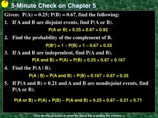
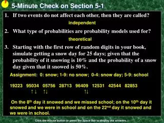
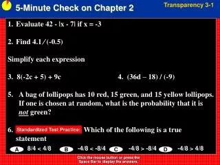
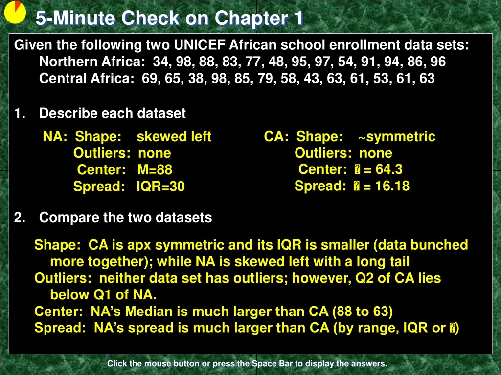
5-Minute Check on Chapter 1 • Given the following two UNICEF African school enrollment data sets:Northern Africa: 34, 98, 88, 83, 77, 48, 95, 97, 54, 91, 94, 86, 96Central Africa: 69, 65, 38, 98, 85, 79, 58, 43, 63, 61, 53, 61, 63 • Describe each dataset • Compare the two datasets NA: Shape: skewed left Outliers: none Center: M=88 Spread: IQR=30 CA: Shape: ~symmetric Outliers: none Center: = 64.3 Spread: = 16.18 Shape: CA is apx symmetric and its IQR is smaller (data bunched more together); while NA is skewed left with a long tail Outliers: neither data set has outliers; however, Q2 of CA lies below Q1 of NA. Center: NA’s Median is much larger than CA (88 to 63) Spread: NA’s spread is much larger than CA (by range, IQR or ) Click the mouse button or press the Space Bar to display the answers.
Lesson 2-1 Describing Location in a Distribution
Objectives • Find and interpret the percentile of an individual value in a distribution of data • Estimate percentiles and individual values using a cumulative relative frequency graph • Find and interpret the standardized score (z-score) of an individual value in a distribution of data • Describe the effect of adding, subtracting, multiplying by, or dividing by a constant on the shape, center, and variability of a distribution of data
Vocabulary • Cumulative relative frequency graph – plots a point corresponding to the cumulative relative frequency in each interval at the smallest value of the next interval; also known as ogives • Density Curve – the curve that represents the proportions of the observations; and describes the overall pattern • Mean of a Density Curve – is the “balance point” and denoted by (Greek letter mu)
Vocabulary cont • Normal Curve – a special symmetric, mound shaped density curve with special characteristics • Percentile – the percent of values in a distribution that are less than the individual’s data value • Standardized Value – a z score • Standardize score – how many standard deviations from the mean the individual value is • Z-score – a standardized value indicating the number of standard deviations about or below the mean
Example 1 • Consider the following test scores for a small class: Jenny’s score is noted in red. How did she perform on this test relative to her peers?
Percentiles • Another measure of relative standing is a percentile rank • One way to describe the location of a value in a distribution is to tell what percent of observations are less than it. • median = 50th percentile {mean=50th %ile if symmetric} • Q1 = 25th percentile • Q3 = 75th percentile Definition: The pth percentile of a distribution is the value with p percent of the observations less than it.
Measuring Position: Percentiles • Jenny earned a score of 86 on her test. How did she perform relative to the rest of the class? Her score was greater than 21 of the 25 observations. Since 21 of the 25, or 84%, of the scores are below hers, Jenny is at the 84th percentile in the class’s test score distribution.
Describing Location in a Distribution • Cumulative Relative Frequency GraphsA cumulative relative frequency graph (or ogive) displays the cumulative relative frequency of each class of a frequency distribution.
Interpreting Cumulative Relative Frequency Graphs Describing Location in a Distribution Use the graph from page 88 to answer the following questions. Was Barack Obama, who was inaugurated at age 47, unusually young? Estimate and interpret the 65th percentile of the distribution 65 11 58 47
Her score is “above average”... but how far above average is it? Measuring Position: vs Average • Consider the following test scores for a small class: Jenny’s score is noted in red. How did she perform on this test relative to her peers?
Standardized Value: “z-score” If the mean and standard deviation of a distribution are known, the “z-score” of a particular observation, x, is: Standardized Value • One way to describe relative position in a data set is to tell how many standard deviations above or below the mean the observation is.
Calculating z-scores • Consider the test data and Julia’s score. According to Minitab, the mean test score was 80 while the standard deviation was 6.07 points. Jenny’s score was above average. Her standardized z-score is: Julia’s score was almost one full standard deviation above the mean. What about some of the others?
Example 1: Calculating z-scores Jenny: z=(86-80)/6.07 z= 0.99 {above average = +z} Kevin: z=(72-80)/6.07 z= -1.32 {below average = -z} Katie: z=(80-80)/6.07 z= 0 {average z = 0}
Statistics Chemistry Example 2: Comparing Scores • Standardized values can be used to compare scores from two different distributions • Statistics Test: mean = 80, std dev = 6.07 • Chemistry Test: mean = 76, std dev = 4 • Jenny got an 86 in Statistics and 82 in Chemistry. • On which test did she perform better? Although she had a lower score, she performed relatively better in Chemistry.
Example 3 • What is Jenny’s percentile? Her score was 22 out of 25 or 88%.
Chebyshev’s Inequality: In any distribution, the % of observations within k standard deviations of the mean is at least Chebyshev’s Inequality The % of observations at or below a particular z-score depends on the shape of the distribution. • An interesting (non-AP topic) observation regarding the % of observations around the mean in ANY distribution is Chebyshev’s Inequality. Note: Chebyshev only works for k > 1
Summary • Summary • An individual observation’s relative standing can be described using a z-score or percentile rank • Z-score is a standardized measure • Chebyshev’s Inequality works for all distributions
5-Minute Check on Section 2-1a What does a z-score represent? According to Chebyshev’s Inequality, how much of the data must lie within two standard deviations of any distribution? Given the following z-scores on the test: Charlie, 1.23; Tommy, -1.62; and Amy, 0.87 Who had the better test score? Who was farthest away from the mean? What does the IQR represent? What percentile is the person who is ranked 12th in a class of 98? number of standard deviations away from the mean 1 – 1/22 = 1 – 0.25 = 0.75 so 75% of the data Charlie; his was the highest z-score Tommy ; his was the highest |z-score| The width of the middle 50% of the data; a single number 1 – 12/98 = 1 – 0.1224 = 0.8776 or 88%-tile Click the mouse button or press the Space Bar to display the answers.
Transforming Data Transforming converts the original observations from the original units of measurements to another scale. Transformations can affect the shape, center, and spread of a distribution.
Transforming Data • Effect of Adding (or Subtracting) a Constant • Adding the same number a (either positive, zero, or negative) to each observation: • adds a to measures of center and location (mean, median, quartiles, percentiles), but • Does not change the shape of the distribution or measures of spread (range, IQR, standard deviation).
Transforming Data • Effect of Multiplying (or Dividing) by a Constant • Multiplying (or dividing) each observation by the same number b (positive, negative, or zero): • multiplies (divides) measures of center and location by b • multiplies (divides) measures of spread by |b|, but • does not change the shape of the distribution
Example 1 • If the mean of a distribution is 14 and its standard deviation is 6, what happens to these values if each observation has 3 added to it? • Given the same distribution (from above), what happens if each observation has been multiplied by -4? μnew = 14 + 3 = 17 σnew = 6 (no change) μnew = 14 -4 = -56 σnew = 6 |-4| = 24
Density Curve • In Chapter 1, we developed a kit of graphical and numerical tools for describing distributions. Now, we’ll add one more step to the strategy. Exploring Quantitative Data • Always plot your data: make a graph. • Look for the overall pattern (shape, center, and spread) and for striking departures such as outliers. • Calculate a numerical summary to briefly describe center and spread. 4. Sometimes the overall pattern of a large number of observations is so regular that we can describe it by a smooth curve.
Density Curve: An idealized description of the overall pattern of a distribution. Area underneath = 1, representing 100% of observations. Density Curve • In Chapter 1, you learned how to plot a dataset to describe its shape, center, spread, etc • Sometimes, the overall pattern of a large number of observations is so regular that we can describe it using a smooth curve
Density Curve • Definition: • A density curve is a curve that • is always on or above the horizontal axis, and • has area exactly 1 underneath it. • A density curve describes the overall pattern of a distribution. The area under the curve and above any interval of values on the horizontal axis is the proportion of all observations that fall in that interval. The overall pattern of this histogram of the scores of all 947 seventh-grade students in Gary, Indiana, on the vocabulary part of the Iowa Test of Basic Skills (ITBS) can be described by a smooth curve drawn through the tops of the bars.
Density Curves • Density Curves come in many different shapes; symmetric, skewed, uniform, etc • The area of a region of a density curve represents the % of observations that fall in that region • The median of a density curve cuts the area in half • The mean of a density curve is its “balance point”
Describing a Density Curve To describe a density curve focus on: • Shape • Skewed (right or left – direction toward the tail) • Symmetric (mound-shaped or uniform) • Unusual Characteristics • Bi-modal, outliers • Center • Mean (symmetric) or median (skewed) • Spread • Standard deviation, IQR, or range
Describing Density Curves Distinguishing the Median and Mean of a Density Curve The median of a density curve is the equal-areas point, the point that divides the area under the curve in half. The mean of a density curve is the balance point, at which the curve would balance if made of solid material. The median and the mean are the same for a symmetric density curve. They both lie at the center of the curve. The mean of a skewed curve is pulled away from the median in the direction of the long tail.
Mean, Median, Mode • In the following graphs which letter represents the mean, the median and the mode? • Describe the distributions • (a) A: mode, B: median, C: mean • Distribution is slightly skewed right • (b) A: mean, median and mode (B and C – nothing) • Distribution is symmetric (mound shaped) • (c) A: mean, B: median, C: mode • Distribution is very skewed left
Uniform PDF • Sometimes we want to model a random variable that is equally likely between two limits • When “every number” is equally likely in an interval, this is a uniformprobabilitydistribution • Any specific number has a zero probability of occurring • The mathematically correct way to phrase this is that any two intervals of equal length have the same probability • Examples • Choose a random time … the number of seconds past the minute is random number in the interval from 0 to 60 • Observe a tire rolling at a high rate of speed … choose a random time … the angle of the tire valve to the vertical is a random number in the interval from 0 to 360
Uniform Distribution • All values have an equal likelihood of occurring • Common examples: 6-sided die or a coin This is an example of random numbers between 0 and 1 This is a function on your calculator Note that the area under the curve is still 1
Uniform PDF P(x=0) = 0.25 P(x=1) = 0.25 P(x=2) = 0.25 P(x=3) = 0.25 Discrete Uniform PDF P(x=1) = 0 P(x ≤ 1) = 0.33 P(x ≤ 2) = 0.66 P(x ≤ 3) = 1.00 Continuous Uniform PDF
Example 2 A random number generator on calculators randomly generates a number between 0 and 1. The random variable X, the number generated, follows a uniform distribution • Draw a graph of this distribution • What is the percentage (0<X<0.2)? • What is the percentage (0.25<X<0.6)? • What is the percentage > 0.95? • Use calculator to generate 200 random numbers 1 0.20 1 0.35 0.05 Math prb rand(200) STO L3 then 1varStat L3
Statistics and Parameters • Parameters are of Populations • Population mean is μ • Population standard deviation is σ • Population percentage is • Statistics are of Samples • Sample mean is called x-bar or x • Sample standard deviation is s • Sample percentage is p
Summary and Homework • Summary • Transformations-- add/sub: moves mean; does not change shape-- multiply: moves mean and changes shape • The area under any density curve = 1. This represents 100% of observations • Areas on a density curve represent % of observations over certain regions • Median divides area under curve in half • Mean is the “balance point” of the curve • Skewness draws the mean toward the tail • Homework • 1, 9, 13, 21, 25, 29