Experimenting with Masthead Designs: Fonts and Colors
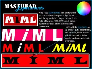
In this project, I explored various fonts and colors to create an appealing masthead. Red became a prominent choice, as it stands out and conveys professionalism. Initially, I added a music note above the "I" in "MIML," but I've come to feel that it detracts from the overall look. I believe that without the music note, the masthead would present a cleaner and more effective aesthetic. This experimentation was essential for finding the right visual identity for my project.

Experimenting with Masthead Designs: Fonts and Colors
E N D
Presentation Transcript
MASTHEAD Experimentss Here I was experimenting with different fonts and colours in order to get the right sort of look for my masthead. As you can see I used red a lot because it looks the best, It stands out from any other colour and looks very professional. MIML Here I added a music note on top of the ‘I’ but it doesn’t really look too good, I think maybe without the music note that specific masthead would look pretty good. M i M L MiML MiM L M I M L