Download
1 / 2
20 likes | 82 Vues
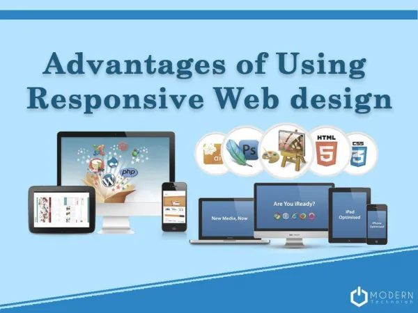
Responsive design is a web design and development technique that creates a site or system that reacts to the size of a user’s screen. Responsive design will optimize a user’s browsing experience by creating a flexible and responsive web page, optimized for the device that is accessing it.

E N D
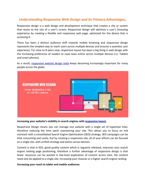
Understanding Responsive Web Design and Its Primary Advantages. Responsive design is a web design and development technique that creates a site or system that reacts to the size of a user’s screen. Responsive design will optimize a user’s browsing experience by creating a flexible and responsive web page, optimized for the device that is accessing it. There has been a distinct audience shift towards mobile browsing and responsive design represents the simplest way to reach users across multiple devices and ensures a seamless user experience. For close to 8 years now, responsive layout has been a big thing in web design with the increasing preference of readers to read news online across multiple devices (i.e. Tablets and smart phones). As a result, responsive website design India keeps becoming increasingly important for many people across the globe. Increasing your website’s visibility in search engines with responsive layout. Responsive Design means you can manage one website with a single set of hypertext links; therefore reducing the time spent maintaining your site. This allows you to focus on link outreach with a consolidated Search Engine Optimization (SEO) strategy. SEO campaigns can be time consuming and costly, but by creating a responsive site, all of your efforts can be focused on a single site, with unified strategy and tactics across devices. Content is vital in SEO, good quality content which is regularly released, improves your search engine ranking page positioning, therefore a further advantage of responsive design is that fewer resources can be wasted in low-level duplication of content across sites, the content need only be applied to a single site, increasing your chances or a higher search engine ranking. Increasing your reach to tablet and mobile audiences
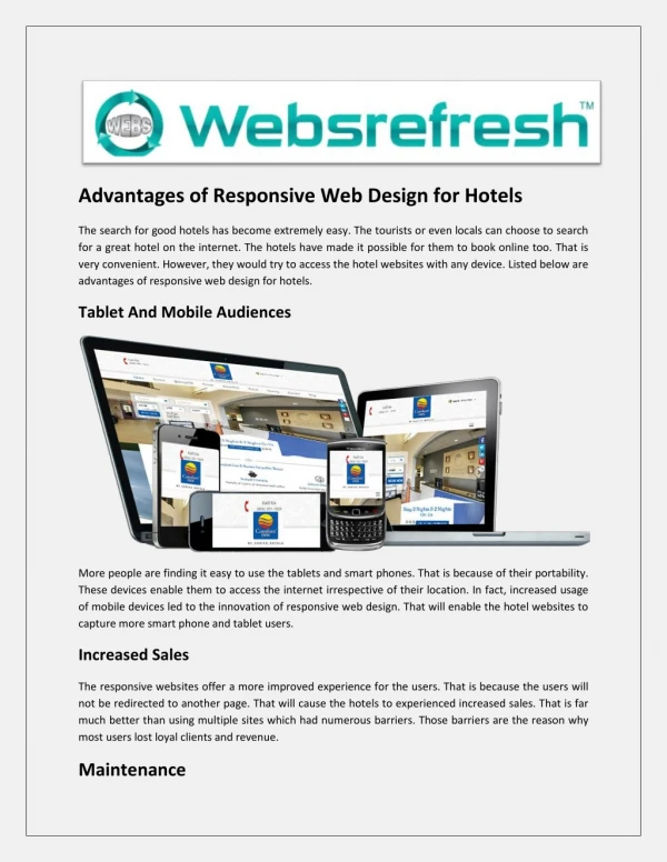
Increasing use of the internet and the proliferation of web applications on tablet and mobile devices has been the driving force behind this development. Traditionally, users would be re- directed to a device specific site (e.g. Mobile), but responsive design means one site can be implemented across devices. With the increase in Tablet sales and smartphone device use exploding, responsive design is key to keeping up ahead of your competitors and establishing market share; content consumption on mobile devices will only continue to balloon as the development progresses.