### Font Design Essentials for Beginners ####
Learn about the fundamentals of typography, from understanding typefaces and styles to font combinations. Discover tips on text alignment, spacing, and effective font usage. Dive into terminology, concepts, and practical applications for designing with fonts. ####

### Font Design Essentials for Beginners ####
E N D
Presentation Transcript
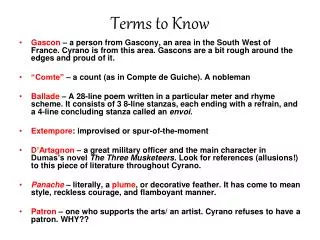
Primer Terms to Know
Primer A few more terms • Typeface – single set of letterforms • Type Family – several font designs representing a range of style variations with a common base • Type style – light, medium, bold, italics, etc… • Baseline – defines the bottom of Capital letters • Character – single letterform or unit • Counter – space enclosed by the strokes of a letter • Case – lower and upper • Ascender, descender, and capline
Primer Text-Alignment Left Right Center
Primer Two Primary Font Categories
Primer Other Categories
Kartira Times New Roman EZREAD
3 Spaces to Consider • Word Space – comfortable readers indicate the space occupied by a lower case “i” is ideal. • Letter Space – natural rhythm in the flow of letters is maintained when the space between two letters is no less than the width of a letter’s stroke. Too much space and there is a disconnect that occurs • Line Space – called Leading is the amount of space between lines. Best at about 120% of font size. Tight lines or Loose lines? EZREAD
AI Tracking
AI Kerning
TheFIT Gill Sans Family
TheFIT Bodini MT Times New Roman
TheFIT Bodini MT Broadway Tahoma
TheFIT Typeface Combinations • When combining two fonts in a design • Match characteristics of form • stroke size • x-height – adjust pt size if needed • Shapes • Use contrast to separate information • Mix families and max the weight • Headings need to pop out at times
TheFIT Stroke, Shape, x-height Britannic Bold Bondini MT
MORE Buying Fonts • Do you really need more than the fonts that came with your computer/printer? • Not really, these can do the trick. • But if you want to expand consider the following 5 font categories • Old style Faces • Sans Serif Fonts • Slab Serif / Egyptian Fonts • Modern Fonts • Transitional Fonts
Drop Caps Wrapping with Text Pull Quotes In the Margin Block Notes Headings/subheadings Behind Background Colors In-Line Headings Bad Hyphenating Lost Line Wrapping Concerns MORE Worth a Mention
MORE Experiment to Convey an Idea
LEARN Activities • Identify Fonts that work together, keep in mind the aspects mentioned in the slides • Type has a voice. Use type to portray the following: • Stress • Excitement • Sadness • Peace • Strength

