Methodology
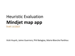
Heuristic Evaluation Mindjet map app Draft 1.8.2013 Vicki Huynh, Jaime Guerrero, Phil Balagtas, Marie-Blanche Panthou. Methodology. Evaluated Mindjet web mapping app based on user-centered design best practices, evaluation criteria and rating scales

Methodology
E N D
Presentation Transcript
Heuristic EvaluationMindjet map appDraft 1.8.2013Vicki Huynh, Jaime Guerrero, Phil Balagtas, Marie-Blanche Panthou
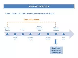
Methodology Evaluated Mindjet web mapping app based on user-centered design best practices, evaluation criteria and rating scales Conducted holistic cognitive walkthrough on task flows for: map creation map editing & topic manipulation file management sharing & co-editing integration Aggregated usability test results from Wildcat Beta & Connect 1.0 usability studies Created recommendations for next steps in design
USER CONTROL User Control: The interface will allow the user to perceive that they are in control and will allow appropriate control. Forgiveness: The interface will make actions recoverable. Predictability: The interface will behave in a manner such that users can accurately predict what will happen next. LEARNABILITY Human Limitations: The interface will not overload the user’s cognitive, visual, auditory, tactile, or motor limits. Consistency: The interface will be consistent. Flexibility: The interface will allow the user to adjust the design for custom use. Technical Clarity: The interface will have the highest possible fidelity. Evaluation Criteria & Rating Scale Weinschenk and Barker classification Susan Weinschenk, Ph.D. in Psychology, and Dean Barker, Software Engineer, developed a series of classifications based on human factors and a holistic approach to the heuristic evaluations. FEEDBACK Responsiveness: The interface will inform users about the results of their actions and the interface’s status. Accuracy: The interface will be free from errors AESTHETICINTEGRITY Aesthetic Integrity: The interface will have an attractive and appropriate design. Simplicity: The interface will present elements simply. Minor usability problem improve product quality but can prioritize under bug fixes No usability problem Major usability problem imperative to fix this before product can be released
1. Map Creation 2. 1. 3.
4. Map Creation 5.
Map Creation Creating new map is discoverable Blank Map option in New Map dialog does not look like a template (no visual representation) *Ribbon commands are disabled when map is opened * Template content can be overwhelming to new users * It isn’t clear whether maps need to be saved or are saved automatically Not sure where the map is saving to User cannot change location where map will be saved to in New Map dialog Lack of “Save As” is not conventional * Indicates most critical issues for the given area
Add an image for Blank Map so that it is represented in the same manner as the other templates (2) • The central topic should be selected by default when a user opens a template (e.g. Blank Map) (3) • Show a Save indicator or button persistently and add the current saved state (or last save time) (5) • Show path along with file name (6) • Label and improve visual treatment for path where file will be saved (7) • Implement Getting Started panel like the one for the desktop app or surface videos buried under Learn More (4) • Prompt for Save location on map creation (7) • Implement another concept that incrementally suggests content to help the user through map creation (4) • Add “Save As” as a way to duplicate or create a new version for a file or don’t follow desktop metaphors that set up incorrect expectations (8) Recommendations Silver Level More design effort, bigger improvements Bronze Level Low effort, quick wins Gold Level Structural changes involved, long term aspirations
2. Map Editing & Topic Manipulation 1. 4. 3. 5.
Map Editing & Topic Manipulation • Difference in action for adding a topic or adding a subtopic is not clear • Adding Topic Elements (i.e. link, attachment, note, image) is easy to find and understand • Adding resource, start date and due date are hidden • *Format section header in Task Pane is misleading • *0% Progress indicator looks like a radio button • Affordance of topic destination while dragging • Delete key does not work on Macs • Shortcuts are hard to find. * Indicates most critical issues for the given area
Change section label from “Format” to “Relationship Format” (4) • Make Delete and Backspace synonymous for topic manipulation and actually remove topics when pressed on Macs (7) • Add existing keyboard shortcuts cues to all commands that apply (in ribbon tooltip, menus, context menu) (8) • Improve the accuracy of the feedback for a dragging topic (6) • Allow ribbon to be customized or rethink how we display Task Info. fields (3) • Have Format Panel be more like an inspector and extend it to cover the properties for other objects such as topics, comments, boundaries etc. (4) • Improve visual design for progress indicator so that it does not look like a radio button. If this change only applied to the web, the effort would be Bronze. Considering it as a cross-platform change brings it closer to Gold. (5) • Show WYSIWYG of topic positions while dragging (6) Recommendations
1. File Management 3. 3. 2. 3. 3. 4.
5. 6. File Management 7.
File Management Opening, duplicating, deleting, uploading , downloading ,renaming and moving a map is conventional Center pane does not reflect all the contents of the selected folder: files are shown but not subfolders *Combination of accordion and tree uses two different selection visualizations User who deletes a file cannot undelete it Opening or switching between maps uses desktop metaphors but does not support multiple documents Version table is in wrong sort order (oldest should be at bottom) *Search does not follow conventional expectations File preview is not available * Indicates most critical issues for the given area
Make mouse-over and selected color for accounts the same color as folders/files (3) • Open new map or different map in a new browser tab (instead of switching) (5) • Sort descending (newest on top) (6) • Show subfolders in the center pane (2) • Allow the deletor to restore (4) • Use web metaphors for opening multiple documents. (Don’t pretend to be like a desktop app.) (5) • Offer file preview (8) • Redesign Search so that it is simpler and conventional (e.g. search is modal; show folder path or allow users to get to it) (7) Recommendations
File Sharing & Co-editing 5. 5. 6. 6. 8. 8. 8. 7.
File Sharing & Co-editing * Inheritance model is not visible to users Can’t share multiple files or folders to multiple people all at once Don’t know whether recipients will get notifications when an item is shared. Assume they will Didn’t realize other users were also viewing (or editing) the same map (while in maps and in files) People are only sorted by last name in Share Dialog and elsewhere List boxes don’t scale for accounts with more than 50 users Newly added user must be found in “Users with access…” list box *Two types of selection in Account User (left) list box but only one works * Co-editing is opaque when it comes to editing and saving * Distinction between members and guests is complicated and ambiguous
Expand presence list by default and make it more visually prominent (4) • Insert new user in the correct sort order in list, scroll into view and select (7) • Synchronize check box and orange highlight (8) • Allow users to share multiple files to multiple people at once (2) • Inform sharer who will be notified (3) • Make a particular list sortable by first or last name or Add a preference for sorting of names(5) • Improve messaging for co-editing (9) • Make inheritance visible or change the model (1) • Allow users to share multiple folders to multiple people at once (2) • Provide more control of notifications for sharer and recipient(s) (3) • Redesign share dialogs (6) • Simplify the model around sharing limits for guests. Display succinct copy about sharing limits and why Guests cannot edit folders. Fully implement business model. (10) Recommendations
Mindjet desktop app. Portfolio-level Integration
Mindjet web app. Portfolio-level Integration
Mindjet mobile app. for Android Portfolio-level Integration
Mindjet mobile app. for iOS Portfolio-level Integration
Mindjet desktop app. Portfolio-level Integration 1.
Mindjet web app. Portfolio-level Integration 1.
Mindjet mobile app. for Android Portfolio-level Integration 1.
Mindjet mobile app. for iOS Portfolio-level Integration 1.
Portfolio-level Integration * Map fidelity between platforms (e.g. desktop to web to mobile) * Saving works differently on different platforms (auto-save on web vs. conventional save on desktop) or in different modes (auto-save for cloud vs. conventional save for local maps) * Desktop expectations allow abandonment (close without save) while editing linked topics will cause permanent, immediate changes to linked topics (SharePoint or Tasks) Files are not synched quickly enough across platforms which leads to the perception that changes were lost. And, on desktop and mobile, the user must hit refresh to see changes * Indicates most critical issues for the given area
Message user that autosave is in effect for maps in the cloud. Use visual indicator to communicate that changes were saved. (2&3) • Map content should be consistent across all platforms (desktop, web and mobile). This could mean removing rarely used functionality. (1) • Implement autosave for desktop when editing local files. Get rid of Save As, etc. (i.e. Abandon all vestiges of the traditional save model in pursuit of a more modern and consistent autosave approach). (2&3) • Improve synching on web client so that changes are “immediately” reflected on other platforms (to other users). (4) Recommendations