Download

1 / 31
310 likes | 711 Vues
Chapter 10 Comparing Two Groups. Section 10.2 Quantitative Response: Comparing Two Means. Comparing Means. We can compare two groups on a quantitative response variable by comparing their means.

E N D
Chapter 10 Comparing Two Groups Section 10.2 Quantitative Response: Comparing Two Means
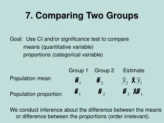
Comparing Means We can compare two groups on a quantitative response variable by comparing their means. What does the difference between the sample means tell us about the difference between the population means?
Example: Teenagers on Nicotine A 30-month study: • Evaluated the degree of addiction that teenagers form to nicotine. • 332 students who had ever smoked were evaluated. • The response variable was constructed using a questionnaire called the Hooked on Nicotine Checklist (HONC) Each HONC score falls between 0 and 10.
Example: Teenagers on Nicotine The HONC score is the total number of questions to which a student answered “yes” during the study. The higher the score, the more hooked on nicotine a student is judged to be.
Example: Teenagers on Nicotine The study considered explanatory variables, such as gender, that might be associated with the HONC score. Figure 10.4 Sample Data Distribution of Hooked on Nicotine Checklist (HONC) Scores for Teenagers Who Have Smoked. Question: Which group seems to have greater nicotine dependence, females or males? Explain your choice using the graph.
Example: Teenagers on Nicotine The study considered explanatory variables, such as gender, that might be associated with the HONC score. Table 10.5 Summary of Hooked on Nicotine Checklist (HONC) Scores, by Gender
Example: Teenagers on Nicotine How can we compare the sample HONC scores for females and males? We estimate by : On average, females answered “yes” to about one more question on the HONC scale than males did.
Example: Teenagers on Nicotine • To make an inference about the difference between • population means, , we need to learn about • the variability of the sampling distribution of:
Standard Error for Comparing Two Means • The difference, is obtained from sample • data. It will vary from sample to sample. • This variation is the standard error of the sampling • distribution of :
Confidence Interval for the Difference Between Two Population Means • Confidence interval for the difference between the population means is is the critical value for a 95% confidence level from the t distribution. The degrees of freedom are calculated using software. If you are not using software, you can take df to be the smaller of and as a “safe” estimate.
Confidence Interval for the Difference Between Two Population Means This method assumes: • Independent random samples from the two groups. • An approximately normal population distribution for each group(This is mainly important for small sample sizes, and even then the method is robust to violations of this assumption).
Example: Nicotine Addiction Data as summarized by HONC scores for the two groups: Smokers: Ex-Smokers:
Example: Nicotine Addiction Were the sample data for the two groups approximately normal? • Most likely not for Group 2 (based on the sample statistics: ) • Since the sample sizes are large, this lack of normality is not a problem
Example: Nicotine Addiction • 95% CI for : • We can infer that the population mean for the smokers is • between 4.1 higher and 5.7 higher than for the ex-smokers.
Interpret a Confidence Interval for a Difference of Means • Check whether 0 falls in the interval. When it does, 0 is • a plausible value for , meaning that it is • possible that . • A confidence interval for that contains only • positive numbers suggests that is positive. We • then infer that is larger than .
Interpret a Confidence Interval for a Difference of Means • A confidence interval for that contains only • negative numbers suggests that is negative. • We then infer that is smaller than . • Which group is labeled ‘1’ and which is labeled ‘2’ is • arbitrary.
SUMMARY: Two-Sided Significance Test for Comparing Two Population Means 1. Assumptions: • Quantitative response variable for two groups. • Independent random samples. • Approximately normal population distributions for each group. (This is mainly important for small sample sizes, and even then the two-sided t test is robust to violations of this assumption).
SUMMARY: Two-Sided Significance Test for Comparing Two Population Means 2. Hypotheses: • The null hypothesis is the hypothesis of no difference or • no effect: • The alternative hypothesis: • (two-sided test) • (one-sided test) • (one-sided test)
SUMMARY: Two-Sided Significance Test for Comparing Two Population Means 3. The test statistic is: Note: change from “z” to “t” in formula
SUMMARY: Two-Sided Significance Test for Comparing Two Population Means 4. P-value: P-value = Two-tail probability from t distribution of values even more extreme than observed t test statistic, presuming the null hypothesis is true with df given by software. • 5. Conclusion: Smaller P-values give stronger evidence against and supporting . Interpret the P-value in context, and if a decision is needed, reject if P-value significance level (such as 0.05).
Example: Cell Phone Use While Driving Impair Reaction Times An experiment investigated whether cell phone use impairs drivers’ reaction times, using a sample of students from the University of Utah. Experiment: • 64 college students • 32 were randomly assigned to the cell phone group • 32 to the control group
Example: Cell Phone Use While Driving Impair Reaction Times Experiment (continued): • Students used a machine that simulated driving situations. • At irregular periods a target flashed red or green. • Participants were instructed to press a “brake button” as soon as possible when they detected a red light. • The control group listened to radio or books-on-tape while they performed the simulated driving. The cell phone group carried out a phone conversation about a political issue with someone in a separate room.
Example: Cell Phone Use While Driving Impair Reaction Times For each subject, the experiment analyzed their mean response time over all the trials. Averaged over all trials and subjects, the mean response time for the cell-phone group was 585.2 milliseconds. The mean response time for the control group was 533.7 milliseconds.
Example: Cell Phone Use While Driving Impair Reaction Times Boxplots of data: Figure 10.6 MINITAB Box Plots of Response Times for Cell Phone Study. Question: Does either box plot show any irregularities that could affect the analysis?
Example: Cell Phone Use While Driving Impair Reaction Times Test the hypotheses: vs. using a significance level of 0.05
Example: Cell Phone Use While Driving Impair Reaction Times P-Value
Example: Cell Phone Use While Driving Impair Reaction Times Table 10.6 MINITAB Output Comparing Mean Response Times for Cell Phone and Control Groups
Example: Cell Phone Use While Driving Impair Reaction Times Conclusion: • The P-value is less than 0.05, so we can reject . • There is enough evidence to conclude that the population mean response times differ between the cell phone and control groups. • The sample means suggest that the population mean is higher for the cell phone group.
Example: Cell Phone Use While Driving Impair Reaction Times What do the box plots tell us? • There is an extreme outlier for the cell phone group. • It is a good idea to make sure the results of the analysis aren’t affected too strongly by that single observation. • Delete the extreme outlier and redo the analysis. • The mean and standard deviation for the cell phone group now decrease substantially. However, the t test statistic is not much different, and the P-value is still small, 0.015, leading to the same conclusion.
Example: Cell Phone Use While Driving Impair Reaction Times Insight: • In practice, you should not delete outliers from a data set without sufficient cause (i.e., if it seems the observation was incorrectly recorded). • It is however, a good idea to check for sensitivity of an analysis to an outlier. • If the results change much, it means that the inference including the outlier is on shaky ground.