Visual Text
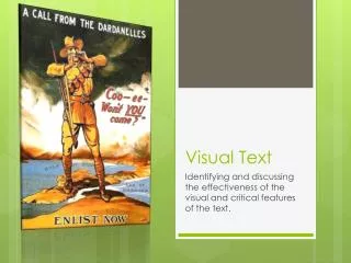
Visual Text. Identifying and discussing the effectiveness of the visual and critical features of the text. Intro. This is one of the propaganda posters advertising Gallipoli to the young Aussie men in the early 1900's, as WWI began .

Visual Text
E N D
Presentation Transcript
Visual Text Identifying and discussing the effectiveness of the visual and critical features of the text.
Intro • This is one of the propaganda posters advertising Gallipoli to the young Aussie men in the early 1900's, as WWI began. • We chose this poster as it is directly involved to the ANZAC's who were enlisting and fighting in the Gallipoli campaign.
Object/Shape/Figures • ANZAC soldier (young male) in the centre making the body gesture that he is calling out for help. • Standing larger than life in between the Dardanelles. • Propaganda text saying 'Enlist Now' in big bold font at the bottom. • A call from a soldier in the Dardanelles, "Coo-ee- won't you come?"
Size • The ANZAC soldier is larger than life being able to stand across Gallipoli and Turkey. • The soldier is wearing typical khaki clothing, a hat and his rifle.
Setting • The setting is over the Dardanelles where all the ANZACs would have been during WWI. • The setting is very dull with earthly colours used for the background.
Colour • The colour scheme is earthly colours which are dry and dull. • The soldier is wearing khaki clothing. • The background is smudges white and black so add to the poster propaganda feel.
Position • The soldier is positioned centre in the foreground and is the only character in the poster. • There is also speech coming from the soldier which is the key object as it is a propaganda poster.
Direction • The soldier is facing us at eye to eye level giving a friendly look and increasing chance of enlistment for the ANZACs.
Angle • The soldier is obviously larger than life and is standing tall and strong. • The audience sees power and authority in the soldier. • We are at equal height to the soldier.
Light • The illustrator uses bring dry lighting to give emphasis the poster and propaganda. • The bring background stands out to a potential viewer. • There is a smudge of dull black and white which shows that the time is neither day nor night.
Body Language • The soldier is looking at us with his hands around his mouth to amplify his call to enlist for the war. • The facial expression is somewhat helpless which will allow the audience to become empathetic and get young Aussie men to enlist. • The body posture is still tall and strong which shows how valiant the soldiers are.
Clothing • The soldier is wearing khaki clothing which was the typical clothing for the ANZACs. • Most Australians can stereotype people who wear khaki because it has cultural significance in our history.

