Visual Text analysis
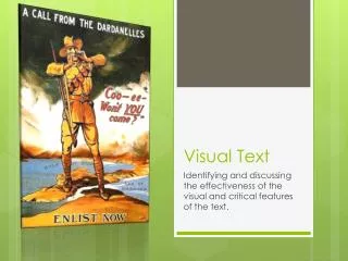
Visual Text analysis. By Walter Wong and James Barker. What this text shows. A Patriotic Australian Soldier, calling upon his fellow country men to join the army and fight in the war. This poster shows us a rather one sided view of the war. . Location of this Poster.

Visual Text analysis
E N D
Presentation Transcript
Visual Text analysis By Walter Wong and James Barker
What this text shows • A Patriotic Australian Soldier, calling upon his fellow country men to join the army and fight in the war. • This poster shows us a rather one sided view of the war.
Location of this Poster • These both show that they are fighting in Gallipoli. The dardanelles is a part of Turkey. And the Gulf of Saros is in Turkey as well. • These visual texts give a young man enlisting into the army a location of the War.
The text within the source • “Coo-ee-” is an old Australian slang for attracting attention, e.g. Hey or Oi. • Both texts requests for men to join the army and fight in the war. • The location of the main text “Coo-ee- Won’t YOU come?” is the main thing that attracts our attention because of the placement of the quote and the color contrast because between the quote and the background. • The words enlist now is put into a strategic position as it is at the bottom and it is in a darker color, which means that it doesn’t seem as important as the first quote. • Although both texts mean the same thing, “Coo-ee- Won’t YOU come?” is a less serious version, and a more casual way of asking to join the army. With this many men would hav thought that the war wasn’t as serious as it was, an d more of a social meeting.
The soldier • The man in the poster is a young fit Australian man, who is fighting in the war. • This poster gives us a representation that the war is just another way for a man to be more masculine. • There is nothing in this section of the poster that suggests that the war is a dangerous and hazardous place to be and that death or the lost of limbs are a result of the war.
Color in the poster • In the poster there is a light and dark section, and the lighter section seems to be surrounding the darker side, which suggests that the Australians are on the winning side of the war. The poster itself isn’t very bright but it uses warm colors. • Warm colors in this picture are used to attract attention • The contrast of colors used make this poster very eye catching. • The use of the colors brown, blue, and white makes it seem like a nice place to be.
Proportion • The size difference between the australian man and the surroundings shows the reader that the Australians are better and the own the rest and it won’t be such a serious place.


