Download

1 / 15
150 likes | 221 Vues
Learn how to calculate range, median, and interquartile range to assess consistency in duck herding times. Explore outliers, comparison methods, and statistical measures for decision-making.

E N D
Find the range Here are Laura and Jo’s duck herding times in minutes: In groups, discuss which girl is more consistent. How did you decide this? • If the scores are spread out then the range will be higher and the scores are less consistent. • If the scores are close together then the range will be lower and the scores are more consistent. The spread is called the range.range = highest score – lowest score
Find the range Calculate the range for each girl to confirm the result of your discussion. 4.31 mins Laura’s range = 9.41 – 5.10 = Jo’s range = 8.52 – 5.15 = 3.37 mins Jo is more consistent. Now calculate the median for each girl. Which girl would you enter into a competition? Why? Remember, the range is not a measure of center. 7.41mins 6.59mins
Range Here is a summary of Chris’s and Rob’s performances in 10 duck herding competitions. Discuss which of these conclusions are correct: • Rob is more reliable. • Chris is better because his median is higher. • Chris is better because his range is higher. • Rob must have gotten a better quickest time. • On average, Rob is faster and more consistent.
Range Here is the original data for Chris and Rob. Set A: 4.26 6.29 5.14 5.17 6.11 3.36 5.54 5.06 4.29 4.31 Set B: 3.52 4.14 4.03 5.09 3.37 4.46 5.55 4.41 3.51 5.42 Use the summary table above to decide which data set is Chris’s and which is Rob’s. • Who has the best time? • Who has the worst time?
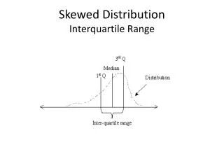
Interquartile range When there are extreme values in the data, it is more appropriate to calculate the interquartile range (IQR). This is the range of the middle half of the data, when the values are written in order. interquartile range = upper quartile – lower quartile The upper quartile is the value that is three quarters of the way along the list. The lower quartile is thevalue that is one quarterof the way along the list. Extreme values in a data set are called outliers.
What is an outlier? An outlieris defined as any data point that is more than 1.5 times the interquartile range(IQR) below the first quartile or above the third quartile. For the set of data values 18, 24, 26, 32, 45, 52, 96 we find the median, Q1, Q3, and the interquartile range in order to see if there are any outliers in the data set. 18, 24, 26, 32, 45, 52, 96 IQR = 52 – 24 = 28 1.5 × IQR = 1.5 × 28 = 42 Q1 median Q3 Q1 – 42 = 24 – 42 = –18 and Q3 + 42 = 52 + 42 = 94. Are there any outliers in this data?What are they?
Girls’ basketball statistics The number of free throw points made by each team member in the most recent season for a girls’ college basketball teamis listed in the table on the left below. Determine the IQR then decide if there are any outliers in the data. Q1 = 15 and Q3 = 65. The IQR = 50 and 1.5 × 50 = 75 So, outliers are values less than (Q1 – 5) or greater than (Q3 + 75). i.e. – 60 > outlier > 140 The data point 142 is an outlier.
Using technology Using the STAT PLOT feature of your graphing calculator and choosing the modified box and whisker graph produces the plot below. It indicates that the number 142 is an outlier. outlier Use the “trace” feature to see the value of the outlier, which is displayed in the bottom corner. Notice that the plot ‘fences in’ the expected data with the outlier lying outside of the ‘fence’.
Interquartile range If there are lots of values in a data set, it is not always easy to find the interquartile range by inspection. In these cases, there are formulas we can use. When there are n values in an ordered data set: n + 1 lower quartile = th value 4 n + 1 median = th value 2 3(n + 1) upper quartile = th value 4
Wife carrying race The table shows the results (in seconds) of a 250m Wife Carrying race held in Finland in 2010 and 2011. Compare the 2010 and 2011 results using the range and interquartile range. Which gives a better summary of the data? Why? 106.4 102.2 162.9 87.7 74.2 72.8 72.8s Interquartile range for 2010: 136.7 – 63.9 = 74.2s Interquartile range for 2011: 139.1 – 64.9 =