Download
1 / 29
290 likes | 454 Vues
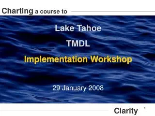
Charting a Course Toward Higher Science and Social Studies GED Scores. Pat Wieseler and Terri Ferris. WARNING: This session contains GRAPH ic information!. Power Point Design By PresenterMedia.com. Who Are We?. Pat Wieseler (507-334-2744, pwieseler@faribault.k12.mn.us)

E N D
Charting a Course Toward Higher Science and Social Studies GED Scores Pat Wieseler and Terri Ferris WARNING: This session contains GRAPHic information! Power Point Design By PresenterMedia.com
Who Are We? • Pat Wieseler (507-334-2744, pwieseler@faribault.k12.mn.us) • 39 years in Adult Education (former manager) • GED, College Prep, Employment Skills, ELL, Training, Myers Briggs, Learning Styles … • One–Room Schoolhouse • On 1 college campus • Loves Social Studies! • Terri Ferris (218-404-3353, terri.ferris@aeoa.org) • 15 years in Adult Education • GED, College Prep, Employment Skills, ELL, Training, Career Assessment • 2 One-Room Schoolhouse sites, 3 College Campus sites • Loves Science!
Session Agenda Data and Graph skills on the 2014 GEDWhich skills cross content? What are the common errors students make on the GED? A look at charts and graphTypes, Uses, Skew, and Misrepresentation of Data 3 1 2 4 5 A brief trip into the world of Statistics Measuring the center of a data set Are you feeling unbalanced?Balancing chemical equations and balance of power Getting the goodsQuestion/answers, classroom strategies, web resources
Data and Graphic Skills for the GED 2014 Cross-Content Skills Use data or evidence to arrive at a conclusion Make a prediction based on data or evidence Put numerical information found in a written source into tables, graphs and charts, and express numerical information in words Show how dependent and independent variables are represented on a graph Calculate the mean, median, mode, and range Analyze how data, graphs, or pictures work in a written source or support an argument at an outstanding level Approx. 50% of the questions on the GED Math test assess Visual Literacy 50%-60% of the Science and Social Studies questions
Most Commonly Missed Charts, Graphs, and Tables Questions on the 2002 GED • Transitioning between text and graphics where candidates read descriptions of events or problems and translate this information into graphical formats or add this information to the data already displayed in a graphic Continued
Most Commonly Missed 2 • Interpreting and comparing graphical data where candidates interpret and compare more than one data set appearing within a graphical illustration Continued
Most Commonly Missed 3 Compare information contained in two or more graphics Continued
Most Commonly Missed 4 Interpreting and selecting tabular data for computation where graphs or tables depict more information than required to answer the question Continued
Most Commonly Missed 5 Identifying how graphs can show different types of information
Charts and Graphs are Used to… Address questions about data collected over time Address questions about numerical data Address questions about Categorical data i.e. Height, Weight, Time, Amount. Most effective way to analyze is by mean, median, and shape Breaks down how many responses were given for each group. Best analyzed by counts and percentages. • Line Plots • Scatter Plots • Stem and Leaf Plots • Line Plots • Bar Graphs • Circle Graphs/Pie Charts • Bar Graphs • Histograms • Line Graphs • Boxplots • Circle Graphs • Line Plots • Circle Graphs • Stem and Leaf Plots Hand-Outs: How to select the right chart for your data Choosing the right kind of graph
Charts and Graphs Used In… Science Social Studies • The majority of graphs published in scientific journals relate two variables • Science uses three types of graphs • Pie/Circle Graphs • Line Graphs (most common) • Bar Graph • Many charts and graphs in science compare dependent and independent variables • Scientific graphs are not drawn in connect-the-dot fashion, lines show “best fit” rather than touching all of the dots • Social Studies uses almost every type of chart and graph • Civics – Uses a lot of tables and political cartoons • Geography – Uses a lot of Maps and line graphs • History – Uses a lot of timelines, line graphs, bar graphs and pie charts • Economics – Uses almost every type of chart, graph, and table
Time Lines A timeline is a way of displaying a list of events in chronological order. It is typically a graphic showing a long bar labeled with dates alongside itself and usually events are labeled on points where they would have happened in time. When showing time on a specific scale on an axis, a timeline can be used to visualize time lapses between events, durations, and the overlap of spans and events. Timelines can use any time scale, depending on the subject and data. Most timelines use a linear scale, where a unit of distance is equal to a set amount of time. • Activity: Social Studies Time Line
Line Graphs (Time Charts) Used to show change (trends) in data over time. Time charts show time on the x-axis (ex: month, year, or day) and the values of the variable(s) being measured on the y-axis (ex: birth rate, population, or total sales). Each point on a line graph summarizes all of the data collected at that particular time. To interpret line graphs, look for patterns and trends as you move across the chart from left to right. Activity: Interpreting Broken Line Graph
Line Plot Used to easily organize one group of data. A Line plot is a statistical graph which represents the data recorded in experiments or surveys. A line plot displays data along a number line where the values are marked as x or any other symbol and they show the frequency. A line plot is very simple and easy to construct, it collects and classifies the data very fast. Activity: Birth Order
Bar Graphs Used when comparing various items or ideas. The most common statistical data display used by the media. Breaks categorical data down by group, and represents these amounts by using bars of different lengths. Uses either the number of individuals in each group (frequency) or the percentage in each group (relative frequency). Hand Out: Graphing and Analyzing Scientific Data
Histograms Used to show frequency and compare items or ideas. Each bar represents an interval of values. A histogram provides a snapshot of all the data, making it a quick way to get the big picture of the data, in particular, its general shape. In a histogram, the bars connect to each other. The height of each bar represents either the number of individuals (frequency) in each group or the percentage of individuals (relative frequency) in each group. You can make a histogram from any numerical set; however, you can’t determine the actual values of the data set (you just know the group where the data falls). Summarize large data sets graphically Compare process results with specification limits
Circle Graph/Pie Chart Great for showing the parts of a single whole. Good when there are only a few categories. All of the pieces put together must equal 100% (or very close to it). Can be difficult for some people, because it is hard to get an idea of how big the piece of the pie really is, so Look for a reported total number of units. Avoid three-dimensional pie charts; they don’t show the slices in their proper proportions. Activity: Ice Cream Flavor Preferences
Scatter Plots Used to determine if a correlation exists between two data sets, and how strong it is. Used to calculate line or curve of best fit. A scatter plot describes a positive trend if, as one set of values increases, the other set tends to increase. A scatter plot describes a negative trend if, as one set of values increases, the other set tends to decrease. A scatter plot shows no trend if the ordered pairs show no correlation. Activity/Hand-Out: Banana Bungee
Tables A table is a means of arranging data in rows and columns. Tables appear in print media, handwritten notes, computer software, architectural ornamentation, traffic signs and many other places. Tables differ significantly in variety, structure, flexibility, notation, representation and use In books and technical articles, tables are typically presented apart from the main text. Activity: Western Europe Today, Interpreting Charts and Tables
Stem and Leaf Plots Used to show frequency; data is grouped according to place value, using the digit in the greatest place. How to make a stem plot Sort data in increasing order Separate each observation into a stem consisting of all but the final digit, and a leaf, the final digit Write the stems in a vertical column, with the smallest at the top, and draw a vertical line to the right of this column Write each leaf in the row to the right of its stem, in increasing order out from the stem
Box Plot (Whisker) Graphs Used to show the range of values as well as the median, quartiles, and outliers; five-number summary is another name for this representation. Can give information regarding the shape, variability, and center of a statistical data set. The median, part of the five-number summary, is shown by a line that cuts through the box in the box plot. Can show whether a data set is symmetric or skewed. A symmetric data set shows the median roughly in the middle of the box. It doesn’t show the shape of the symmetry like a histogram. Taken from GED Ready Math
How Graphs Can Distort Data A statistical Graph can give you a false picture of the statistics on which it was based. For example it can be misleading through its choice of scale on the frequency/relative frequency axis and/or its starting value By using a stretched out scale, you can stretch the truth, make difference look more dramatic, or exaggerate values Truth stretching can also occur if the frequency axis starts out at a number that’s very close to where the differences in the heights of the bars start; you are in essence chopping off the bottom bars (less exciting part) and just showing their tops, emphasizing (in a misleading way) where the action is. Not every Frequency axis needs to start at zero, but watch for situations that elevate the differences Activity: Pick 3 Lottery
How to Identify Skew and Symmetry Sometimes the mean versus median debate can get quite interesting. Especially when you look at the skew and symmetry of your statistical data. Example: Suppose you’re part of an NBA team trying to negotiate salaries. If you represent the owners, you want to show how much everyone is making and how much money you’re spending, so you want to take into account those superstar players and report the average. But if you’re on the side of the players, you would want to report the median, because that’s more representative of what the players in the middle are making. Fifty percent of the players make a salary above the median, and 50 percent make a salary below the median. Hand-Out: Finding the Middle of a Statistical Data Set
Skew and Symmetry (continued) It is best to find and compare both the mean and the median Data sets can have many different possible shapes: • If most of the data are on the left side of the histogram but a few larger values are on the right, the data are said to be skewed to the right. When data are skewed right, the mean is larger than the median. • If most of the data are on the right, with a few smaller values showing up on the left side , the data are skewed to the left. When data are skewed left, the mean is smaller than the median. • If the data are symmetric, they have about the same shape on either side of the middle. With symmetric data, the mean and median are close together.
Separation of Power/Checks and Balances Activity w/ Hand-Outs: Checks and Balances Separation of Power
Balancing Chemical Equations Hand-Outs: Identifying chemical formulas How to Balance Chemical Equations
Visual Literacy Teaching Strategies Hand Outs: Using Graphics, 2014 Science and Social Visual Literacy
Questions What did we miss? What wasn’t clear? What would you like to know more about?