Exploring Graphical Methods in Data Analysis
Learn about graphical versus numerical methods, frequency distributions, and various plots like histograms, box plots, and scatter plots. Understand the importance of accurate data representation.

Exploring Graphical Methods in Data Analysis
E N D
Presentation Transcript
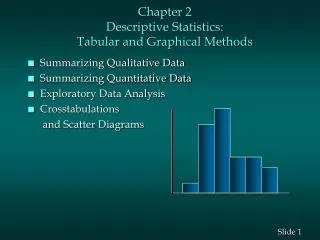
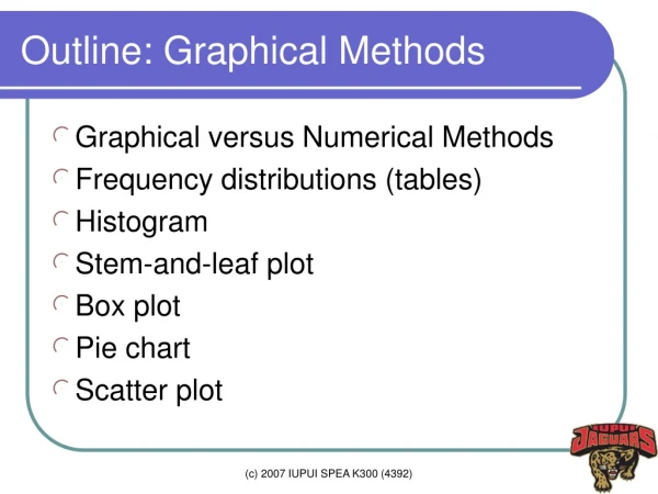
Outline: Graphical Methods • Graphical versus Numerical Methods • Frequency distributions (tables) • Histogram • Stem-and-leaf plot • Box plot • Pie chart • Scatter plot (c) 2007 IUPUI SPEA K300 (4392)
Graphical vs. Numerical Methods • Graphical methods: • Intuitive, easy to understand • Difficult to construct manually • Useful to find overall patterns • Numerical methods: • Require some knowledge • Provide more objective ways of describing data (c) 2007 IUPUI SPEA K300 (4392)
Frequency Table • Class and frequency • Mutually exclusive and exhaustive • Class limits should not overlap • Class should not be omitted • Class limits (boundaries) • Class width • Should be uniform (equal width) • Class midpoint (c) 2007 IUPUI SPEA K300 (4392)
Steps • Determine the number of classes • Find minimum and maximum values • Select the number of classes • Find the limits and boundaries • Tally the data to get frequencies • Relative frequency = freq/N • Cumulative frequency (c) 2007 IUPUI SPEA K300 (4392)
Example • Cereal Calories, question 15 on page 59 • Range: 190 (= 270 - 80) • 5 classes; 50 class width • Class midpoint: 125, 175… class | Freq. Percent Cum. ------------------------+----------------------------------- <=100 | 8 17.39 17.39 100-150 | 14 30.43 47.82 150-200 | 13 28.26 76.08 200-250 | 9 19.57 95.65 250-300 | 2 4.35 100.00 ------------------------+----------------------------------- Total | 46 100.00 (c) 2007 IUPUI SPEA K300 (4392)
Bar Chart (c) 2007 IUPUI SPEA K300 (4392)
Histogram • Continuous vertical bars for density (c) 2007 IUPUI SPEA K300 (4392)
Histogram Polygon, Oglive • Frequency polygon connects midpoints of classes • Ogive is the cumulative frequency graph • Histogram shapes, Figure 2-8 on page 56 (c) 2007 IUPUI SPEA K300 (4392)
Stem-and-leaf plot • Provide much useful information • Sort data in the ascending order • Determine leading digits • Record data by putting their trailing digit • Question 15 on page 79 Stem-and-leaf plot for tax 1* | 2788 2* | 001489 3* | 1367 4* | 148 5* | 0 6* | 0 7* | 6 (c) 2007 IUPUI SPEA K300 (4392)
Box plot • Minimum, maximum • 25th and 75th percentile (1th and 3th quartile) • Mean, medium (c) 2007 IUPUI SPEA K300 (4392)
Pie chart • Degree=(frequency/N)*360 (c) 2007 IUPUI SPEA K300 (4392)
Scatter Plot (Q14 on page 89) • To examine the relationship between two variables • Positive, negative, linear, exponential, … (c) 2007 IUPUI SPEA K300 (4392)
Misleading Graphs • Page 70-73 • Irrelevant scales • Not report units and labels. • Irrelevant type of graphs • Irrelevant perspective (c) 2007 IUPUI SPEA K300 (4392)
Perspectives (c) 2007 IUPUI SPEA K300 (4392)