Download
1 / 27
270 likes | 344 Vues
Develop versatile identities for multi-national clients, create graphic solutions for mergers, and design UI for project management tools. Deliverables include web design, illustrations, brochures, and more.

E N D
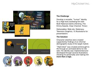
HipCricket Inc. The Challenge Develop a versatile, “human” identityfor a High-tech marketing firm withMulti-National Clients (Hershey, The Emmy Awards, Clear Channel, Timex) Deliverables: Web site, Stationary, Television Graphics, 15 Illustrations for presentations The Solution Character sketches were created supported by findings of an informal demographic study of the target market. “HipCricket” was created and brought to life through an animated demo for the web. His identity was implemented and developed through several illustrations showing his personality and making him more than a logo.
Comcast, GE, NBC Merger Transaction The Challenge Create a simple communicative graphic identity, and “look and feel” that showed how Comcast and GE were partnering to purchase NBC Universal (and the result of that merger). Solution needed to fit the web, timeline, and several fact sheets. The Solution Comcast and GE logos were placed atthe top of the page with a curved line intimating a “new birth” of NBCU. Logos of all companies affected were included underneath the NBCU logo. On the web, to keep everything “above the fold” the logos scrolled across. A simple grey gradient was used as a secondary element to ad interest to the pagewithout clutter.
NWC Companies The Challenge Provide UI/design for for a project management tool for landscaping companies. Three sets of users (Client, Inspector, Contractor) were required to use the interface to communicate work that needed to be done, or was completed. Projects were either Urgent, or on an ongoing basis. Both large and small form browser designs were required. The Solution Interface was broken down into two main tabs: “Work Orders” and “Completed Work” for each of the three user groups. Icons were used to show urgency. Users had the ability to collapse and edit areas in place, as well as sort information through drop down menus.
GlaxoSmithKline A Testimonial Thank you so much for the amazing work on the brochure. Thanks for the flexibility, professionalism, patience, and high-quality work! It is always a pleasure working with your team! This not only conveys the desired information, but also conveys the “feel” I was hoping to capture to generate enthusiasm and “launch” this phase of the curriculum. To top it off, you did all of this in only about a week, which is truly amazing and appreciated. On behalf of our team in Commercial Capabilities, thank you! Deb Marsh Manager, Marketing Capabilities
Viva Physicians The Challenge Design two related sites: 1 VIVA’s main site, and 2 VIVA’s conference site. They didn’t want the sites to be too “clinical or medical looking”. Mobile designs needed to be done for both sites. The conference site had many tertiary elements. The Solution Dark and vibrant red were brought into both sites to tie them together. Abstract imagery, that intimated “vascular” were used in header and background. A secondary navigation, and strong icons were used on the interior pages of the mobile sites. On the conference site home, back and forward buttons were incorporated to allow ease of navigation for pages with tertiary elements.
Inspiring One and All The Challenge The client was very emotionally tied to the piece (being a cancer survivor). She wanted to create something that was nondescript enough that most people could relate to it, yet have it be impacting enough to gain funding for start-up. She wanted both the identity and the brochure to veer away from “cancer survivor” groups and focus on the day-to-day things that people with cancer can do to bring support their livelihood as well as what their support team could do to help. The logo needed to be able to be used as an “icon” that could be applied to merchandise to support the organization The Solution A “gate fold” brochure was created with silhouettes of two people having a dialogue. The brochure was signed off with a letter explaining the cause.
WeInspire.com The Challenge WeInspire.com is the corporate offshoot of Inspiring One and All. The web site needed to be thought through and designed for presentation purposes. The site is customized to individual users, altering content to not only meet their needs, but the needs of theirsupport system. There are three basic user groups:individuals, corporations, and medical professionals. The Solution The site was “architected on the fly” while it was being designed. A personal icon called “GiGi” was created to help act as a virtual concierge for all groups of users. Priorities were set for each individual element and they were placed on the pages accordingly, while retaining consistency through header, footer,and colors.
USAutoShip.com The Challenge Create a “user friendly” environment for a complex navigational system that users will follow through with until they place their order. The Solution The footprint of the graphics was reduced to a bare minimum to allow for the interface to be easily legible. The interface was broken down into simple steps and color was used to emphasize the different areas. An animated demo was added to explain the entire process of shipping a vehicle, including external elements outside ofthe site.
Work Options Group The Challenge They needed to consolidate their web site and collateral into a solid identity that was reflective of the professional stature of their client base. The Solution A “postit” concept was pulled throughweb, e-flyers, brochures and posters, and a key card for a large conference regarding back-up care. This enabled us to keep existing identity and color palette, adding a new element that explained the company’s purpose, and spoke to the need of employers.
Work Options Group Brochure Key Card Posters
Bright Horizons The Challenge Show available cases to be staffed by providers of daycare. Each case could have many or few sessions, and and a provider could be “requested”. Providers could have room for some of the dependents, or some of the sessions, but not all. The Solution All cases were listed in one table, to give the provider the opportunity to compare sessions. Color coding was used to show if the provider was “requested”. A “partial space” button was added. Mobile screens were also developed.
Retail University The Challenge Develop an identity, e-newsletter(via PDF attachment) and web-site for a new program to supplement an existing business. The intention of the new program was to offer classes in Retail Marketing to gain exposure and connections, driving business back to the main company. The Solution We wanted the pieces to look scholarly but not stiff, and to clearly show the retail orientation. By combining a “notebook” theme with a barcode, we were able to convey both ideas with one graphic, leaving the pages clean and legible,while still conveying the point.
USAutoShip.com The Challenge Create a “user friendly” environment for a complex navigational system that users will follow through with until they place their order. The Solution The footprint of the graphics was reduced to a bare minimum to allow for the interface to be easily legible. The interface was broken down into simple steps and color was used to emphasize the different areas. An animated demo was added to explain the entire process of shipping a vehicle, including external elements outside ofthe site.
JEG Search Marketing Flyer
Edupoint The Challenge Revise existing UI to make user experience faster and more intuitive. The Solution The left navigation was made collapsible with a pullout menu for subcategories. Students list was repurposed to allow show which courses were available for a particular student.
homewise The Challenge Revise existing site for large Non-profit in Santa Fe, NM with a broad client base. Client wanted to simplify the navigation as well as “humanize” the feel of the site. They needed to streamline their process of data collection from users (which was a downloadable PDF file that users needed to mail and then Homewise would put into their database manually) The Solution Navigation was broken down into 4 main sections. Photos and testimonials of clients were included throughout the site. The site was built in DNN, offering the client the ability to update it regularly, and custom form modules were developed to allow users to submit data that was added to their database as well as sent in PDF format to the Admin.
For Broadstreet – Pitch to Johns Hopkins The Challenge A big part of the look and feel for Johns Hopkins new wings are the windows that were designed by Spencer Finch. We wanted concepts that were reflective of that for the collateral used for the opening of those wings. The Solution We came up with three concepts that utilized thecolors from the windows in three very different ways. Finche’s windows
Down To Earth Landscapes The Challenge Create an earthy, tactile identity to be used for website and other collateral The Solution We had so much fun! Everything and anything went straight onto the scanner.
PPT for Upfront for Current TV The Challenge Visually represent the “Market Gap” in the television industry and show where Current TV fits in. The Solution By using a grid of screens to start the presentation, we showed how saturated the market is. We then divided the screens into different categories and showed logos for the main networks. We combined the logos into a “blob” and went into “static screens”. The term “REAL REALITY” was used to describe Current’s genre.
Scrivner Financial Services The Challenge Utilize an existing identity in an elegant manner, to create a site that spoke individuals regarding financial planning. The Solution Colors from the existing identity were used throughout the site, and a tree motif was used to signify growth.
Todd Financial Group The Challenge Create an online identity that was both fun and spoke to financial clients, large and small. The Solution Obviously… the goose that laysthe golden egg.
Bright Horizons The Challenge Take a complex interface that users are familiar with and revise to allow users to manage multiple tasks at one time The Solution Wherever possible, we used “docking” to allow the user to customize their own workspace. Taxonomy was reviewed, simplified and revised.
Blue Black Group The Challenge Utilize existing identity to create an online presentation to draw in new clients andas a follow-up and conclusion to sales pitches. The client is a multi-national branding firm. They wanted to convey their pragmatic marketing experience in a creative, yet understated way. The Solution Flash animation and sound were used on the home page to pull the interest beyond, just a text statement. The information and design is in itself “pragmatic”, clear, concise, and simple. This was not a site to add “bells and whistles” to, and we recognized this from the beginning.
Bristol Myers Squibb The Challenge Create training modules that incorporated lengthy video and quizzes to be used to train sales reps for Orencia. The modules were created in 5 languages and tied in with a centralized LMS The Solution Videos and quiz segments were broken down into manageable sized chunks, and emphasis was given to the videos by overlaying quiz questions on top of stills
Revise Your Website The Challenge Create a tagline, identity, and website for a start-up business revolved around editing copy on websites. The client wanted to convey that although people have spell check on their computers, they often use the wrong word, such as “They’re” vs. “Their”. The Solution “Write right.” Concise, simple… And a complete sentence.
Linda Durham Contemporary Art The Challenge LDCA is one of the most active galleries in Santa Fe, New Mexico, offering amulti-artist show every month featuring new work that needed not only to be added to the web site, but held in an easily accessible database. It needed to be updated and maintained by gallery staff, with particular attention to aesthetic. The Solution A CMS using DNN was created so that LDCA staff members could edit the site on their own. This saved them apx. $1000 / mo. on web designer fees. It also allowed them to be able to organize digital files of artists’ work. We created a visual design for the site that was versatile enough to allow for variation on the number of pieces an artist was showing, yet templated enough to keep the design consistent while being “touched by many hands”.
Perimeter Marketing Company The Challenge Create a site that acted as a virtual sales pitch as well as a tool that enabled the companies clients to proof designs online, and allow their printers and executives to upload and download files. The Solution A Flash presentation was used on the home page to draw attention to the message of how prospective clients could improve their sales. A CMS was put in place that allowed the organization of files and editing of the site. Their clients could approve of the proofs online via a checkbox.