School Magazine Research
Explore insightful articles, captivating stories, and colorful features in our latest school magazine. Stay updated with the release date, lead story, and secondary stories. Engaging content for students, parents, and educators.

School Magazine Research
E N D
Presentation Transcript
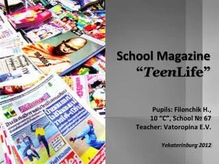
School Magazine Research By Abigail Kirby
Masthead School Logo Transparent, background image Publish Date Lead Story Secondary Stories Extra Information Main Image
C - The colours on this magazine clash with each other and we can see that no particular colour scheme has been followed. Less important information on the magazine are in brighter colours making them catch your attention more, whereas the title and leading story do not grasp our attention. The titles and information regarding the second stories also do not follow a similar colour scheme so we do not associate them with each other. Some of the text have a different colour outline whereas other don't. F – The font used on the masthead does not catch our attention as much as the leading story because it is only a plain font, it is not bold and does not include capital letters. The fonts on the other text vary from a more plain hard font to scroll type fonts. Secondary stories have different fonts making the magazine look unorganised. I - The transparent background is a picture of two people taken from a low angle. As we cannot see the people due to back lighting we have no indication that the image can actually be associated with the school. An image of a building has also been used as a background which is behind the transparent image, although the transparent image is badly chosen, the two images match well due to the colour of the building and the colour of the sky. The final image of the two people had been badly cropped, we can see that it is not on it’s original background as we can see a white outline from the original image. L – There is one leading story and two secondary stories on the magazine, We have been informed of the release date, what will be included in the magazine and the page number that the leading story will be on. L – There are three images placed upon each other, the layout of the images isn’t bad if they had put more effort into cropping and deciding on the right images. The placement of the secondary stories are to the side of the main image which is well presented. The leading story is bigger than the masthead and catches your attention more than the masthead, it is slanted at an angle making the magazine looks un professional and unorganised.
C – There are few colours used on the front cover of this magazine, The colours do not clash, unlike the other magazine each section of text follows the same colour scheme which makes the magazine look more organised. The more important text such as the leading story and the masthead have a white outline so that they catch your attention more. F – The fonts used on the magazine are plain. Most of the text in the magazine are in the same font, this also allows the magazine to look organised. The masthead has three different fonts for each word, the word ‘Parent’ is in a more italic font to emphasise that the magazine is for both parents and students, ‘And’ is in a plain font as it is a less important information, it is a connective so it is less needed than the other two words. The word ‘School’ is the only word in a san serif font to show that the school is formal, perhaps a private school. I – There is a simple image used on the magazine, the background behind the boy has been faded as it is not the main focus of the magazine but we are still able to associate it with a school. The leading story can be linked with the image as we can see that he is in a science lab due to the equipment. L – There is a leading story and several secondary stories, we are informed on what will be involved in the magazine and the date the magazine is published , the language is simple there is very little extra information in each story. L – the layout of the magazine is very organised. There is one main image with the leading story to the side of it, the masthead is above the image and catches your attention straight away. There is also a creeper at the bottom of the magazine which holds the secondary stories, this is a well presented way of informing the reader of the contents of the magazine.
C – There are few colours on this magazine cover, they do not clash with each other. The yellow colour of the ball is eye catching. The more important information such as the leading story and the title are both the same colour red making them stand out, the less important information such as the secondary stories are white. The red masthead and creeper matches the colour of the bib for the school teams. F – All fonts in the magazine are san serif as the magazine is about sport having a more formal font would not match. The font size of the masthead is much bigger than the other information as it is meant to catch your attention more. The information on the page numbers and there content is in a plain font most probably Calibri,. I – There is also only one main image on this magazine much like the last one, there is no effect on this image unlike the image in the last magazine which has a blur affect. Although there are no effect used on the image it still looks well presented. We are able to focus on different aspects of the image, we look at it as a whole instead of different sections . L – There is a lot of unnecessary information on this magazine front cover, we do not need to know the page number of each piece of content within the magazine. There is a leading story but no secondary stories. We are informed of the issue number and when it has been released. L – The magazine is well laid out therefore well presented, an image has been used that relates to the magazine’s leading story, the masthead is eye catching.