Crosstabs
Understand the relationship between two variables using crosstabulation. Learn to create and interpret tables with percentages, not just case counts. Analyze data with SPSS. Explore hypothesis testing through meaningful cross-tab presentations. Enhance analytical skills and demonstrate clear, precise writing.

Crosstabs
E N D
Presentation Transcript
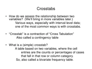
Crosstabs • How do we assess the relationship between two variables? (We’ll bring in more variables later.) Various ways, especially with interval-level data; one of the most common ways is with crosstabs. • “Crosstab” is a contraction of “Cross Tabulation” Also called a contingency table • What is a (simple) crosstab? A table based on two variables, where the cell entries are the counts or percentages of cases that fall in that row or column category. So, also called a bivariate frequency table.
WARNING: • There’s going to be a lot coming at you (in class). • It requires paying attention, thinking (wow!). • But—it only involves percentages, so no complicated “statistics” (yet).
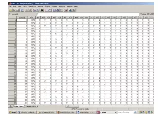
We begin with the observations (persons). A file of about a thousand people would have data like this (except that Gender and Watching TV would be coded using numbers). You would create the cross-tab (presumably using SPSS—these are real bears to do by hand). An example: gender & tv watching
Are Women More Likely to Watch Than Men? • You might want to ask the question: are women more likely to watch this particular tv program than men are? • So, you display the data in a crosstab (in this case a 2x2 table). • But how do you read it?
Almost without exception, you want to look at percentages rather than numbers of cases. • But, which way to percentage? • Add to 100% within categories of the iv. • In the way that makes sense for the question at hand. (Requires thinking.)
Note I’ve percentaged the total row or col. Not necessary, but often useful, and it’s done automatically by SPSS. I’ve used whole numbers. Nothing about creating tables defines accuracy level. Don’t overdo accuracy.
Which way is correct? • Recall: Dv is the one we’re trying to explain. Iv is the one used to explain the dv. The question we are asking is: are women more likely to watch this particular tv program than men are?
Burning question • Does it make any difference which variable makes up the rows, and which the columns? • No. There’s no agreed-upon convention for whether the iv goes in the rows or columns (text notwithstanding). BUT • If you switch row and column variables, then which percentages are right (for your question) will also change.
More analytical matters. Illustration: Do different careers attract different partisans? (class survey) • Are Democrats or Republicans more likely to go into: • Law? • Politics? • Business? • Academia?
Party ID * Career Recode? Note small # of cases in some rows. Also, are Ind and Other different? DKs? Delete or combine with other rows?
More analytical matters (cont.) • These are analytical matters. Don’t make meaningless combinations just because of small N’s. Keep in/delete “don’t knows” depending on your reasoning about them. • Suppose we decide to keep DKs and combine the three smallest categories.
Recoded • Table is simpler, easier to read. • More meaningful because it doesn’t make distinctions we aren’t really interested in.
Final analytical matter • How much of a difference is enough to be meaningful? Important question For now, see Weisberg et al. reading, pp. 211-12. You might want to look at this when doing your data assignment.
Presentation matters • DO NOT USE SPSS OUTPUT DIRECTLY Reformat as necessary Provide meaningful labels Give it a title Show n’s, %s, not cell counts • Can be easily done in MSWord (maybe other ways as well)
Data Analysis #1Due one week from today (by ind’s, not pairs) • Directions are on the syllabus • Describe a hypothesis (NES or GSS). Tell us why this hyp makes sense. Thoughtfulness is rewarded. (Dem’s more often voted for Gore is not that thoughtful.) • Discuss the opera’zation of your concepts. Tell us how you operationalized your variables, but also why. Tell us about measurement problems.
Generate an SPSS cross-tab to test your hypothesis. Percentage the table properly. Presentation as noted earlier. • Explain the table: is your hypothesis supported? (More than “yes” or “no” is required.) Note possible alternative explanations.
Usually ≤ 3 pp. (double-spaced) + table Table should go on a separate page. • Writing is important. Use clear, straightforward prose (you are not writing a novel). Proper grammar; correct spelling, punctuation, and capitalization; typo- free