Visualizing Data and Communicating Information Larry Jerome: Data Architect KIPP DC
370 likes | 387 Vues
Learn the process of developing visualizations, identifying your purpose, choosing the right metrics, chart types, and enhancing visualizations for clear communication. Improve data visualization skills.

Visualizing Data and Communicating Information Larry Jerome: Data Architect KIPP DC
E N D
Presentation Transcript
Visualizing Data and Communicating Information Larry Jerome: Data Architect KIPP DC
Introductions • Name • Organization/Role • Most commonly used platform (e.g. excel, R, Tableau, Qlik, etc. ) • What are you currently working on or what’s currently challenging you?
What is data visualization? A primary goal of data visualization is to communicate information clearly and efficiently to users via graphics, plots, information graphics, tables, and charts Source: Wikipedia; Jen Underwood: Business Intelligence and Predictive Analytics, April 10, 2013
What is data visualization? Two basic types of visualization Source: Wikipedia; Jen Underwood: Business Intelligence and Predictive Analytics, April 10, 2013
Identifying Your Purpose What questions do you need to answer? • Who is your audience? • What questions do they have? • What action will be taken? Source: Rebecca Vichniac: KIPP Data Summit, June 2014
Identifying Your Purpose: Who is your audience • Role: what decisions do they make? What questions do they need answered? • Work flow: in what context will it be used? What information is needed regularly? How much time do they have? • Comfort and skills: how sophisticated are they with using the data? Do they enjoy digging into the numbers? • Business and data expertise: How familiar are they with the metrics? Do they understand where the data comes from? Are they familiar with the organization and terminology? Source: Rebecca Vichniac: KIPP Data Summit, June 2014
Choosing the right metric The Perfect Metric • Align to organizational mission or strategy • Identify specific, quantifiable outputs/outcomes • Establish targets against which results can be evaluated Actionable
Choosing The Right Metric: Evaluating Metrics Source: Rebecca Vichniac: KIPP Data Summit, June 2014
http://goo.gl/r0tNYN Choosing The Right Chart Type
Choosing The Right Chart Type: Comparison • Among Items • Over Time
Choosing The Right Chart Type: Distribution • Single Variable • Two (or more) Variables
Choosing The Right Chart Type: Composition Changing over time • Static
Choosing the right chart type: Relationship Comparison of two or more sets of values
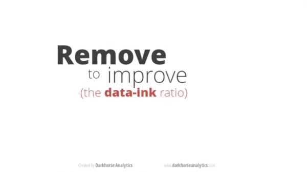
Enhancing Visualizations Use Complimentary Colors for Comparisons
Enhancing Visualizations Identify Groups of Attributes Use fewer than 6 colors
Enhancing Visualizations Highlight Metric Patterns Less saturation: small values More saturation: larger values
Enhancing Visualizations: Color Saturation Add Size to Emphasize Metric Trends
Best in Data Visualization Larry.Jerome@kippdc.org @larryfredjerry • Dadaviz.com • https://public.tableau.com/s/gallery • http://www.tableau.com/learn/whitepapers • http://www.perceptualedge.com/blog/ • http://www.edwardtufte.com/bboard/q-and-a • Fivethirtyeight.com • Qz.com • Vox.com • NYT Upshot