Download
1 / 10
100 likes | 192 Vues
A trendy music magazine focused on R&B genre with exclusive features on artists like Usher, Beyoncé, Rita Ora, and more. Targeted at ages 16+, offering insights into the latest R&B hits and artist interviews. The captivating cover features a female artist, with a minimalist design in coral colors and silver accents, exuding sophistication and intimacy. Dive into the world of R&B with "That Sound" and explore the musical journey of top R&B stars.

E N D
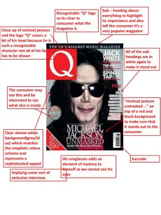
Sub – heading above everything to highlight its importance and also tell the consumer it’s a very popular magazine Recognizable “Q” logo so its clear to consumer what the magazine is Close up of michaeljackson and the logo “Q” covers a bit of his head because he is such a recognizable character not all of his face has to be shown All of the sub-headings are in white again to make it stand out The consumer may see this and be interested to see what else is inside “michealjackson unmasked …” on top of a red and black background to make sure that it stands out to the consumer Clear almost white background(grey/blue) which matches the simplistic colour scheme and represents a sophisticated appeal His sunglasses adds an element of mystery to himself as we cannot see his eyes barcode Implying some sort of exclusive interview
The magazine is so recognizable that Janet Jackson can cover the bottom half and consumers will still recognise what magazine it is Name of the model on the front cover and then under her name in black it says “likes to watch” which will get the consumers interested because they’ll want to know what exactly it is she likes to watch Exclusive story about busta rhymes to get the consumer interested Interests any video game lovers “15” in big and bold to get the consumers attention Mid-shot with a pale silver background Sub headings listed on the bottom left hand corner in pale pinks and baby blues to make them stand out also done in bolds to again make it stand out The consumer sees this and wants to purchase the magazine because they want to see what exposure lies inside the magazine List on the bottom right corner of famous artists barcode Slightly seductive as the saying goes “sex sells”
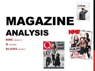
R&B also known as rhythm and blues started in the 1940’s with artists such as Andy Kirk, Freddie Slack and Joe Liggins. The term R&B was originally used by record companies to describe recordings marketed predominantly to urban African Americans, at a time when "urbane, rocking, jazz based music with a heavy, insistent beat" was becoming more popular. The meaning soon shifts in the early 1950s, the term rhythm and blues was frequently applied to blues records. Starting in the mid-1950s, after this style of music contributed to the development of rock and roll, the term "R&B" became used to refer to music styles that developed from and incorporated electric blues, as well as gospel and soul music. By the 1970s, rhythm and blues was used as a blanket term for soul and funk. In the 1980s, a newer style of R&B developed, becoming known as "Contemporary R&B". Marvin Gaye Stevie Wonder The Shirelles Etta James Well known starts in the 21st century: Ashanti Usher Chris Brown Melanie Fiona
USHER "OMG", which features will.i.am, is the third official US single and the first international single. It reached number-one in Ireland, New Zealand, the United Kingdom, Australia and the United States. he has currently released a single “Climax”. BEYONCE Former member of the very successful girl group Destiny’s Child. She is now having a very successful solo artist with her hits “me myself & i” and “end of time”. Especially her world wide dance with the song “Single Ladies” RITA ORA A new artist signed by Jay Z has smashed the charts with her single “Hot Right Now”. She has now released her new single “R.I.P” featuring TinnieTempah
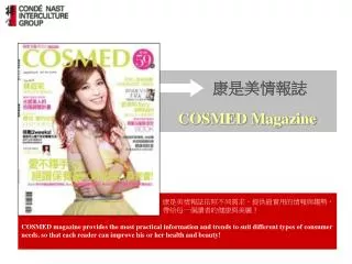
My music magazine will be focused on the genre of R&B , it will be aimed for an audience of 16 + seeing as at this age most people discover the genre they prefer to listen to and also seeing as the music at times can be quite explicit. The name of my magazine will be “that sound” with a sub heading following saying “that you just cant get enough of …”. The reasons I have chose this is because I feel as though it really connects to the idea of being the name of a music magazine hence the word “sound”. And then also the sub heading “that you just cant get enough of…” which is meant to be the ending of the sentence , so its “that sound, you just cant get enough of”. My focal image will be a female model that I am using she will be the female artist that this issue of the magazine is based on. Reason being I feel that these days when you think of R&B you think of the upcoming female superstars like beyonce , rihanna , jenniferhudson and so on so I feel using a female is a good idea. I want the consumer to feel some sort of intimacy with the “artist” so I'm going to use a mid – close up shot at an eye level angle. I want to use coral colours so pale pinks and silvers , very simple make up with a bit of brown eye shadow to emphasis my models blue eyes. For mise-en-scene I want my model to be leaning on a wall of some sort. I want a very simple cover and I feel as though using coral colours and a simple wall will give me the simplistic feel I'm looking for. I will be using short big cell lines to entice my audience, combined with the simple cover it should correspond quite nicely. On my contents page I will have all the things featuring in the issue of the magazine and in my double page spread ill have my “artist” being interviewed and some special bonus questions given by her fans. For a double page spread I need a main image and then another image I may fade the image slightly , full length shot with occupies one half of the page so I can wrap the text around the image.
I felt like this was sofisticated and gave the magazine a feminine feel since the front cover model was feminine it seemed appropriate. But then I thought to myself its ment to be a uni-sex magazine and having this font may mis-communicat this. And then I opted to do something a bit more mascaline so I chose this font which seemed to communicate a uni-sex feel. However I felt this wasn’t recognizable enough for my magazine I needed something that could stand out and be recogniseable as a brand. So I then went for something a bit more different, something not really seen before. This font is uni-sex and different which Is exactly what I'm going for so I feel to use this would be appropriate, and the I came across something different that I felt would be much more better…