Fuzzy Traffic Light Method
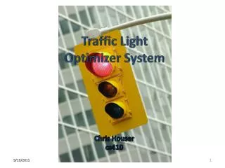
Fuzzy Traffic Light Method. A Presentation by William Silvert, Ph. D. Lisbon, Portugal. Standard Traffic Lights. Each Indicator is represented by a single traffic light, red, yellow or green. There is no smooth transition, just two sharp lines separating red-yellow and yellow-green.

Fuzzy Traffic Light Method
E N D
Presentation Transcript
Fuzzy Traffic Light Method A Presentation by William Silvert, Ph. D. Lisbon, Portugal
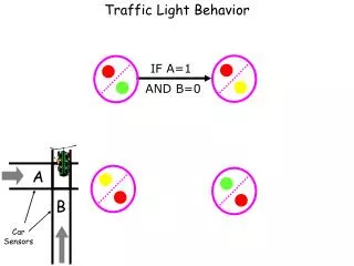
Standard Traffic Lights • Each Indicator is represented by a single traffic light, red, yellow or green. • There is no smooth transition, just two sharp lines separating red-yellow and yellow-green. • The meaning of the lights can be very sensitive to the location of these cuts.
Criteria for Improvement The objective is to develop a more general approach with the following characteristics: • Resolution • Uncertainty • Weighting
Resolution • The most serious problem with the standard traffic light method is the way that the lights change discontinuously when the Indicators change smoothly. • There is general agreement that there must be a more gradual representation of the significance of changing indicators.
Uncertainty • A less obvious point, but one which is clearly relevant to fisheries management, is the need to represent the degree of uncertainty in the interpretation of Indicators, and to provide a mechanism for expressing conflicting evidence or interpretation.
Weighting It is also clear that not all Indicators are equally significant. They can be: • Of varying accuracy • Of different relevance • Of dubious value • New and untested
Alternative Approaches • Most alternatives to the standard traffic light method use some sort of averaging to show that an Indicator is on the border between red and yellow or between yellow and green. • One example is using intermediate colours, such as orange between red and yellow.
Fuzzy Traffic Lights • Fuzzy Sets offer one way to improve the standard traffic light method. • With fuzzy traffic lights an Indicator can correspond to more than one light. • For example, instead of using orange to show that an Indicator is on the red-yellow boundary, we can simply show both red and yellow lights.
Advantages of Fuzzy • Fuzzy traffic lights are continuous, we can switch between colours gradually to achieve higher resolution. • Fuzzy traffic lights show uncertainty if we illuminate several lights at once. • Fuzzy traffic lights can be weighted to show relative importance of indicators.
Memberships • The key idea behind Fuzzy Set Theory is that something can belong to more than one set at a time. • When we say that a light is red, that means that it belongs to the set “red”. • With fuzzy sets we can have a light be 50% in set red and 50% in yellow.
Displaying Fuzzy Lights • There are several ways to show a fuzzy traffic light: • Bubble charts, which look a lot like real traffic lights • Pie charts, which display information more quantitatively • Stacked bar graphs, which are less familiar but very effective
Bubble Charts • A Bubble Chart looks like a regular traffic light, but the sizes of the ”lights” are proportional to the membership in each of the three sets, red yellow & green.
Pie Charts • A pie chart looks less like a traffic light, but it gives a more quantitative picture of how much of each light is lit, • The area of each slice represents the fuzzy membership.
Stacked Bar Graphs • A stacked bar graph is somewhat like a traffic light with rectangular bulbs. • The area of each part of the bar represents the membership in the corresponding set.
Choosing the Display • The bubble chart resembles traffic lights most, but it does not give a good sense of the quantitative information about memberships. • The pie chart and the stacked bar graph both represent the relative memberships clearly.
Displaying Weighting • The bubble graph does not give a good idea of the relative weights of the different Indicators. • By varying the diameter of the pie charts or the width of the bar graphs we can show the relative importance of different indicators.