Master CSS3: Advanced Techniques & Selectors Overview
Explore the latest in CSS3 with detailed selectors, fonts, colors, and backgrounds. Learn animations and UI states in this comprehensive guide to advanced CSS3 features.

Master CSS3: Advanced Techniques & Selectors Overview
E N D
Presentation Transcript
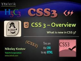
CSS 3 – Overview What is new in CSS 3? Nikolay Kostov Telerik Corporation www.telerik.com
Table of Contents • What is CSS 3? • Selectors • Fonts • Colors • Backgrounds • Borders • Box Model • Animations
What is CSS 3? • Cascading Style Sheets level 3 is the most recent iteration of CSS • It is divided into several separatedocuments called "modules" • CSS 3 has not been approved as a specification, but there are already a lot of properties that are supported in various browsers. • The earliest CSS 3 drafts were published in June 1999
Attribute Selectors • E[foo^="bar"] • An E element whose "foo" attribute value begins exactly with the string "bar" • Example: a[src^="https://"] • E[foo$="bar"] • An E element whose "foo" attribute value ends exactly with the string "bar" • E[foo*="bar"] • An Eelement whose "foo" attribute value contains the substring "bar"
Attribute Selectors Live Demo
Structural Pseudo-classes • :root • The root of the document • E:nth-child(n) • An E element, the n-thchild of its parent • E:nth-last-child(n) • An E element, the n-thchild of its parent, counting from the last on • E:nth-of-type(n) • An E element, the n-th sibling of its type
Structural Pseudo-classes (2) • E:nth-last-of-type(n) • An E element, the n-thsibling of its type, counting from the last one • E:last-child • An E element, last child of its parent • E:first-of-type • An E element, first sibling of its type • E:last-of-type • An E element, last sibling of its type
Structural Pseudo-classes (3) • E:only-child • An E element, only child of its parent • E:only-of-type • An E element, only sibling of its type • E:empty • An E element that has no children (including text nodes) • More detailed descriptions: http://www.w3.org/TR/css3-selectors/#structural-pseudos
Structural Selectors Live Demo
The UI Element StatesPseudo-classes • E:enabled • A user interface element E which is enabled • E:disabled • A user interface element E which is disabled • E:checked • A user interface element E which is checked (for instance a radio-button or checkbox) • Currently supported only in Opera!
UI Selectors Live Demo
Other CSS 3 Selectors • E:target • An Eelement being the target of the referring URI • E:not(s) • An Eelement that does not match simple selector • E ~ F • An Felement preceded by an E element
Other CSS 3 Selectors Live Demo
Font Embeds • Use @font-faceto declare font • Point to font file on server • Call font with font-family • Currently not supported in IE • Use font embedding instead of images @font-face { font-family: SketchRockwell; src: url('SketchRockwell-Bold.ttf'); } .my_CSS3_class { font-family: SketchRockwell; font-size: 3.2em; }
Text Shadow • Applies shadow to text • Syntax: text-shadow: <horizontal-distance> <vertical-distance><blur-radius> <shadow-color>; • Do not alter the size of a box text-shadow: 2px 2px 7px #000000;
Text Overflow • Specifies what should happen when text overflows the containing element • Syntax:text-overflow: <value>; • Possible values: • ellipsis - Display ellipses to represent clipped text • clip- Default value, clips text • Currently not supported in Firefox and IE
Word Wrapping • Allows long words to be able to be broken and wrap onto the next line • Syntax:word-wrap: <value>; • Possible values: • normal • break-word • Supported in all major browsers
CSS 3 Fonts Live Demo
Opacity • Sets the opacity level for an element • Syntax:opacity: <value>; • Value from 0.0 (fully transparent) to 1.0 • The opacity is supported in all major browsers. • Note: IE8 and earlier supports an alternative, the filter property: filter: Alpha(opacity=50). • Example: <img src="img.jpg" style= " opacity: 0.4;filter: alpha(opacity=40)" />
RGBA Colors • Standard RGB colors with an opacity value for the color (alpha channel) • Syntax:rgba(<red>, <green>,<blue>, <alpha>) • The range for red, green and blue is between integers 0and 255 • The range for the alpha channel is between 0.0 and 1.0 • Example: rgba(255, 0, 0, 0.5)
HSL Colors • Hue is a degree on the color wheel • 0(or 360) is red, 120is green, 240 is blue • Saturation is a percentage value • 100% is the full color • Lightness is also a percentage • 0% is dark (black) • 100% is light (white) • 50% is the average
HSLA Colors • HSLA allows a fourth value, which sets the Opacity (via the Alpha channel) of the element. • As RGBA is to RGB, HSLA is to HSL • Supported in IE9+, Firefox 3+, Chrome, Safari, and in Opera 10+ • Example: • hsla(0, 100%, 50%, 0.5) • Result:
CSS 3 Colors Live Demo
Gradient Backgrounds • Gradients are smooth transitions between two or more specified colors • Use of CSS gradients can replace images and reduce download time • Create a more flexible layout, and look better while zooming • Supported in all major browsers via different keywords • This is still an experimental feature
Gradient Backgrounds Example /* Firefox 3.6+ */ background: -moz-linear-gradient(100% 100% 90deg, #FFFF00, #0000FF); /* Safari 4-5, Chrome 1-9 */ background: -webkit-gradient(linear, 0% 0%, 0% 100%, from(#0000FF), to(#FFFF00)); /* Safari 5.1+, Chrome 10+ */ background: -webkit-linear-gradient(#FFFF00, #0000FF); /* Opera 11.10+ */ background: -o-linear-gradient(#2F2727, #0000FF);
Multiple Backgrounds • CSS3 allows multiple background images • Simple comma-separated list of images • Supported in Firefox (3.6+), Chrome (1.0/1.3+), Opera (10.5+) and Internet Explorer (9.0+) • Comma separated list for the other properties background-image: url(sheep.png), url(grass.png);
Backgrounds Live Demo
Border color • Allows you to create cool colored borders • Only Firefox supports this type of coloring border: 8px solid #000;-moz-border-bottom-colors: #555 #666 #777 #888 #999 #aaa #bbb #ccc;-moz-border-top-colors: #555 #666 #777 #888 #999 #aaa #bbb #ccc;-moz-border-left-colors: #555 #666 #777 #888 #999 #aaa #bbb #ccc;-moz-border-right-colors: #555 #666 #777 #888 #999 #aaa #bbb #ccc;
Border image • Defines an image to be used instead of the normal border of an element • Split up into a couple of properties • Example: • The border-image property has 3 parts: • More detailed description: • http://css-tricks.com/6883-understanding-border-image/ border-image: url(border-image.png) 25% repeat;
Border radius • Allows web developers to easily utilize rounded corners in their design elements • Widespread browser support • Syntax: • Example: border-*-*-radius: [<length>|<%>][<length>|<%>]? -moz-border-radius: 15px;border-radius: 15px; background-color: #FF00FF;
Box shadow • Allows to easily implement multiple drop shadows (outer or inner) on box elements • Specifying values for color, size, blur and offset • Example: -moz-box-shadow: 10px 10px 5px #888;-webkit-box-shadow: 10px 10px 5px #888;box-shadow: 10px 10px 5px #888;
Borders Live Demo
CSS3 box-sizing • Determine whether you want an element to render it's borders and padding within its specified width, or outside of it. • Possible values: • box-sizing: content-box (default)box width: 278 pixels + 10 pixels padding and 1 pixel border on each side = 300 pixels • box-sizing: border-boxbox width: 300 pixels, including padding and borders
CSS3 box-sizing (Example) • Example: Box with total width of 300 px (including paddings and borders) width: 300px; border: 1px solid black; padding: 5px; /* Firefox */ -moz-box-sizing: border-box; /* WebKit*/ -webkit-box-sizing: border-box; /* Opera 9.5+, Google Chrome */ box-sizing: border-box;
CSS 3 Flexible Box Model • The flexible box model determines the way boxes are distributed inside other boxes and the way they share the available space. • New values for "display" property: • flexbox • inline-flexbox • This box model is still under development • Still not supported in major browsers
CSS 3 Box Model Properties • flex-direction • Specifies how flexbox items are placed • flex-order • May be used to change the ordering of the elements. Elements are sorted by this value. • flex-pack • Defines the flexibility of packing spaces • flex-align • Changes the way free space is allocated
CSS 3 flex-direction • The flex-directionproperty specifies how flexbox items are placed in the flexbox. • Possible values: • lr – Displays elements from left to right • rl – Displays elements from right to left • tb – Displays elements from top to bottom • bt – Displays elements from bottom to top • inline and inline-reverse • block and block-reverse
Box Model Live Demo
Animations • Works in all webkit browsers • Example: @keyframes resize { 0% {...} 50% {...} 100% {...} } #box { animation-name: resize; animation-duration: 1s; animation-iteration-count: 4; animation-direction: alternate; animation-timing-function: ease-in-out; }
Transitions • Add an effect when changing from one style to another • Different timing functions: • ease, ease-in, ease-out, ease-in-out, linear • Example: #id_of_element { -webkit-transition: all 1s ease-in-out; -moz-transition: all 1s ease-in-out; -o-transition: all 1s ease-in-out; -ms-transition: all 1s ease-in-out; transition: all 1s ease-in-out; }
2D Transformations • 2D transforms are widely supported • Skew – skew element • transform: skew(35deg); • Scale – scale element • transform: scale(1,0.5); • Rotate – rotates element • transform: rotate(45deg); • Translate – moves element • transform: translate(10px, 20px);
3D Transformations • 3D transforms are similar to 2D transforms • Only work in Safari and Chrome • X, Y and Z transformation • transform: rotateX(180deg); • transform: rotateY(180deg); • transform: rotateZ(180deg); • perspective: 800; • perspective-origin: 50% 100px; • translate3d, scale3d