Download
1 / 3
30 likes | 48 Vues
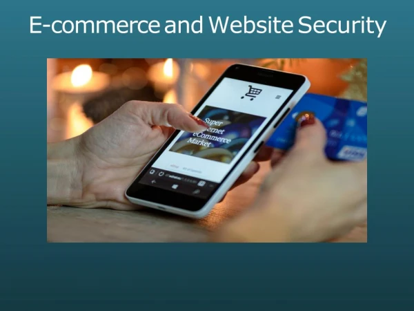
Visit http://xirainfotech.com for more digital service like Digital Marketing Company, Digital Advertising Company, SEO Service Provider, Social Media Marketing Company, Web Design Development Company, Web Design Company, Graphics Design Company, Software Company, Software Development Company, Mobile Apps Development Company.

E N D
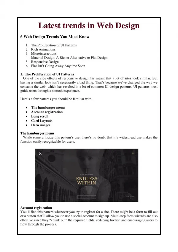
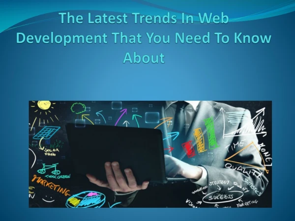
Here are 9 web design trends you need to know about — 1.Drop shadows & depth 2.Color schemes 3.Particle backgrounds 4.Mobile first 5.Custom illustrations 6.Big, bold typography 7.Grid layouts 8.Integrated animations 9.Dynamic gradients 1. Drop shadows and depth The use of shadows is not new, so why mention it? Although shadows have been a staple of web design for quite a while, thanks to the progress of web browsers, we now see some exciting variations. With grids and parallax layouts, web designers are playing with shadows more than ever to create depth and the illusion of a world beyond the screen. This is a direct reaction to the flat design trend that was popular in years past. Shadow play creates a surprisingly versatile effect that increases not only the aesthetics of a web page, but also helps User Experience (UX) by providing emphasis. For example, using soft, subtle shadows as hover states to designate a link is not a new idea, but combining them with vibrant color gradients. 2. Vibrant, saturated color schemes While in the past many brands and designers were stuck with web-safe colors, more designers are becoming courageous in their approach to color—including super saturation and vibrant shades combined with headers that are no longer just horizontal but reimagined with slashes and hard angles. This is partly helped by technological advances in monitors and devices with screens that are more suitable for reproducing richer colors. Vibrant and even clashing colors can be useful for newer brands hoping to instantly attract their visitors’ attention, but it is also perfect for brands who want to set themselves apart the ‘web-safe’ and the traditional. 3. Particle backgrounds Particle backgrounds are a great solution to performance issues websites run into with a video background. These animations are lightweight JavaScript that allow movement to be created as a natural part of the background, all without taking too long to load.
They say that an image says more than thousand words, and a moving one certainly does. Similarly, particle backgrounds immediately attract the user’s attention, so brands can create a memorable impression of themselves in only a few seconds. Additionally, motion graphics like these are becoming more and more popular on social media, providing eye-popping leads back to landing pages. 4. Mobile first As mentioned earlier, mobile browsing has now officially surpassed desktop. Almost everyone these days shops and orders on their Smartphone. In the past, this was a clunky process that users were not as quick to adopt. Designers puzzled: how do we get a decent menu, submenu and subsubmenu on a small screen? But now mobile design has matured. The roll-out burger has become established, minimizing the menu for the small screen. You might have to ditch large, beautiful photos your client sends you in the mobile version, but icons are much more economical in terms of space and have become so common that the user has no trouble understanding them. And UX issues have become easier to identify and fix with micro-interactions getting you immediate feedback on your users actions. 5. Custom illustrations Illustrations are great, versatile media for creating images that are playful, friendly and add an element of fun to a site. Experienced artists can make illustrations that are full of personality and tailored to a brand’s tone—what all brands strive for in markets that get more crowded each year. While this trend is perfect for businesses that are fun and energetic, it can help make brands that are typically perceived as serious and right-brained more approachable to their customers. Whatever your brand identity is, there’s likely an illustration style to match it. 6. Big, bold typography Typography has always been a powerful visual tool, able to create personality, evoke emotion and set tone on a website all while conveying important information. And now, because device resolutions are getting sharper and easier to read, I expect a huge increase in the use of custom fonts. Excluding Internet Explorer, many browsers can support hand-made typefaces that are enabled by CSS for web browsers. The trend of large letters, contrasting sans serif and serif headings help create dynamic parallels, improve UX and best of all, keeps the visitor reading your website. For web pages in particular, headers are key SEO elements and help to order information for the scanning eyes of readers. 7. Asymmetry and broken grid layouts
One big change in 2017 was the introduction of asymmetrical and unconventional ‘broken’ layouts, and this web trend will still be going strong in 2018. The appeal of the asymmetrical layout is that it is unique, distinctive and sometimes experimental. Although large-scale brands with a lot of content still use traditional grid-based structures, I expect an increase in the use of unconventional layouts across the web, as brands create unique experiences to set themselves apart. Traditional companies generally might not be interested in this aesthetic, but bigger brands that can afford to be a little risky will expect out-of-the-box ideas from their web designer. 8. Integrated animations As browser technology advances, more websites are moving from static images and finding new ways, like animations, to engage users in their communication approach. Unlike the particle animations mentioned earlier (which are generally large backgrounds), smaller animations are helpful for engaging the visitor throughout their entire experience on the page. For example, graphics can animate the user while the page is loading, or show the user an interesting hover state from a link. They can also be integrated to work with scrolling, navigation or as the focal point of the entire site. Animation is great tool for including users in the story of a website, allowing them to see themselves (and their potential future as customers) in the characters. Even if you are only interested in animations for fun abstract visuals, they work well to create meaningful interactions for your visitors. 9. Dynamic gradients Over the last few years, flat design has been a much preferred web design trend over dimensional colors, but gradients are making a big comeback in 2018. Last time gradients were around, they were seen mainly in the form of subtle shading to suggest 3D (Apple’s iOS icons were a great example). Now, gradients are big, loud and full of color. The most popular recent incarnation is a gradient filter over photos—a great way to make a less interesting image look intriguing. A simple gradient background can also be the perfect on-trend solution if you don’t have any other images to work with.