Bar / Line / Pie Graphs
Bar / Line / Pie Graphs. Let’s start out with the Circle or Pie Graph. These are great ways to represent relative sizes of the all the parts to the whole. Usually used to display percentages. Bar / Line / Pie Graphs.

Bar / Line / Pie Graphs
E N D
Presentation Transcript
Bar / Line / Pie Graphs Let’s start out with the Circle or Pie Graph. These are great ways to represent relative sizes of the all the parts to the whole. Usually used to display percentages.
Bar / Line / Pie Graphs Let’s start out with the Circle or Pie Graph. These are great ways to represent relative sizes of the all the parts to the whole. Usually used to display percentages. Reed’s Family Budget Transportation 17 % 34 % Other Housing 16 % Food 10 % 23 % Entertainment
Bar / Line / Pie Graphs Let’s start out with the Circle or Pie Graph. These are great ways to represent relative sizes of the all the parts to the whole. Usually used to display percentages. Reed’s Family Budget If Mr. Reed’s take - home pay = $3200 / month , we could figure out how much money the family spends on each part of the pie graph. Transportation 17 % 34 % Other Housing 16 % Food 10 % 23 % Entertainment
Bar / Line / Pie Graphs Let’s start out with the Circle or Pie Graph. These are great ways to represent relative sizes of the all the parts to the whole. Usually used to display percentages. Reed’s Family Budget If Mr. Reed’s take - home pay = $3200 / month , we could figure out how much money the family spends on each part of the pie graph. Just multiply the $3200 by each percentage ( you’ll have to change the percent to a decimal ) Transportation 17 % 34 % Other Housing 16 % Food 10 % 23 % Entertainment
Bar / Line / Pie Graphs Let’s start out with the Circle or Pie Graph. These are great ways to represent relative sizes of the all the parts to the whole. Usually used to display percentages. Reed’s Family Budget If Mr. Reed’s take - home pay = $3200 / month , we could figure out how much money the family spends on each part of the pie graph. Just multiply the $3200 by each percentage ( you’ll have to change the percent to a decimal ) Transportation 17 % 34 % Other Housing = $3200 x 0.34 = $1088.00 Housing 16 % Food 10 % 23 % Entertainment
Bar / Line / Pie Graphs Let’s start out with the Circle or Pie Graph. These are great ways to represent relative sizes of the all the parts to the whole. Usually used to display percentages. Reed’s Family Budget If Mr. Reed’s take - home pay = $3200 / month , we could figure out how much money the family spends on each part of the pie graph. Just multiply the $3200 by each percentage ( you’ll have to change the percent to a decimal ) Transportation 17 % 34 % Other Housing = $3200 x 0.34 = $1088.00 Entertainment = $3200 x 0.10 = $320.00 Housing 16 % Food 10 % 23 % Entertainment
Bar / Line / Pie Graphs Let’s start out with the Circle or Pie Graph. These are great ways to represent relative sizes of the all the parts to the whole. Usually used to display percentages. Reed’s Family Budget If Mr. Reed’s take - home pay = $3200 / month , we could figure out how much money the family spends on each part of the pie graph. Just multiply the $3200 by each percentage ( you’ll have to change the percent to a decimal ) Transportation 17 % 34 % Other Housing = $3200 x 0.34 = $1088.00 Entertainment = $3200 x 0.10 = $320.00 Food = $3200 x 0.23 = 736.00 Housing 16 % Food 10 % 23 % Entertainment
Bar / Line / Pie Graphs Let’s start out with the Circle or Pie Graph. These are great ways to represent relative sizes of the all the parts to the whole. Usually used to display percentages. Reed’s Family Budget If Mr. Reed’s take - home pay = $3200 / month , we could figure out how much money the family spends on each part of the pie graph. Just multiply the $3200 by each percentage ( you’ll have to change the percent to a decimal ) Transportation 17 % 34 % Other Housing = $3200 x 0.34 = $1088.00 Entertainment = $3200 x 0.10 = $320.00 Food = $3200 x 0.23 = 736.00 Transportation = $3200 x 0.17 = $544.00 Housing 16 % Food 10 % 23 % Entertainment
Bar / Line / Pie Graphs Let’s start out with the Circle or Pie Graph. These are great ways to represent relative sizes of the all the parts to the whole. Usually used to display percentages. Reed’s Family Budget If Mr. Reed’s take - home pay = $3200 / month , we could figure out how much money the family spends on each part of the pie graph. Just multiply the $3200 by each percentage ( you’ll have to change the percent to a decimal ) Transportation 17 % 34 % Other Housing = $3200 x 0.34 = $1088.00 Entertainment = $3200 x 0.10 = $320.00 Food = $3200 x 0.23 = 736.00 Transportation = $3200 x 0.17 = $544.00 Other = $3200 x 0.16 = $512.00 Housing 16 % Food 10 % 23 % Entertainment
Bar / Line / Pie Graphs Let’s start out with the Circle or Pie Graph. These are great ways to represent relative sizes of the all the parts to the whole. Usually used to display percentages. Reed’s Family Budget Transportation 17 % 34 % Other Housing 16 % Food 10 % 23 % Entertainment
Bar / Line / Pie Graphs Let’s start out with the Circle or Pie Graph. These are great ways to represent relative sizes of the all the parts to the whole. Usually used to display percentages. Reed’s Family Budget EXAMPLE # 1 : Mr. Reed’s take - home pay = $4250 / month . He gets a $200 / month raise and decides to put all the money into food. What percentage of the budget now accounts for food ? Transportation 17 % 34 % Other Housing 16 % Food 10 % 23 % Entertainment
Bar / Line / Pie Graphs Let’s start out with the Circle or Pie Graph. These are great ways to represent relative sizes of the all the parts to the whole. Usually used to display percentages. Reed’s Family Budget EXAMPLE # 1 : Mr. Reed’s take - home pay = $4250 / month . He gets a $200 / month raise and decides to put all the money into food. What percentage of the budget now accounts for food ? Transportation 17 % 1st $4250 + $200 = $4650 / month 34 % Other Housing 16 % Food 10 % 23 % Entertainment
Bar / Line / Pie Graphs Let’s start out with the Circle or Pie Graph. These are great ways to represent relative sizes of the all the parts to the whole. Usually used to display percentages. Reed’s Family Budget EXAMPLE # 1 : Mr. Reed’s take - home pay = $4250 / month . He gets a $200 / month raise and decides to put all the money into food. What percentage of the budget now accounts for food ? Transportation 17 % 1st $4250 + $200 = $4650 / month 34 % Other Housing In the old budget, the Reed’s were spending $977.50 on food ( $4250 x 0.23 ) 16 % Food 10 % 23 % Entertainment
Bar / Line / Pie Graphs Let’s start out with the Circle or Pie Graph. These are great ways to represent relative sizes of the all the parts to the whole. Usually used to display percentages. Reed’s Family Budget EXAMPLE # 1 : Mr. Reed’s take - home pay = $4250 / month . He gets a $200 / month raise and decides to put all the money into food. What percentage of the budget now accounts for food ? Transportation 17 % 1st $4250 + $200 = $4650 / month 34 % Other Housing In the old budget, the Reed’s were spending $977.50 on food ( $4250 x 0.23 ) Adding $200 to 977.50 = $1,177.50 16 % Food 10 % 23 % Entertainment
Bar / Line / Pie Graphs Let’s start out with the Circle or Pie Graph. These are great ways to represent relative sizes of the all the parts to the whole. Usually used to display percentages. Reed’s Family Budget EXAMPLE # 1 : Mr. Reed’s take - home pay = $4250 / month . He gets a $200 / month raise and decides to put all the money into food. What percentage of the budget now accounts for food ? Transportation 17 % 1st $4250 + $200 = $4650 / month 34 % Other Housing In the old budget, the Reed’s were spending $977.50 on food ( $4250 x 0.23 ) Adding $200 to 977.50 = $1,177.50 $1,177.50 ÷ $4650 = 0.253 or 25.3 % 16 % Food 10 % 23 % Entertainment
Bar / Line / Pie Graphs Let’s start out with the Circle or Pie Graph. These are great ways to represent relative sizes of the all the parts to the whole. Usually used to display percentages. Reed’s Family Budget EXAMPLE # 2 : The circle graph shows the Smith family’s monthly budget. The Smith family has a total monthly income of $3,465.00 Transportation 20 % 30 % Other Housing 8 % Food 15 % 27 % Clothing
Bar / Line / Pie Graphs Let’s start out with the Circle or Pie Graph. These are great ways to represent relative sizes of the all the parts to the whole. Usually used to display percentages. Reed’s Family Budget EXAMPLE # 2 : The circle graph shows the Smith family’s monthly budget. The Smith family has a total monthly income of $3,465.00 The Smith’s decide to spend the same amount on clothing each month as they do transportation. How much money will be spent on expenses other than clothing and transportation ? Transportation 20 % 30 % Other Housing 8 % Food 15 % 27 % Clothing
Bar / Line / Pie Graphs Let’s start out with the Circle or Pie Graph. These are great ways to represent relative sizes of the all the parts to the whole. Usually used to display percentages. Reed’s Family Budget EXAMPLE # 2 : The circle graph shows the Smith family’s monthly budget. The Smith family has a total monthly income of $3,465.00 The Smith’s decide to spend the same amount on clothing each month as they do transportation. How much money will be spent on expenses other than clothing and transportation ? Transportation costs = 20% Clothing costs = 20 % Transportation 20 % 30 % Other Housing 8 % Food 15 % 27 % Clothing
Bar / Line / Pie Graphs Let’s start out with the Circle or Pie Graph. These are great ways to represent relative sizes of the all the parts to the whole. Usually used to display percentages. Reed’s Family Budget EXAMPLE # 2 : The circle graph shows the Smith family’s monthly budget. The Smith family has a total monthly income of $3,465.00 The Smith’s decide to spend the same amount on clothing each month as they do transportation. How much money will be spent on expenses other than clothing and transportation ? Transportation costs = 20% Clothing costs = 20 % So together they spend 40% of their money on those expenses. Transportation 20 % 30 % Other Housing 8 % Food 15 % 27 % Clothing
Bar / Line / Pie Graphs Let’s start out with the Circle or Pie Graph. These are great ways to represent relative sizes of the all the parts to the whole. Usually used to display percentages. Reed’s Family Budget EXAMPLE # 2 : The circle graph shows the Smith family’s monthly budget. The Smith family has a total monthly income of $3,465.00 The Smith’s decide to spend the same amount on clothing each month as they do transportation. How much money will be spent on expenses other than clothing and transportation ? Transportation costs = 20% Clothing costs = 20 % So together they spend 40% of their money on those expenses. That leaves 60% left over for other expenses… Transportation 20 % 30 % Other Housing 8 % Food 15 % 27 % Clothing
Bar / Line / Pie Graphs Let’s start out with the Circle or Pie Graph. These are great ways to represent relative sizes of the all the parts to the whole. Usually used to display percentages. Reed’s Family Budget EXAMPLE # 2 : The circle graph shows the Smith family’s monthly budget. The Smith family has a total monthly income of $3,465.00 The Smith’s decide to spend the same amount on clothing each month as they do transportation. How much money will be spent on expenses other than clothing and transportation ? Transportation costs = 20% Clothing costs = 20 % So together they spend 40% of their money on those expenses. That leaves 60% left over for other expenses… $3,465.00 x 0.60 = $2,079.00 for other expenses Transportation 20 % 30 % Other Housing 8 % Food 15 % 27 % Clothing
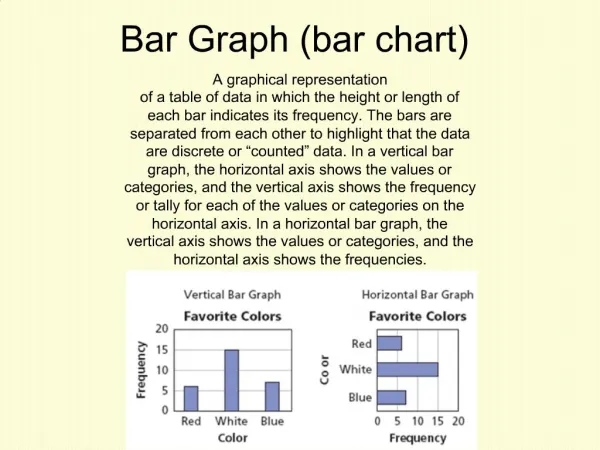
Bar / Line / Pie Graphs The next graph we will look at is a bar graph. Bar graphs show variables that are distinct and unconnected between data points. The height of the bar indicates the value of the data point.
Bar / Line / Pie Graphs The next graph we will look at is a bar graph. Bar graphs show variables that are distinct and unconnected between data points. The height of the bar indicates the value of the data point. For example : The graph below shows the number of male / female students in a middle school. 50 40 Girls 30 Boys 20 10 6th graders 7th graders 8th graders
Bar / Line / Pie Graphs The next graph we will look at is a bar graph. Bar graphs show variables that are distinct and unconnected between data points. The height of the bar indicates the value of the data point. For example : The graph below shows the number of male / female students in a middle school. How many girls are there in the middle school ? 50 40 Girls 30 Boys 20 10 6th graders 7th graders 8th graders
Bar / Line / Pie Graphs The next graph we will look at is a bar graph. Bar graphs show variables that are distinct and unconnected between data points. The height of the bar indicates the value of the data point. For example : The graph below shows the number of male / female students in a middle school. How many girls are there in the middle school ? Approximately 39 40 30 50 40 Looking at the graph : 40 + 30 + 39 = 109 Girls 30 Boys 20 Estimation is accepted when using these graphs… 10 6th graders 7th graders 8th graders
Bar / Line / Pie Graphs The next graph we will look at is a bar graph. Bar graphs show variables that are distinct and unconnected between data points. The height of the bar indicates the value of the data point. For example : The graph below shows the number of male / female students in a middle school. How many boys are there in the middle school ? 50 40 Girls 30 Boys 20 10 6th graders 7th graders 8th graders
Bar / Line / Pie Graphs The next graph we will look at is a bar graph. Bar graphs show variables that are distinct and unconnected between data points. The height of the bar indicates the value of the data point. For example : The graph below shows the number of male / female students in a middle school. How many boys are there in the middle school ? Approximately 37 Approximately 28 Approximately 46 50 40 Looking at the graph : 28 + 37 + 46 = 111 Girls 30 Boys 20 Estimation is accepted when using these graphs… 10 6th graders 7th graders 8th graders
Bar / Line / Pie Graphs Lastly let’s look at a line graph. Line graphs have continuous intervals that are unbroken sequences. Lines with no gaps or holes in it.
Bar / Line / Pie Graphs Lastly let’s look at a line graph. Line graphs have continuous intervals that are unbroken sequences. Lines with no gaps or holes in it. Adam and Sean are selling magazines to raise money for their school. They recorded their total sales at the end of each week for 5 weeks. The graph below shows their results. 10 8 # of magazines sold 6 4 2 Adam Sean 0 3 4 5 1 2 weeks
Bar / Line / Pie Graphs Lastly let’s look at a line graph. Line graphs have continuous intervals that are unbroken sequences. Lines with no gaps or holes in it. Adam and Sean are selling magazines to raise money for their school. They recorded their total sales at the end of each week for 5 weeks. The graph below shows their results. 10 1) How many magazines did Sean sell in week 3 ? 8 # of magazines sold 6 4 2 Adam Sean 0 3 4 5 1 2 weeks
Bar / Line / Pie Graphs Lastly let’s look at a line graph. Line graphs have continuous intervals that are unbroken sequences. Lines with no gaps or holes in it. Adam and Sean are selling magazines to raise money for their school. They recorded their total sales at the end of each week for 5 weeks. The graph below shows their results. 10 1) How many magazines did Sean sell in week 3 ? Answer : 8 8 # of magazines sold 6 4 2 Adam Sean 0 3 4 5 1 2 weeks
Bar / Line / Pie Graphs Lastly let’s look at a line graph. Line graphs have continuous intervals that are unbroken sequences. Lines with no gaps or holes in it. Adam and Sean are selling magazines to raise money for their school. They recorded their total sales at the end of each week for 5 weeks. The graph below shows their results. 10 1) How many magazines did Sean sell in week 3 ? Answer : 8 8 2) How many magazines did Adam sell in week 2 ? # of magazines sold 6 4 2 Adam Sean 0 3 4 5 1 2 weeks
Bar / Line / Pie Graphs Lastly let’s look at a line graph. Line graphs have continuous intervals that are unbroken sequences. Lines with no gaps or holes in it. Adam and Sean are selling magazines to raise money for their school. They recorded their total sales at the end of each week for 5 weeks. The graph below shows their results. 10 1) How many magazines did Sean sell in week 3 ? Answer : 8 8 2) How many magazines did Adam sell in week 2 ? Answer : 6 # of magazines sold 6 4 2 Adam Sean 0 3 4 5 1 2 weeks
Bar / Line / Pie Graphs Lastly let’s look at a line graph. Line graphs have continuous intervals that are unbroken sequences. Lines with no gaps or holes in it. Adam and Sean are selling magazines to raise money for their school. They recorded their total sales at the end of each week for 5 weeks. The graph below shows their results. 10 1) How many magazines did Sean sell in week 3 ? Answer : 8 8 2) How many magazines did Adam sell in week 2 ? Answer : 6 # of magazines sold 6 3) Who sold the most magazines ? 4 2 Adam Sean 0 3 4 5 1 2 weeks
Bar / Line / Pie Graphs Lastly let’s look at a line graph. Line graphs have continuous intervals that are unbroken sequences. Lines with no gaps or holes in it. Adam and Sean are selling magazines to raise money for their school. They recorded their total sales at the end of each week for 5 weeks. The graph below shows their results. 10 1) How many magazines did Sean sell in week 3 ? Answer : 8 8 2) How many magazines did Adam sell in week 2 ? Answer : 6 # of magazines sold 6 3) Who sold the most magazines ? 4 Adam = 3 + 6 +4 +9 + 8 = 30 Sean = 6 +4 + 8 +7 + 2 = 27 2 Adam Sean 0 3 4 5 1 2 weeks
Bar / Line / Pie Graphs Lastly let’s look at a line graph. Line graphs have continuous intervals that are unbroken sequences. Lines with no gaps or holes in it. Adam and Sean are selling magazines to raise money for their school. They recorded their total sales at the end of each week for 5 weeks. The graph below shows their results. 10 1) How many magazines did Sean sell in week 3 ? Answer : 8 8 2) How many magazines did Adam sell in week 2 ? Answer : 6 # of magazines sold 6 3) Who sold the most magazines ? 4 Adam = 3 + 6 +4 +9 + 8 = 30 Sean = 6 +4 + 8 +7 + 2 = 27 2 Adam Adam sold 3 more magazines than Sean… Sean 0 3 4 5 1 2 weeks