Download
1 / 1
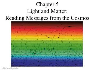
### Optimizing Font Design for Enhanced Readability and Brand Identity ###
10 likes | 123 Vues
This project focuses on the effective use of Frutiger font variants, particularly in light and bold weights, to create visually appealing and legible branding materials. By analyzing different sizes and styles such as 52pt light and 36pt bold, we highlight how to strategically emphasize important elements with the use of Frutiger. The goal is to enhance overall readability while maintaining an engaging aesthetic that aligns with brand identity. This exploration offers insights for graphic designers seeking to leverage typography effectively in their work. ###
Télécharger la présentation 
### Optimizing Font Design for Enhanced Readability and Brand Identity ###
An Image/Link below is provided (as is) to download presentation
Download Policy: Content on the Website is provided to you AS IS for your information and personal use and may not be sold / licensed / shared on other websites without getting consent from its author.
Content is provided to you AS IS for your information and personal use only.
Download presentation by click this link.
While downloading, if for some reason you are not able to download a presentation, the publisher may have deleted the file from their server.
During download, if you can't get a presentation, the file might be deleted by the publisher.
E N D
Presentation Transcript
52pt. Frutiger light w/bold 36pt. Frutiger roman w/bold ENTITY NAME IN CAPS 20PT. FRUTIGER ROMAN W/BOLD


More Related