Download
1 / 6
80 likes | 398 Vues
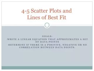
Scatter Plots and Lines of Best Fit. PS.1.AC.4: Apply probability to real-world situation such as weather prediction, game theory, fair division, insurance tables, and election theory. Students will be able to interpret and make scatter plots and draw lines of best fit. Scatter Plots.

E N D
Scatter Plots and Lines of Best Fit PS.1.AC.4: Apply probability to real-world situation such as weather prediction, game theory, fair division, insurance tables, and election theory. Students will be able to interpret and make scatter plots and draw lines of best fit. Chapter 1
Scatter Plots • Data can be presented in many ways. • Graphs are useful because they can help identify characteristics of data. • A scatter plot is a type of visual display used to explore the relationship between two sets of data, represented by unconnected points on a grid. Chapter 1
10 8 6 4 2 0 1 2 3 4 5 6 7 8 9 10 Years of Experience Scatter Plots • This scatter plot shows the relationship between hourly wages and years of experience. Hourly Wage Chapter 1
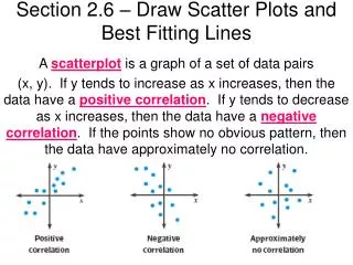
Correlations • A pattern may emerge on the graph that shows a relationship or no relationship between the two sets of data. • If the dots approach being on or close to a line, we say the relationship has a strongcorrelation. • If the dots are scattered over the graph, we say the relationship has a weak or nocorrelation. Chapter 1
Line of Best Fit • We try to draw the line that the data is clustered around, and we call this the line of best fit. • If the line slants upwards from left to right, we say it has a positive correlation. • If the line slants downwards from left to right, we say it has a negative correlation. • To see examples of this, click here. Chapter 1
Using the Calculator • Put the coordinates of the horizontal axis in List 1. • Put the coordinates of the vertical axis in List 2. • Go to 2nd List (Stat) then over to CALC and down to LinReg(ax+b) and push ENTER twice. • You should get y = ax + b, followed by the values for a and b. This is the equation of the line of best fit. Please change any decimals to fractions. Chapter 1