Download
1 / 12
130 likes | 267 Vues
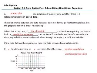
2.6 Drawing scatter plots and lines of best fit. Objective: Be able to plot a point Generate an equation for a line of best fit Common Core Standards A-CED-2, F-IF-2, F-IF-4, F-IF-6, F-BF-1, F-LE-2, S-ID-6, S-ID-8, S-ID-9 Assessments: Define all vocab from this section 2-6 Worksheet.

E N D
2.6 Drawing scatter plots and lines of best fit Objective: Be able to plot a point Generate an equation for a line of best fit Common Core Standards A-CED-2, F-IF-2, F-IF-4, F-IF-6, F-BF-1, F-LE-2, S-ID-6, S-ID-8, S-ID-9 Assessments: Define all vocab from this section 2-6 Worksheet
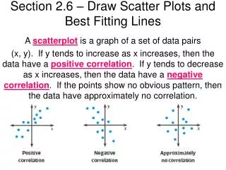
Correlation • A scatter plot is a plot with a set of ordered pairs plotted on it. • Positive correlation • Negative correlation
Correlation Coefficient • A number between -1 and 1 represented by r that measures how well a line represents a set of data points. • If r is close to 1 it is a close relation with a positive correlation • If r is close to -1 it is a close relation with a negative correlation. • If r is close to 0 it the points are not close to the line.
Turn on Correlation Coefficients • Hit 2nd CATALOG (this is over the 0 button). Go down to DiagnosticOn, hit ENTER then ENTER again. • The closer that the correlation coefficient is to 1 the better fit the line is.
Least Squares Regression Line • Least-Square regression line- the one and only line for which the sum of the squares of the residuals is as small as possible. • Stat, Edit • L1 are the x values and L2 are the y values • Stat, calc, LinReg(ax+b), Enter *To get the equation to go into y1=, you need to enter- LinReg(ax+b) L1, L2, Y1 y1 is in vars, y-vars, Function, #1
The scatter plot shows a strong positive correlation. So, the best estimate given is r = 1. (The actual value is r0.98.) EXAMPLE 2 Estimate correlation coefficients SOLUTION
EXAMPLE 3 Approximate a best-fitting line Alternative-fueled Vehicles The table shows the number y (in thousands) of alternative-fueled vehicles in use in the United States xyears after 1997. Approximate the best-fitting line for the data.
Enter the data into two lists. Press and then select Edit. Enter years since 1997 in L1 and number of alternative-fueled vehicles in L2. EXAMPLE 5 Use a graphing calculator to find a best-fitting line Use the linear regression feature on a graphing calculator to find an equation of the best-fitting line for the data in Example 3. SOLUTION STEP1
Find an equation of the best- fitting (linear regression) line. Press choose the CALC menu, and select LinReg(ax+b). The equation can be rounded to y=40.9x+263. EXAMPLE 5 Use a graphing calculator to find a best-fitting line STEP2
Make a scatter plot of the data pairs to see how well the regression equation models the data. Press [STAT PLOT] to set up your plot. Then select an appropriate window for the graph. EXAMPLE 5 Use a graphing calculator to find a best-fitting line STEP3
ANSWER An equation of the best-fitting line is y=40.9x+263. EXAMPLE 5 Use a graphing calculator to find a best-fitting line STEP4 Graph the regression equation with the scatter plot by entering the equation y = 40.9x + 263. The graph (displayed in the window 0≤x≤ 8 and 200 ≤y≤600) shows that the line fits the data well.
OIL PRODUCTION: The table shows the U.S. daily oil production y(in thousands of barrels) xyears after 1994. 4. a. Approximate the best-fitting line for the data. Try on your own! Use your calculator. GUIDED PRACTICE