Download
1 / 47
500 likes | 638 Vues
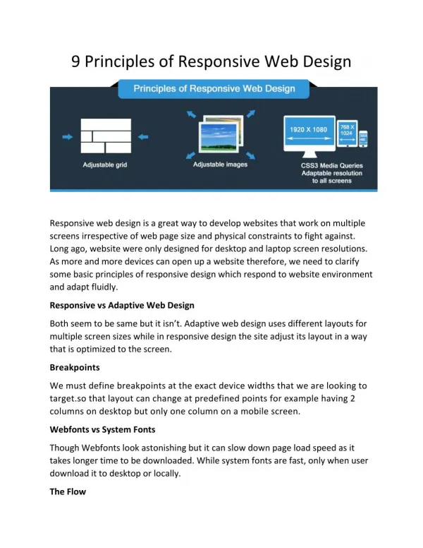
Principles of Web Design. C. Candace Chou. Modified from Drs. Catherine Fulford’s and Curtis Ho’s presentations. Basics of Web Design. Simplicity and consistency Standard HTML Content and navigation Organization Typography Web-safe Color Accessibility. Essential Information.

E N D
Principles of Web Design C. Candace Chou Modified from Drs. Catherine Fulford’s and Curtis Ho’s presentations
Basics of Web Design • Simplicity and consistency • Standard HTML • Content and navigation • Organization • Typography • Web-safe Color • Accessibility
Essential Information • An informative title • The creator’s identity (author or institution) • A creation or revision date • At least one link to a local home page • The “home page” URL on the major menu pages in your site Source: Lynch, P & Horton, S (1999), Web Style Guide. Yale University Press.
Rule of Thumb • Use careful layouts of text and links with relatively small graphics • Web page graphic should not be more than 535 pixels wide or more than about 320 pixels high (within letter size paper) • Browser safe area: 600 x 350
Web Grid Grid: http://info.med.yale.edu/caim/manual/pages/page_grid.html Browser Size Test: http://www.wpdfd.com/restest.htm
Informal BALANCE Formal
Optical Center The viewer will tend to focus at the screen’s optical center, located slightly above the center of the screen. Tend to locate objects at this optical center
CENTER OF INTEREST Focal point
CENTER OF INTEREST Focal point
CENTER OF INTEREST NOT Focal point
Rule of Thirds • Divide the screen into thirds horizontally and vertically • Place focus of interests on the four intersections
Rule of Thirds • Upper right position • See full shadow and tracks
Layout • Use 2/3 - 1/3 format or 2 columns. • Use header and picture column • Use table formatting • Try inventive layouts
Layout • Leave 20% white space. • Use shorter paragraphs • Avoid heavy lines.
Fonts T Serif fonts have thin lines and feet. T Sans-serif fonts have even lines and NO feet.
Fonts T Serif fonts are easier to read in print media. T Sans-serif fonts are more legible in projected media.
Serif Sans-Serif Palitino Geneva Times Arial Courier Helvetica Fonts
Readability of Fonts • This is a serif font (Times) • Can you read this easily? Do the letters all run together? Would you like to see an entire screen full of this? This is Times 18-points • This is a sans-serif font (Arial) • Which is easier to read, this text block or the block above? In general, sans-serif fonts look better on computer monitors. This is Arial 18-point.
Legi bility • Use sans-serif for headers. • Use sans-serif for projected visuals. • Use at 18 points for projected visuals. • Change preferences in web browsers.
Readability • Use serif font for lots of printed text. • Use 12 points for adult learners. • Use 14 for children & special needs.
Readability • Use ragged right justification. • Avoid centering. • Avoid full justification. • Avoid italic fonts, look awful in small fonts
What Does Research Say? • Bernard, Mills, Peterson, & Storrer (2001) • http://psychology.wichita.edu/surl/usabilitynews/3S/compare.htm • A comparison of the following fonts: • Sans Serif Fonts: Agency FB, Arial, Comic Sans MS, Tahoma, Verdana • Serif Fonts: Courier New, Georgia, Goudy Old Style, Century Schoolbook, Times New Roman • Ornate Fonts: Bradley Hand ITC, Monotype Corsiva
Research Results • Font Legibility: No significant difference • Reading Time: Tahoma faster than Corsivia • Perceived Font Legibility: Courier, Comic, Verdana, Georgia, and Times
Preferred Fonts • Elegant Font Type: Corsivia • Youthful & Fun: Comic • Business Like: Times and Courier • General Preference: Arial, Comic, Tahoma, Verdana, Courier, Georgia, and Schoolbook
DON’T USE ALL CAPS FOR LARGE BLOCKS OF TYPE. READERS READ FASTEST WHEN SENTENCES ARE PRINTED IN UPPER AND LOWER CASE - THE WAY THEY NORMALLY ARE SEEN IN PRINT. HEADLINES ARE SET IN ALL CAPS BECAUSE THEY REQUIRE THE READER TO SLOW DOWN, GIVING EMPHASIS TO A FEW WORDS. WASN’T THIS BLOCK OF ALL CAPS DIFFICULT TO READ?
DON’T USE ALL CAPS FOR LARGE BLOCKS OF TYPE. READERS READ FASTEST WHEN SENTENCES ARE PRINTED IN UPPER AND LOWER CASE - THE WAY THEY NORMALLY ARE SEEN IN PRINT. HEADLINES ARE SET IN ALL CAPS BECAUSE THEY REQUIRE THE READER TO SLOW DOWN, GIVING EMPHASIS TO A FEW WORDS. WASN’T THIS BLOCK OF ALL CAPS DIFFICULT TO READ? Compare Don’t use all caps for large blocks of type. Readers read fastest when sentences are printed in upper and lower case - the way they normally are seen in print. Headlines are set in all caps because they require the reader to slow down, giving emphasis to a few words. Wasn’t this better?
Color • Use color to enhance your presentation. • Avoidmorethan5colorsononeslide • http://www.angelfire.com/mn/aptmgmt/building.html
Selecting Color • Complementary colors: colors opposite each other, e.g., red-green, blue-orange • Split colors: the 2 colors next to its complement, e.g., purple-orange & green Source:http://library.thinkquest.org/50065/art/effects.html
Complementary Colors Split Complement When two pure complementary hues are placed next to each other, the design seems to vibrate. They create an exciting feeling that quickly attracts attention. The effect of this color scheme is similar to using complementary colors, except that it offers the artist a little more variety with which to work.
Analogous Colors Colors next to each other on the color wheel that have a common hue are referred to as analogous colors. Red-purple, purple and blue-purple is one set of analogous colors because they all have purple in common. The common hue creates a feeling of unity in the design by tying together each part of the design. Warm and Cool Colors Warm and cool colors are two specific sets of analogous colors. Blue, green and purple are cool colors. Red, orange and yellow are warm colors. Create a cold, icy feeling Create a warm, sunny feeling
Now is the time for all good men to come to the aid of their country. Now is the time for all good men to come to the aid of their country.
BEST LEGIBILITY for text ------------------------------------------------------------------------ black text on a white background dark green text on a white background dark blue text on a white background brown text on a white background. WORST LEGIBILITY for text ------------------------------------------------------------------------ red text on green background green text on red background green text on blue background
BEST VISIBILITY to attract attentionbut not for large blocks of text text black on orange text red on white text dark blue on yellow text white text on purple Source: http://library.thinkquest.org/50065/psych/effects.html
Color Psychology Green can signify growth and movement.
Color Psychology Blue, the most universally liked color, can convey calm.
Color Psychology Red can stand for power, energy, or danger.
Color Psychology Yellowis thought of as positive, used for highlighting against dark background.
Color Psychology Purple has spiritual meaning for some people.
Background White or Yellow Red or Black
Remember good design is invisible. • Learn more. • Decrease anxiety. • Increase motivation. • Increase time studying.
Accessibility I • Make sure your site is usable on the main browser flavors and versions • Make sure it's usable without having to download a plug-in first • Test your site at the development stage to check it works on various operating systems with different browser flavors/versions • Use style sheets to separate style and content
Accessibility II • Use the appropriate html tags to define your text - enables the text readers blind people use to read the text on your site • Make good use of headings, <em> and <strong> • Always specify alternative text for graphics - <img src="image.gif" width="10" height="10" alt="image description"> • Check the colors you use aren't bad for those with various forms of color blindness • If in doubt - desaturate (make black and white) the design to see if it still makes sense • Don't use color as the only indicator of change (e.g. in a new section) • Always underline links Source: http://www.jessett.com/web_sites/usability/accessibility.shtml
Web Resources • Instructional Design • http://www.lrc.arizona.edu/facdev/Technology/vizdes.htm • Web Style Guide • http://info.med.yale.edu/caim/manual/pages/page_design.html • http://www.wpdfd.com/ • Font • http://psychology.wichita.edu/surl/usabilitynews/3W/fontSR.htm • http://www.wpdfd.com/wpdtypo.htm • Layout • http://www.jessett.com/ • http://www.dartmouth.edu/~cc/ • Accessibility Test • http://www.cast.org/bobby/